10+2[1] 12Msc European Forestry
Marcos Rodrigues & Pere Gelabert
October 8, 2024
R is an object-oriented programming language and environment for statistical computing that provides relatively simple access to a wide variety of statistical techniques (R Core Team 2016). R offers a complete programming language with which to add new methods by defining functions or automating iterative processes.
Many statistical techniques, from the classic to the latest methodologies, are available in R, with the user in charge of locating the package that best suits their needs.
R can be considered as an integrated set of programs for data manipulation, calculation and graphics. Among other features R allows:
R is distributed as open source software, so obtaining it is completely free.
R is also multiplatform software which means it can be installed and used in various operating systems (OS), mainly Windows and Linux. However, the available functions and packages syntax is practically the same in any OS. From an operational point of view, R consists of a base system and additional packages that extend its functionality. Among the main types of packages we found:
The functions included in the packages installed by default, that is, those that are predefined in the basic installation R, are available for use at any time. However, in order to use the functions of new packages, specific calls must be made to those packages.
The installation of R depends on the operating system to be used. You can find all the necessary information in:
For the development of this course we will use the Windows version but feel free to use whatever version fits your needs. The last version of R is downloadable from here. We will install the latest version available. Remember that you have to install the version that corresponds to the architecture of your OS (32 or 64 bits). In case of doubt install both versions or at least the 32-bit version, which will always work on our computer.
Installation in Windows is very simple. Just run the executable (.exe) file and follow the installation steps (basically say Yes to everything). Once R is installed, we will install RStudio an integrated development environment (IDE) that is more user-friendly than the basic R interface. RStudio provides a more complete environment and some useful tools such as:
We will install the latest version of RStudio. You can see the installation steps in the installation video tutorial.
Being an open source software and with a strong collaborative component R has a large amount of resources and documentation relative to the specific syntax of the language itself (control structures, function creation, calls to objects …) and to every single package available as well.
On the other hand, R counts on a series of manuals which are available right after installing the software. You can find them in the installation directory of R (C:Files-X.X.X). These manuals and many others can also be downloaded from the R project website:
Finally, in addition to the wide repertoire of manuals available, there is also a wide range of resources and online help including:
It is relatively important to become familiar from the beginning with the various alternatives for getting help. A key part of your success in using R lies in your ability to be self-relient and be able to get help and apply it to your own problems.
R is basically a command line environment that allows the user to interact with the system to enter data, perform mathematical calculations or visualize results through plots and maps.
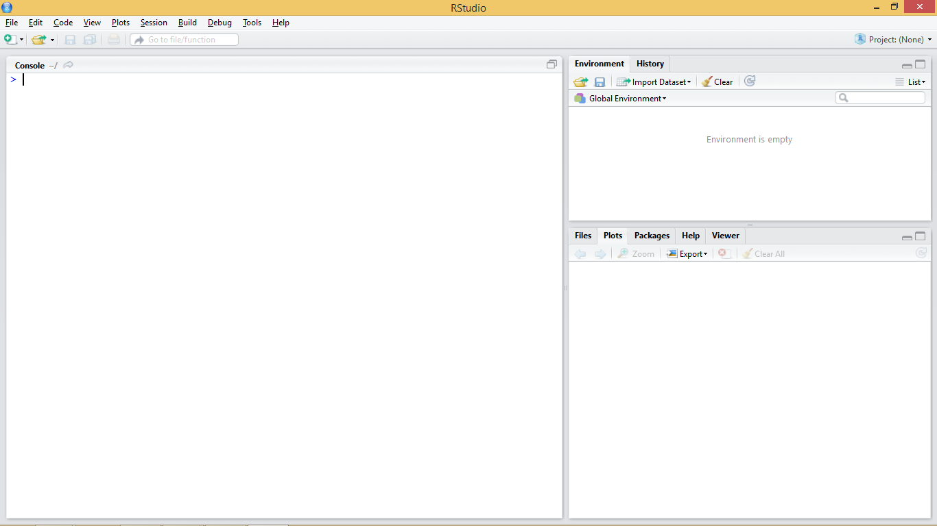
Figure 1.1 shows standard appearance of the R console, which can be considered as a windows cmd like terminal or console. We have also seen what the terminal and working environment looks like in RStudio at the end of the installation process (Figure 1.2). A third possibility is to work directly on the cmd terminal (Figure 1.3). The commands and instructions are the same regardless of the environment that we chose. In this course we will focus on the use of RStudio, since it is the simplest of them all.
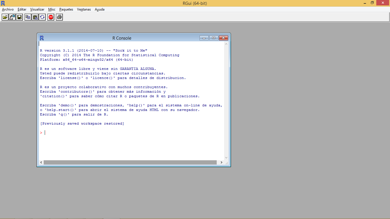

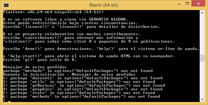
The terminal (regardless of the chosen option) is usually the main working window and is where we will introduce the necessary instructions to carry out our operations. It is in this window where we will visualize the results from most instructions and objects we generate. An exception to this are plots and maps which are displayed in a specifically-devoted window located in the bottom-right corner.
Let’s get started and insert our first command in the R’s terminal. When R is ready or awaiting us to input an instruction the terminal shows a cursor right after a > symbol to indicate it.
At this point it is necessary to take into account that R is an interpreted language, which means that the different instructions or functions that we specify are read and executed one by one. The procedure is more or less as follows. We introduce an instruction in the R console, the application interprets and executes it, and finally generates or returns the result.
To better understand this concept we will do a little test using the R console as a calculator. Open the working environment of RStudio if you did not already open it and enter the following statement and press enter:
What just happened is that the R interpreter has read the instruction, in this case a simple arithmetic operation, executed it and returned the result. This is the basic way to proceed to enter operations. However, it will not be necessary for us to always enter the instructions manually. Later we will see how to create scripts or introduce blocks of instructions.
We have previously mentioned some features of R such as that R is an object-oriented language. But, what does this mean? It basically means that to perform any type of task we use objects. Everything in R is an object (functions, variables, results …). Thus, entities that are created and manipulated in R are called objects, including data, functions and other structures.
Objects are stored and characterized by their name and content. Depending on the type of object we create that object will have a given set of characteristics. Generally the first objects one creates are those of variable type, in which we will be able to store a piece of data and information. The main objects of variable type in R are:
Number: an integer or decimal number depending on whether we specify decimal figures.
Factor:a categorical variable or text.
Vector: a list of values of the same type.
Array: a vector of k dimensions.
Matrix: a particular case of array where k=2 (rows, cols).
Data.frame: table composed of vectors.
List: vector with values of different types.
Obviously there are other types of objects in R. For example, another object with which we are going to familiarize ourselves is the model objects. We can create them by storing the output of executing some kind of model like a linear regression model for instance. Spatial data also fits in its particular variety of objects. Through the course we will see both models and spatial information (vector and raster).
Objects in R are created by declaring a variable by specifying its name and then assign it a value using the <- operator. We can also use = but the <- operator is most commonly found in examples and manuals.
So, to create an object and assign it a value the basic instruction is composed of object name <- value.
Try to introduce the following instructions to create different kind of objects:
We can also store in an object the result form any operation:
So here is the thing. The type of object we create depends on the content that we assign. Therefor, if we assign a numeric value, we are creating an object of type number (integer or decimal) and if we assign a text string (any quoted text, either with single or double quotes), we are creating a text type object or string. Once created, the objects are visualized using calls using the name that we have assigned to the object. That is, we will write to the terminal in the name of the object and then its value will be shown.
Some considerations to keep in mind when creating objects or working with R in general lines:
R is case-sensitive so radio ≠ Radio
If a new value is assigned to an object it is overwritten and deletes the previous value.
Textual information (also known as string or char) is entered between quotation marks, either single ('') or double ("").
The function ls() will show us in the terminal the objects created so far.
If the value obtained from an instruction is not assigned in an object it is only displayed in the terminal, it is not stored.
One of the most common objects in R is the vector. A vector can store several values, which must necessarily be of the same type (all numbers, all text, and so forth). There are several ways to create vectors. Try entering the following instructions and viewing the created objects.
We have just covered the basic methods for vector creation. The most common approach is use the function c() which allow as to introduce values manually by separatting them using ,.
Another option that only works for vectors containing integer values is the use of : which produces a ordered sequence of numbers by adding 1 starting from the first value and finishing in the last.
Vectors, lists, arrays, and data frames are indexed objects. This means that they store several values and assign to each of them a numerical index that indicates their position within the object. We can access the information stored in each of the positions by using name[position]:
Note that opposite to most of the other programming languages, the index for the first position in an indexed object is 1, whereas Python, C++ and others use 0.
As with an unindexed object, it is possible to modify the information of a particular position using the combination name[position] and the assignment operator <-. For example:
Let’s see some specific functions and basic operations for vectors and other indexed objects:
length(vector): Returns the number of positions of a vector.
Logical operators <,>, ==,!=: Applying these operators on a vector returns a new vector with values TRUE/FALSE for each of the positions of the vector, depending on whether the given values satisfies or not the condition.
Once we have seen vectors we go to explore how objects of type list work. A list is an object similar to a vector with the difference that lists allow to store values of different type. Lists are created using the list(value1, value2, ...) function. For example:
To access the values stored in the different positions proceed in the same way we did with vectors, ie name[position]:
We can use the length() function with list too:
Arrays are an extension of vectors, which add additional dimensions to store information. The most common case is the 2-dimensional matrix (rows and columns). To create an array, we use array(values, dimensions). Both values and dimensions are specified using vectors. In the following example we see how to create a matrix with 4 rows and 5 columns, thus containing 20 values, in this case correlative numbers from 1 to 20:
     [,1] [,2] [,3] [,4] [,5]
[1,]    1    5    9   13   17
[2,]    2    6   10   14   18
[3,]    3    7   11   15   19
[4,]    4    8   12   16   20
To access the stored values we will use a combination of row-and-column positions like matrix[row, col], where row indicates the row postition and col the column one. If we only assign value to one of the coordinates ([row,] or [,col]) we get the vector corresponding to the specified row or column.
A data frame is used for storing data tables. It is a list of vectors of equal length. For example, the following variable df is a data frame containing three vectors n, s, b.
As you can see, the function data.frame() is used to create the data.frame. However, we will seldom use these function to create objects or store data. Normally, we will call an instruction to read text files containing data or call data objects available in some packages.
We have seen so far aspects related to the creation of objects. However we should be also know how many objects we have created in our session and how to remove them if necessary. To display all created objects we use ls(). Deleting objects in R is done by the command remove rm(object) and then call to the garbage collector with gc() to free-up the occupied memory.
If we want to removal all the objects we have currently in our working session we can pass a list object containing the names of all objects to the gc() function. If you are thinking on combining gc()and ls()you are right. This would be the way:
Up to this point we have seen and executed some instructions in R, generally oriented to the creation of objects or realization of simple arithmetic operations.
However, we have also executed some function-type statements, such as the length() function. A function can be defined as a group of instructions that takes an input, uses this input to compute other values and returns a result or product. We will not go into very deep details, at least for now. It suffices to know that to execute a function it is enough to invoke the instruction that calls the desired function (length) and to specify the necessary inputs, also known as arguments. These inputs are always included between the parentheses of the instruction (length(vector)). If several arguments are needed we separate them using ,.
Sometimes we can refer to a given argument by using the argument’s name as is the case of the example we saw to delete all the objects in a session rm(list=ls()).
So far we have inserted instructions in the console but this is not the most efficient way to work. We will focus on the use of scripts which are an ordered set of instructions. This means we can write a text file with the instructions we want to insert and then run them at once.
RStudio has an script development environment which opens in the top-left window. We can access the scripting window pressing File/New File/R script.
For additional information visit the RStudio support site.
So far we have seen how to enter data and create objects manually, but it is also possible, and in fact is most common, to read data from files and store it in an object. If the target data file is properly structured, we will create a matrix or a ‘data.frame’ object which we can manipulated afterwards.
Using data files normally requires us to specify the location of that file using paths. To avoid this, R has a tool that allow us to specify a target folder -the so-called working directory or folder- to work with.
The working directory is the default path for reading and writing files of any kind. We can know the path to the current working directory using the getwd() command. To set a new working directory, we use the command setwd("path"). Remember that setwd() requires a string argument (whereas getwd() does not) to specify the path to the working directory (“path”).
By default, in Windows the working directory is set to the Documents folder.
Once the working directory is specified, everything we do in R (read files, export tables and/or graphics …) will be done in that directory. However, it is possible to work with other file system locations, specifying a different path through the arguments of some functions.
R allows you to read any type of file in ASCII format (text files). The most frequently used functions are:
read.table() and its different variations
scan()
read.fwf()
For the development of this course we will focus on using the read.table() function as it is quite versatile and easy to use. Before starting to use a new function we should always take a look at the available documentation. we will take this opportunity to show you how to do this in R so that you begin to become familiar R help.
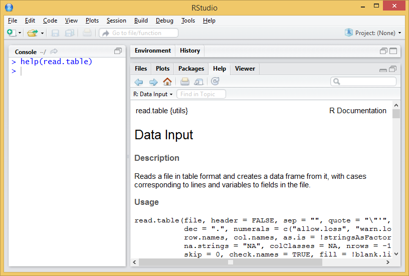
Any available function in R, regardless of being a standard one or belonging to an imported package has a documentation entry in the R help. R help describes us in detail the use of any function, providing information of the different arguments of the function, argument types, defaults, reference to the method (when applies) and even short code examples. To access the help we will use the help() function as follows:
Entering the help() function we access the manual. In this case we can see a brief description of the function read.table() and its different variants (read.csv(), …). Below is the description of the arguments of the function, followed by some examples of application. This is the usual procedure for all functions available in R (Figure 1.5).
In case we use the regular R interface or the cmd terminal, the help entry will open in our default web browser.
At first glance the read.table() function seems to require many arguments, while its variations seem simpler. As already mentioned, arguments are just parameters that we can specify or change to execute a function, thus tunning the operation of the functions and the result to be obtained.
Arguments are specified within the function separated by commas (“,”). However, it is not necessary to assign a value to each one of them, since in the case of omitting an argument it is assigned a default value (always reported in the help entry). In the case of read.table() versus other functions like read.csv() the main advantage of using the first is that we can manipulate any argument, whereas most of them are fixed in the later. read.csv() is desigend to open comma separate files following the north-american standard (, as field delimiter and . as decimal separator). On the other hand, read.table() can potentially open any text file regardless of the separator, encoding, decimal format and so on so forth. Most of the executions of read.table() consist of:
💡read.table(file,header=TRUE, sep=“,”,dec=“.”)
file: path and name of the file to open.
header: TRUE/FALSE argument to determine whether the first row of the data file contains column names.
sep: field or column separator4.
dec: decimal separator.
Let’s see an example of reading file. We will read the file coordinates.txt, located in the Data directory. The file is structured in 3 columns with heading and separated by “;”. Al data are integer so no decimal separator is needed. See Table 2.2.
| FID_1 | X_INDEX | Y_INDEX |
|---|---|---|
| 364011 | 82500 | 4653500 |
| 371655 | 110500 | 4661500 |
| 487720 | 55500 | 4805500 |
| 474504 | 28500 | 4783500 |
| 436415 | 85500 | 4729500 |
| 457549 | 38500 | 4757500 |
| 469377 | 39500 | 4775500 |
| 397162 | 124500 | 4687500 |
| 434666 | 41500 | 4727500 |
| 478383 | 49500 | 4789500 |
| 488973 | 329500 | 4807500 |
| 394153 | 77500 | 4684500 |
| 426962 | 36500 | 4718500 |
| 362216 | 148500 | 4651500 |
The process to follow is:
Set working directory.
Use the function to save the data in an object.
If we do…
…as we have not specified any object in which to store the result of the function, the contents of the file are simply printed on the terminal. This is a usual mistake, don’t worry. To store and later access the contents of the file we will do the following:
    FID_1 X_INDEX Y_INDEX
1  364011   82500 4653500
2  371655  110500 4661500
3  487720   55500 4805500
4  474504   28500 4783500
5  436415   85500 4729500
6  457549   38500 4757500
7  469377   39500 4775500
8  397162  124500 4687500
9  434666   41500 4727500
10 478383   49500 4789500
11 488973  329500 4807500
12 394153   77500 4684500
13 426962   36500 4718500
14 362216  148500 4651500
Please note that:
You have to specify your own working directory.
The path to the directory is specified in text format, so you type “in quotation marks”.
The name of the file to be read is also specified as text.
The header argument only accepts TRUE or FALSE values.
The sep argument also requires text values to enter the separator5.
It is advisable to save the data an object (table <-).
The result of read.table() is an array stored in an object named table. Since read.table() returns an array we can manipulate our table using the same procedure described in the @ref(arrays) section.
 [1] 364011 371655 487720 474504 436415 457549 469377 397162 434666 478383
[11] 488973 394153 426962 362216[1] 364011Below we found some interesting functions to preview and verify the information, and to know the structure of the data we have just imported. These functions are normally used to take a quick look into the first and last rows of an array or data.frame object and also to describe the structure of a given object.
head(): displays the first rows of the array.
tail(): displays the last rows of the array.
str(): displays the structure and data type (factor or number).
   FID_1 X_INDEX Y_INDEX
1 364011   82500 4653500
2 371655  110500 4661500
3 487720   55500 4805500
4 474504   28500 4783500
5 436415   85500 4729500
6 457549 38500 4757500 FID_1 X_INDEX Y_INDEX
9 434666 41500 4727500
10 478383 49500 4789500
11 488973 329500 4807500
12 394153 77500 4684500
13 426962 36500 4718500
14 362216 148500 4651500'data.frame': 14 obs. of 3 variables:
$ FID_1 : int 364011 371655 487720 474504 436415 457549 469377 397162 434666 478383 ...
$ X_INDEX: int 82500 110500 55500 28500 85500 38500 39500 124500 41500 49500 ...
$ Y_INDEX: int 4653500 4661500 4805500 4783500 4729500 4757500 4775500 4687500 4727500 4789500 ...As already mentioned, read.table() is adequate to start reading of files to incorporate data into our working session in R. In any case we must be aware that there are other possibilities such as the read.csv() and read.csv2() that we have already seen when accessing the read.table() description. These functions are variations that defaults some arguments such as the field separator (columns) or the decimal character. In the help of the function you have information about it.
Of course, we can also write text files from our data. The procedure is quite similar to read data but using write.table() instead of read.table. Remember that the created files are saved into the working directory, unless you specify an alternative path in the function arguments. As always, before starting the first thing is to consult the help of the function.
The arguments of the function are similar to those already seen in read.table ():
💡write.table(object,file,names,sep)
object: object of type matrix (or dataframe) to write.
file: name and path to the created file (in text format).
row.names: add or not (TRUE or FALSE) queue names. FALSE is recommended.
sep: column separator (in text format).
dec: decimal separator (in text format).
Try the following instructions6 and observe the different results:
Let’s see the most common instructions for manipulating and extracting information in R. Specifically we will see how to extract subsets of data from objects of type vector, array or dataframe. We will also see how to create new data sets from the aggregation of several objects. There are many commands that allow us to manipulate our data in R. Many things can be understood as manipulation but for the moment we will focus on:
Select or extract information
Sort tables
Add rows or columns to a table
As you might already guess, we will work with tabular data like arrays and data.frames which we further refer to as tables.
The first thing we will do is access the information stored in the column(s) of a given table object. There are two basic ways to do this:
Using the position index of the column.
Using the name (header) of the column.
These two basic forms are not always interchangeable, so we will use one or the other depending on the case. It is recommended that you use the one that feels most comfortable for you. However, in most examples the column position index is used since it is a numerical value that is very easily integrated with loops and other iterative processes.
To extract columns using the position index we will use a series of instructions similar to those already seen in extracting information from Arrays, Vectors and Lists. The following statement returns the information of the second column of the array object table and stores it in a new object that we called col2:
 [1]  82500 110500  55500  28500  85500  38500  39500 124500  41500  49500
[11] 329500  77500  36500 148500
It is also possible to extract a range of columns, proceeding in a similar way to what has already been seen in the creation of vectors. The following statement extracts columns 2 and 3 from the table object and stores them in a new object called cols:
   X_INDEX Y_INDEX
1    82500 4653500
2   110500 4661500
3    55500 4805500
4    28500 4783500
5    85500 4729500
6    38500 4757500
7    39500 4775500
8   124500 4687500
9    41500 4727500
10   49500 4789500
11  329500 4807500
12   77500 4684500
13   36500 4718500
14  148500 4651500
Now let’s see how to select columns using their name. Name extraction is performed using a combination of object and column name object using $ to separte object from column name. The following statement selects the column named Y_INDEX from the array object table and stores it in col.Y_INDEX:
 [1] 4653500 4661500 4805500 4783500 4729500 4757500 4775500 4687500 4727500
[10] 4789500 4807500 4684500 4718500 4651500
A key piece of information here is the name of the column which we need to know in advance. Well, we can check the original text file or inspect the object table using str(). We can also take look to the top-right window activaing the Environment sub-window and unwrap table but be aware this can be only accessed using RStudio.
The main difference between these two methods is that index selection makes it possible to extract column ranges easily. To do this using the name of the columns you have to use functions like subset():
Using the argument select we can point the columns that we want to extract using a vector with column names. Using subset() it is also possible to specify the columns that we do NOT want to extract. To do this proceed as follows:
In this way we would only extract the first column, excluding X_INDEX and Y_INDEX. Of cours, we can do this using the column index as well:
The main reason why we are learning how to manipulate table columns is to be able to prepare our data for other purposes. It may be the case we need to join tables or columns that proceed from the same original table. The instruction cbind() allow us to merge together several tables and/or vectors provided they have the same number of rows. We can merge as many objects as we want to, by separating them using ,:
        col2  cols2
 [1,]  82500 364011
 [2,] 110500 371655
 [3,]  55500 487720
 [4,]  28500 474504
 [5,]  85500 436415
 [6,]  38500 457549
 [7,]  39500 469377
 [8,] 124500 397162
 [9,]  41500 434666
[10,]  49500 478383
[11,] 329500 488973
[12,]  77500 394153
[13,]  36500 426962
[14,] 148500 362216It is often the case we need to alter or change the name of a table object. If we wanted to rename all the columns of an object we would to pass a vector with names to the function colnames() in case we are renaming an array or names() if we are dealing with a data.frame. Note that the vector should have the same length as the total number of columns. Lets rename our table cols3:
What if we want to change only a given name. Then we just point to the column header using the position index like this:
You may be wondering How can we know what kind of object is my table?. That is a very good question. Specially at the begining is quite difficult to be in control this stuff. If you use RStudio you already see a description of the objects in the top-right window. array or matrix objects show something like [1:14,1:2] indicating multiple dimensions, vectors are similar but with only 1 dimension [1:14] and data.frames show the word data.frame in their description. However, this is not the fancy way to deal with object types. Just for the record, when we mean type an actual code developer means class. Of course there is a function called class() that returns the class an object belongs to:
Finally, let’s look at how to sort columns and arrays. To sort a column in R, the sort() function is used. The general function of the function is:
 [1]  28500  36500  38500  39500  41500  49500  55500  77500  82500  85500
[11] 110500 124500 148500 329500
If we want to reorder an array based on the values of one of its columns, we will use the order () function. The general operation of the function is:
    FID_1 X_INDEX Y_INDEX
4  474504   28500 4783500
13 426962   36500 4718500
6  457549   38500 4757500
7  469377   39500 4775500
9  434666   41500 4727500
10 478383   49500 4789500
3  487720   55500 4805500
12 394153   77500 4684500
1  364011   82500 4653500
5  436415   85500 4729500
2  371655  110500 4661500
8  397162  124500 4687500
14 362216  148500 4651500
11 488973  329500 4807500
To be honest, in this last example we are actually working with rows. Take a look at the position of the ,. The brackets are also something that we will use later to extract data from a table. But it feels right to bring here the order() command right after sort().
Let us now turn to the manipulation of rows. The procedure is basically the same as in the case of columns, except for the fact that we normally do not work with names assigned to rows (although that’s a possibility), but we refer to a row using its position. To extract rows or combine several objects according to their rows we use the following expressions:
Same as with Arrays we point to rows instead of columns when we use the index value to the left of the [row,col]. So that’s the thing, we just change that and we are dealing with rows. We can join rows and tables using the rbind() function rather than cbind(). r stands for row and c for column.
We can extract a subsample of rows that meet a given criteria:
💡table[criteria,]
   FID_1 X_INDEX Y_INDEX
1 364011 82500 4653500 FID_1 X_INDEX Y_INDEX
2 371655 110500 4661500
5 436415 85500 4729500
8 397162 124500 4687500
11 488973 329500 4807500
14 362216 148500 4651500Oh, we expect you to have found out this by yourself but evidently we can combine row and column manipulation if that fits our purpose.
There are a large number of functions in the basic installation of R. It would be practically impossible to see all of them so we will see some of the most used, although we must remember that not only is there the possibility of using predesigned functions, but R also offers the possibility to create your own functions.
Below are some of the basic statistical functions that we can find in R. These functions are generally applied matrix-array or data.frame data objects. Some of them can be applied to the whole table and others to single columns or rows.
sum() Add values.
max() Returns the maximum value.
min() Returns the minimum value.
mean() Calculates the mean.
median() Returns the median.
sd() Calculates the standard deviation.
summary() Returns a statistical summary of the columns.
We are going to apply them using some example data. We will use the data stored in the file fires.csv, inside the Data folder (Table 3.1). This file contains data on the annual number of fires between 1985 and 2009 in several European countries.
fires <- read.csv2("./data/Module_1/fires.csv", header = TRUE)
knitr::kable(coords, caption = "Structure of the fires.csv file.")| FID_1 | X_INDEX | Y_INDEX |
|---|---|---|
| 364011 | 82500 | 4653500 |
| 371655 | 110500 | 4661500 |
| 487720 | 55500 | 4805500 |
| 474504 | 28500 | 4783500 |
| 436415 | 85500 | 4729500 |
| 457549 | 38500 | 4757500 |
| 469377 | 39500 | 4775500 |
| 397162 | 124500 | 4687500 |
| 434666 | 41500 | 4727500 |
| 478383 | 49500 | 4789500 |
| 488973 | 329500 | 4807500 |
| 394153 | 77500 | 4684500 |
| 426962 | 36500 | 4718500 |
| 362216 | 148500 | 4651500 |
The first thing is to import the file into atable.
Once data is imported we can take a look at the structure to make sure that everything went well. We should have integer values for each region:
'data.frame':   25 obs. of  7 variables:
 $ YEAR    : int  1985 1986 1987 1988 1989 1990 1991 1992 1993 1994 ...
 $ PORTUGAL: int  8441 5036 7705 6131 21896 10745 14327 14954 16101 19983 ...
 $ SPAIN   : int  12238 7570 8679 9247 20811 12913 13531 15955 14254 19263 ...
 $ FRANCE  : int  6249 4353 3043 2837 6763 5881 3888 4002 4769 4618 ...
 $ ITALY   : int  18664 9398 11972 13588 9669 14477 11965 14641 14412 11588 ...
 $ GREECE  : int  1442 1082 1266 1898 1284 1322 858 2582 2406 1763 ...
 $ EUMED   : int  47034 27439 32665 33701 60423 45338 44569 52134 51942 57215 ...
Now we will calculate some descriptive statistics for each column to have a first approximation to the distribution of our data. To do this we will use the function summary() that will return some basic statistical values such as:
Quantile
Mean
Median
Maximum
Minimum
      YEAR         PORTUGAL         SPAIN           FRANCE         ITALY
 Min.   :1985   Min.   : 5036   Min.   : 7570   Min.   :2781   Min.   : 4601
 1st Qu.:1991   1st Qu.:14327   1st Qu.:12913   1st Qu.:4002   1st Qu.: 7134
 Median :1997   Median :21870   Median :16771   Median :4618   Median : 9540
 Mean   :1997   Mean   :20848   Mean   :16937   Mean   :4907   Mean   : 9901
 3rd Qu.:2003   3rd Qu.:26488   3rd Qu.:20811   3rd Qu.:6249   3rd Qu.:11965
 Max.   :2009   Max.   :35697   Max.   :25827   Max.   :8005   Max.   :18664
     GREECE         EUMED
 Min.   : 858   Min.   :27439
 1st Qu.:1322   1st Qu.:45623
 Median :1486   Median :55215
 Mean   :1656   Mean   :54249
 3rd Qu.:1898   3rd Qu.:62399
 Max.   :2582   Max.   :75382
The summary() function is not only used to obtain summaries of data through descriptive statistics, but can also be used in model type objects to obtain a statistical summary of the results, coefficients, significance … Later we will see an example of this applied on a linear regression model.
Let’s now see what happens if we apply some of the functions presented above. Try running the following instructions:
As can be seen these 3 instructions work with a tablebut mean(), median() and sd() will not. We have to apply them to a single column:
So far we have seen how to apply some of the basic statistical functions to our data, applying those functions to the data contained in the matrix or some of its columns. In the case of columns we have manually specified which one to apply a function. However, we can apply functions to all elements of an array (columns or rows) using iteration functions.
The apply() function allows you to apply a function to all elements of a table. We can apply some of the functions before the rows or columns of an array. There are different variants of this function. First, as always, invoke the help of the function to make sure what we are doing.
According to the specified in the function help we can see that the apply () function works as follows:
💡apply(x, margin, fun, …)
Where:
X: data matrix.
MARGIN: argument to specify whether the function is applied to rows (1) or columns (2).
FUN: function to be applied (mean,sum…)
For example, if we want to sum the values of each country/region we will do as follows:
    YEAR PORTUGAL    SPAIN   FRANCE    ITALY   GREECE    EUMED
 1997.00 20848.20 16937.24  4907.16  9900.64  1655.80 54249.04
Well, almost there. We have included the YEAR column which is the first one:
PORTUGAL    SPAIN   FRANCE    ITALY   GREECE    EUMED
20848.20 16937.24  4907.16  9900.64  1655.80 54249.04
📝EXERCISE 1: Calculate the total number of fires on a yearly basis.
Deliverable:
Submit the commented code following the exercises portfolio template example and write a text file (.txt) with the result.
📝EXERCISE 2: Open the file “barea.csv” (file containing Burned Area by year and country) and save it in an object named “barea” - Select and store in a new matrix the data from the year 2000 to 2009. - Calculate descriptive statistics 2000-2009. - Calculate the mean, standard deviation, minimum and maximum of all columns and save it to a new object.
Deliverable:
Submit the commented code following the exercises portfolio template example and write a text file (.txt) with the result.
🪄EXERCISE 2 HINT:
Use the apply function to calculate each statistic, separately.
We have already seen how some of the basic functions of R. work. However, we have the possibility of extending the functionalities of R by importing new packages into our environment. These packages are developed by different research groups and/or individuals.
There are currently over 20015 packages available in the R project repository (CRAN). Obviously we do not need to know how each one of them works, but only focus on those that fit our needs.
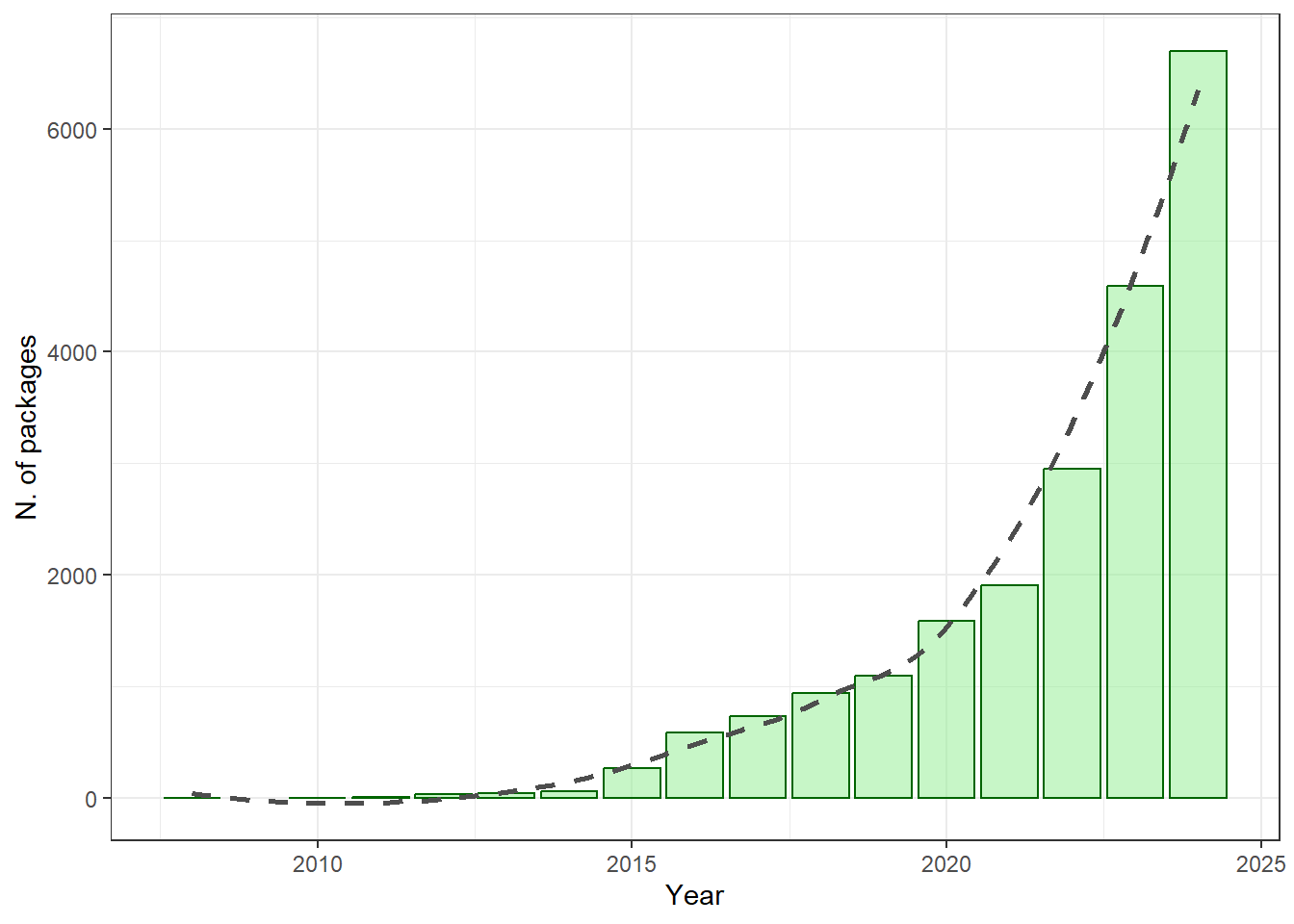
The import and installation of new packages is carried out in 2 stages:
obtaining and installing and internal call to the package.
Loading the package into our session.
We will install the “foreign” package. This package provides functions for reading and writing data stored in different statistical software formats such as Minitab, S, SAS, SPSS, Stata, Systat … and to read and write dBase files such as attribute tables of vector layers in format shapefile. The first thing we will do is get the package via download. This can be done from the menu of R:
Packages / Install packages …
Select download directory (mirror)
Search for “foreing”
If you are using RStudio simply go to the Packages tab in the lower right box and select the Install option. In the popup window select the Repository (CRAN, CRANextra) option in the drop-down menu and type the name of the package.
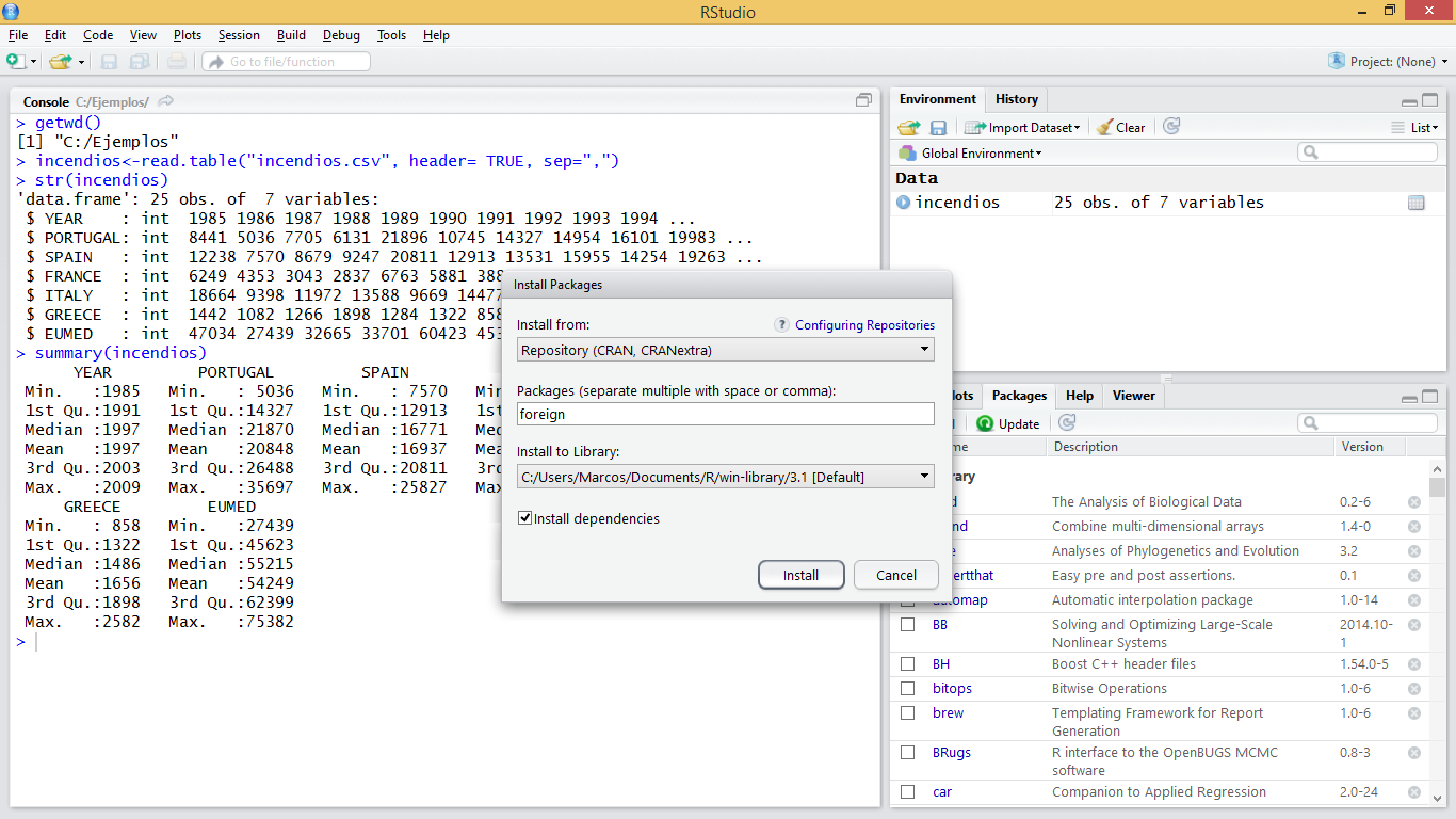
Another option is to obtain the package in .zip format directly from the webpage of project R and use the function Install package (s) from local zip files … (or Package archives in RStudio).
It is also possible to install packages through instructions in the R window, which is the most recommended method7:
At this point we would have installed the package in our personal library of R. However, in order to use the functions of the new package in our R environment it is necessary to make an internal call to the package. This is generally done using thelibrary()function8:
Once this is done we have all the functions of the package ready to be used. All that is left is to learn how to use the functions of the package… which is easy to say but maybe not to do.
So far we have mainly seen how to use pre-designed functions either in the default installation or from other packages. However, there is the possibility of creating our own functions.
A function is a group of instructions that takes an input or input data, and uses them to calculate other values, returning a result or product. For example, the mean() function takes as input a vector and returns as a result a numeric value that corresponds to the arithmetic mean.
To create our own functions we will use the object called function that constitute new functions. The usual syntax is:
💡FunName <- function(args){comands}
Where:
arguments are the arguments we want to pass to our function.
commands are the instructions needed to do whatever the function does.
Let’s look at a simple example. We will create a function to calculate the standard deviation of a vector with numerical data. The standard deviation formula looks like this:
Which is essentially the square root (sqrt()) of the variance (var()):
The function name is desv(). This function requires a single argument (x) to be executed. Once the function is defined, it can be called and used as any other predefined function in the system.
Let’s see an example with 2 arguments. We will create a function to calculate the NDVI. The function will take as arguments two objects of vector type corresponding to the sensor Landsat TM channels 3 and 4:
The normalized difference vegetation index (NDVI) is a simple graphical indicator that can be used to analyze remote sensing measurements, typically but not necessarily from a space platform, and assess whether the target being observed contains live green vegetation or not wikipedia.org.
Where
As we have said, once created we can use our functions in the same way as the rest of functions. This includes using the apply() function and its derived versions to iterate over rows and columns of an array or data frame.
Let’s see an example with the function desv(), previously created applied to the data of number of fires:
R is not just an environment for the implementation and use of functions for statistical calculation but it is also a powerful environment for generating and displaying plots. Creating plots is besides an effective and quick way to visualize our data. By doing so we can verify whether data was correctly imported or not. However, creating graphics is also done by command-line instructions, which can sometimes be a bit tricky, especially at the beginning.
In R we can create many types of plots. With some packages it is also possible to generate maps similar to those created by GIS, although for the moment we will only see some basic types such as:
Dot charts
Line charts
Barplots
Histograms
Scatterplots
Before going into detail with the specific types of graphics we will see some general concepts which apply to the majority of plots:
All graphics always require an object that contains the data to be drawn. This object is usually specified in the first argument of the function corresponding to each type of chart.
There are a number of arguments to manipulate axis labels or the chart title:
main: text with the title of our plot.
xlab: text for x axis label.
ylab: text for y axis label.
xlim: vector with upper and low range for the x-axis.
ylim: vector with upper and low range for the y-axis.
cex: number indicating the aspect ratio between plot elements and text. 1 by default.
col: changes de color the plotted element. See http://www.stat.columbia.edu/~tzheng/files/Rcolor.pdf
legend(): adds a legend element describing symbology.
This is one of the most basic types of graphics if not the most basic one we can create. To create such a graph we will use the plot() function. Let’s look at a simple example using data from fires.csv9:
As you can see, we are plotting data from the SPAIN column, ie, yearly fire occurrence data in Spain.
Remember RStudio displays plots in the right-bottom window. In addition, if you need to take closer look use the Zoom button to pop-up a new plot window.
Le’s tune up and enhance our plot. We can change the symbol type using the pch argument. You’ll find a list of symbol types (not just dot charts) at http://www.statmethods.net/advgraphs/parameters.html.
We can change symbol size using cex:
And we can change the color of the symbol with col:
The col argument can be specified either using the color name as in the example or using its code number, hexadecimal or RGB so that col = 1, col = "white", and col = "#FFFFFF" are equivalent. In some types of symbols we can also change the color of the symbol background in addition to the symbol itself using the argument bg:
The finish our plot we will modify axis labels, add a title and a legend:
par(mar=c(3.5, 3.5, 2, 1), mgp=c(2.4, 0.8, 0))
plot(fires$SPAIN,pch=21,cex=1,col='black',bg='red',
     main='Number of fires in Spain',ylab = 'Number of fires',xlab = '')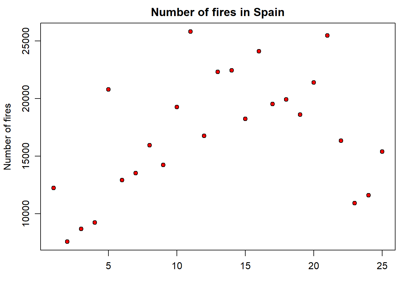
Note that we have used the xlab argument to leave the x-axis label blank. Now we add the legend. It is important you bear in mind that the legend is added with an additional command right after the plot statement. Legends in basic plots are just an image we add to an existing plot by emulating the symbol used in that plot using the legend() function:
par(mar=c(3.5, 3.5, 2, 1), mgp=c(2.4, 0.8, 0))
plot(fires$SPAIN,pch=21,cex=1,col='black',bg='red',
     main='Number of fires in Spain',ylab = 'Number of fires',xlab = '')
legend( "topleft" , cex = 1.3, bty = "n", legend = c("Spain"), , text.col = c("black"), col = c("red") , pt.bg = c("red") , pch = c(21) )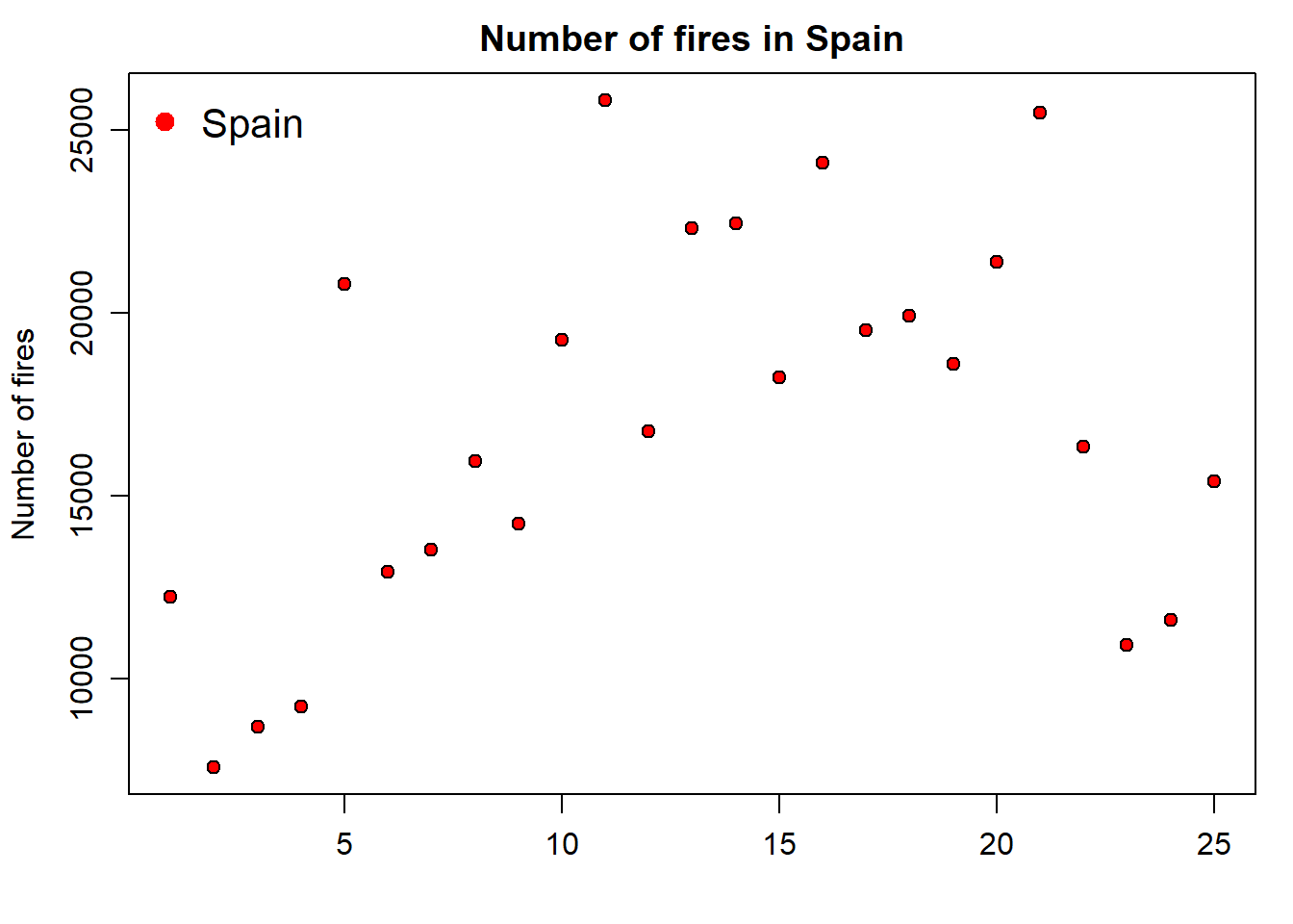
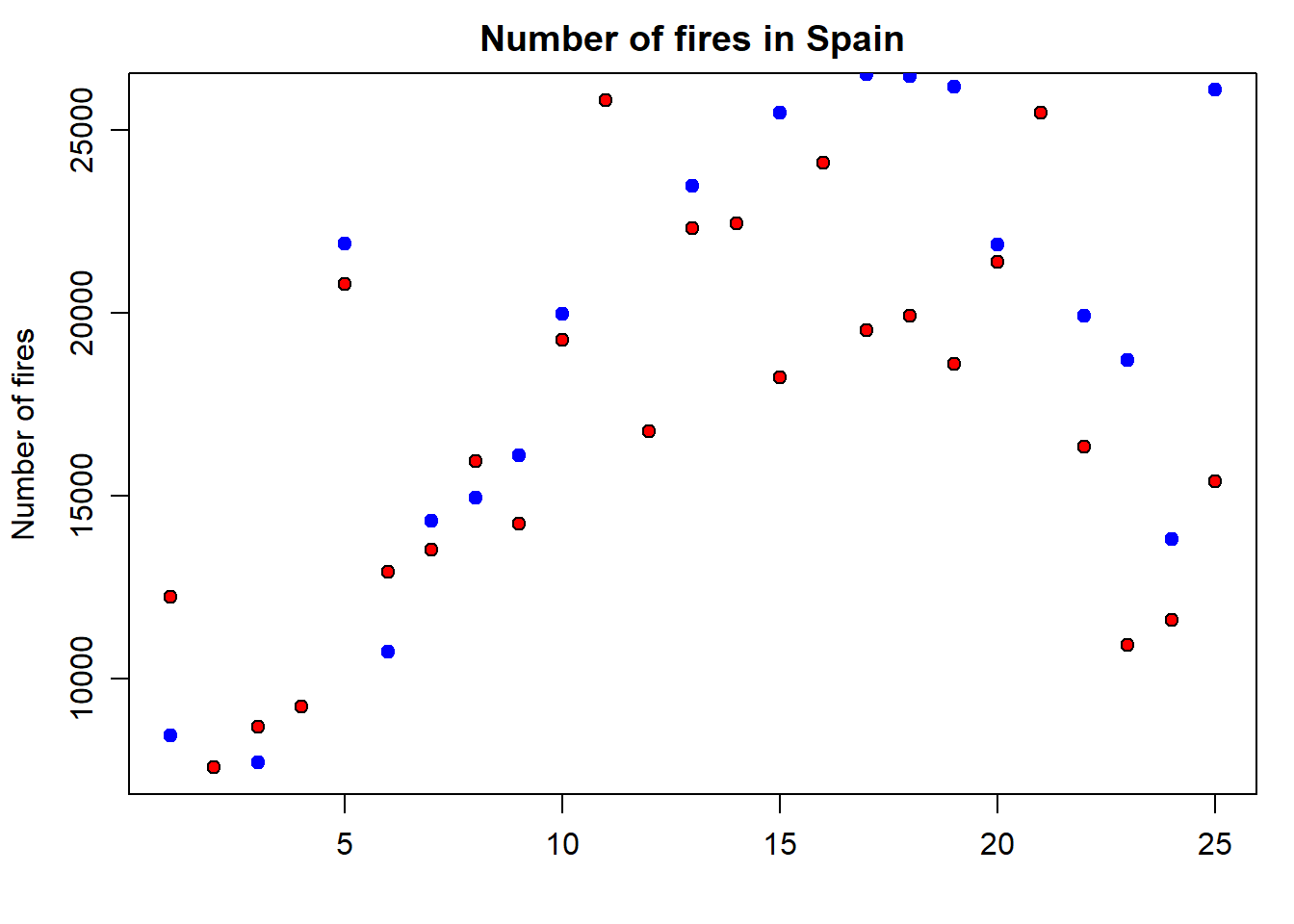
But, what if we want to add a second series of data? Then we proceed in a way similar to the legend() statement, but using the functionpoints() similar to what we have seen in the plot() example. In the following code we add a second point data series with portugal:
par(mar = c(3.5, 3.5, 2, 1), mgp = c(2.4, 0.8, 0))
plot(
  fires$SPAIN,
  pch = 21,
  cex = 1,
  col = 'black',
  bg = 'red',
  main = 'Number of fires in Spain',
  ylab = 'Number of fires',
  xlab = ''
)
points(
  fires$PORTUGAL,
  pch = 21,
  cex = 1,
  col = "blue",
  bg = "blue"
)
Finally, we update the legend to fit the new plot with the second series of data. To do that we simply include a second value on each argument using a vector:
par(mar=c(3.5, 3.5, 2, 1), mgp=c(2.4, 0.8, 0))
plot(fires$SPAIN,pch=21,cex=1,col='black',bg='red',
     main='Number of fires in Spain',ylab = 'Number of fires',xlab = '')
points(fires$PORTUGAL,pch=21,cex=1,col="blue",bg="blue")
legend( "topleft" , cex = 1.3, bty = "n", legend = c("Spain","Portugal"), , text.col = c("black"), col = c("red","blue") , pt.bg = c("red","blue") , pch = c(21) )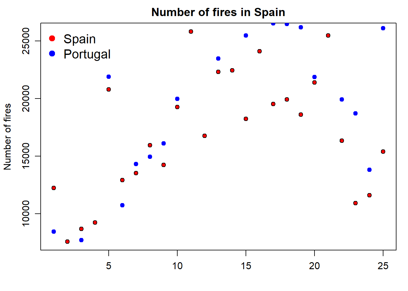
The problem we are now experiencing is that data for Portugal doesn’t fit in the extent of the plot as it is. We should modify this using the xlim and ylim arguments. At this point x-axis works fine, so we’ll leave it as it is. The problem comes from y-axis. We can solve it by passing the ylim argument passing the minimum and maximum values of the fires data. We bring here some functions from Descriptive statistics and summaries.
par(mar = c(3.5, 3.5, 2, 1), mgp = c(2.4, 0.8, 0))
plot(
  fires$SPAIN,
  pch = 21,
  cex = 1,
  col = 'black',
  bg = 'red',
  main = 'Number of fires in Spain',
  ylab = 'Number of fires',
  xlab = '',
  ylim = c(min(fires[, 2:6]), max(fires[, 2:6]))
)

points(
  fires$PORTUGAL,
  pch = 21,
  cex = 1,
  col = "blue",
  bg = "blue"
)
legend(
  "topleft" ,
  cex = 1.3,
  bty = "n",
  legend = c("Spain", "Portugal"),
  ,
  text.col = c("black"),
  col = c("red", "blue") ,
  pt.bg = c("red", "blue") ,
  pch = c(21)
)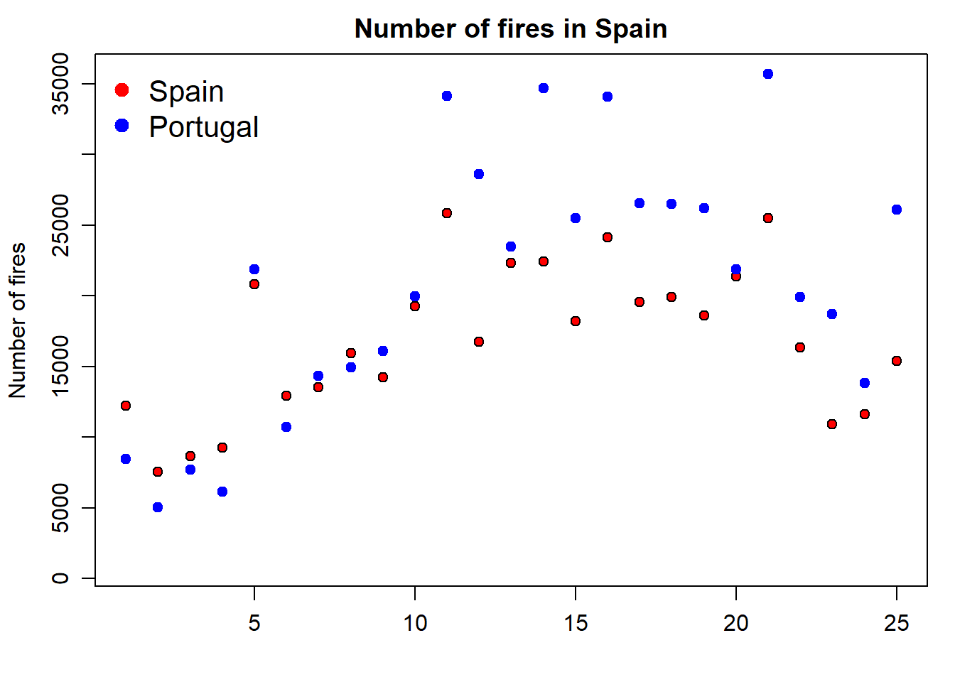
📝EXERCISE 3: Explain in detail how the statement ylim = c(min(fires[,2:6]),max(fires[,2:6])) works in terms of the max() and min() functions and its interaction with the firesobject.
Deliverable:
Write a brief report describing the working procedure of the aforementioned instruction.
Well, this is quite easy. In line plots we use lines to represent our data series instead of points which are the default symbol. How do we do that? Just adding an additionla argument to specify we want to use lines with type = 'l':
par(mar = c(3.5, 3.5, 2, 1), mgp = c(2.4, 0.8, 0))
plot(fires$SPAIN,
     pch = 4,
     type = 'l',
     col = 'red')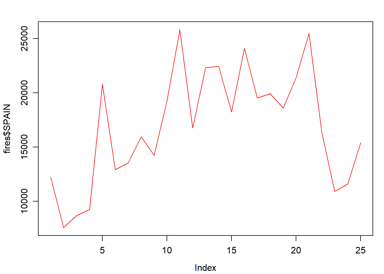
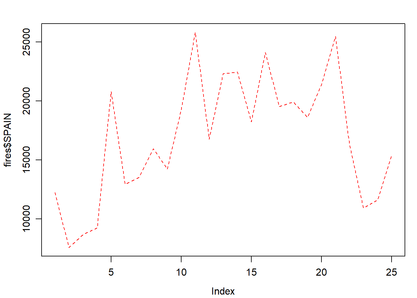
Of course we can change the line style:
par(mar = c(3.5, 3.5, 2, 1), mgp = c(2.4, 0.8, 0))
plot(
  fires$SPAIN,
  pch = 4,
  type = 'l',
  lty = 2,
  col = 'red'
)
Adding a second (or third, fourth,…,$n$) series is done withlines():
par(mar = c(3.5, 3.5, 2, 1), mgp = c(2.4, 0.8, 0))
plot(
  fires$SPAIN,
  pch = 4,
  type = 'l',
  col = 'red',
  ylim = c(min(fires[, 2:6]), max(fires[, 2:6]))
)
lines(fires$PORTUGAL,
      cex = 1,
      col = "blue",
      lty = 2)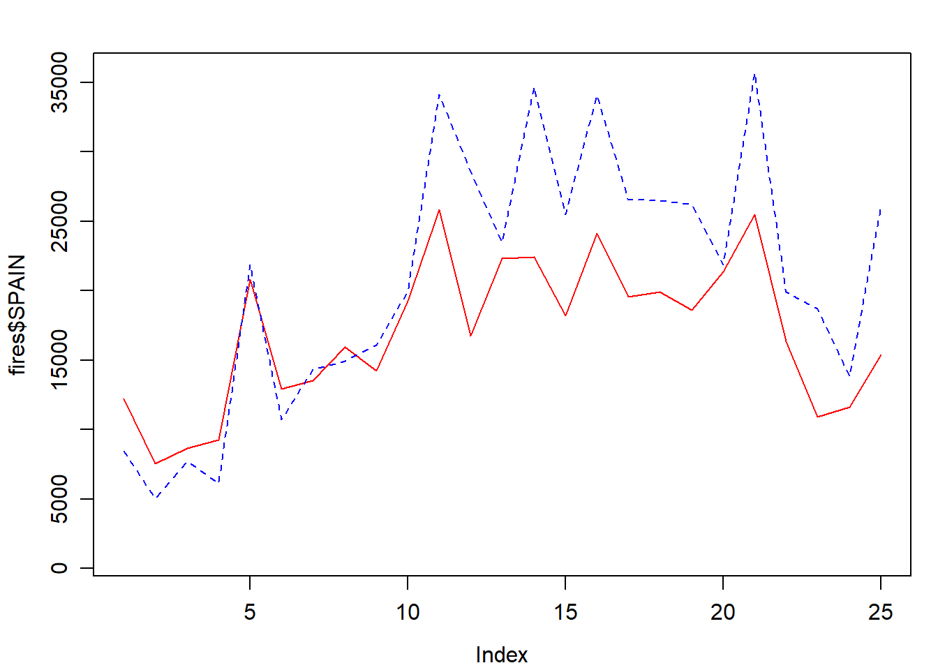
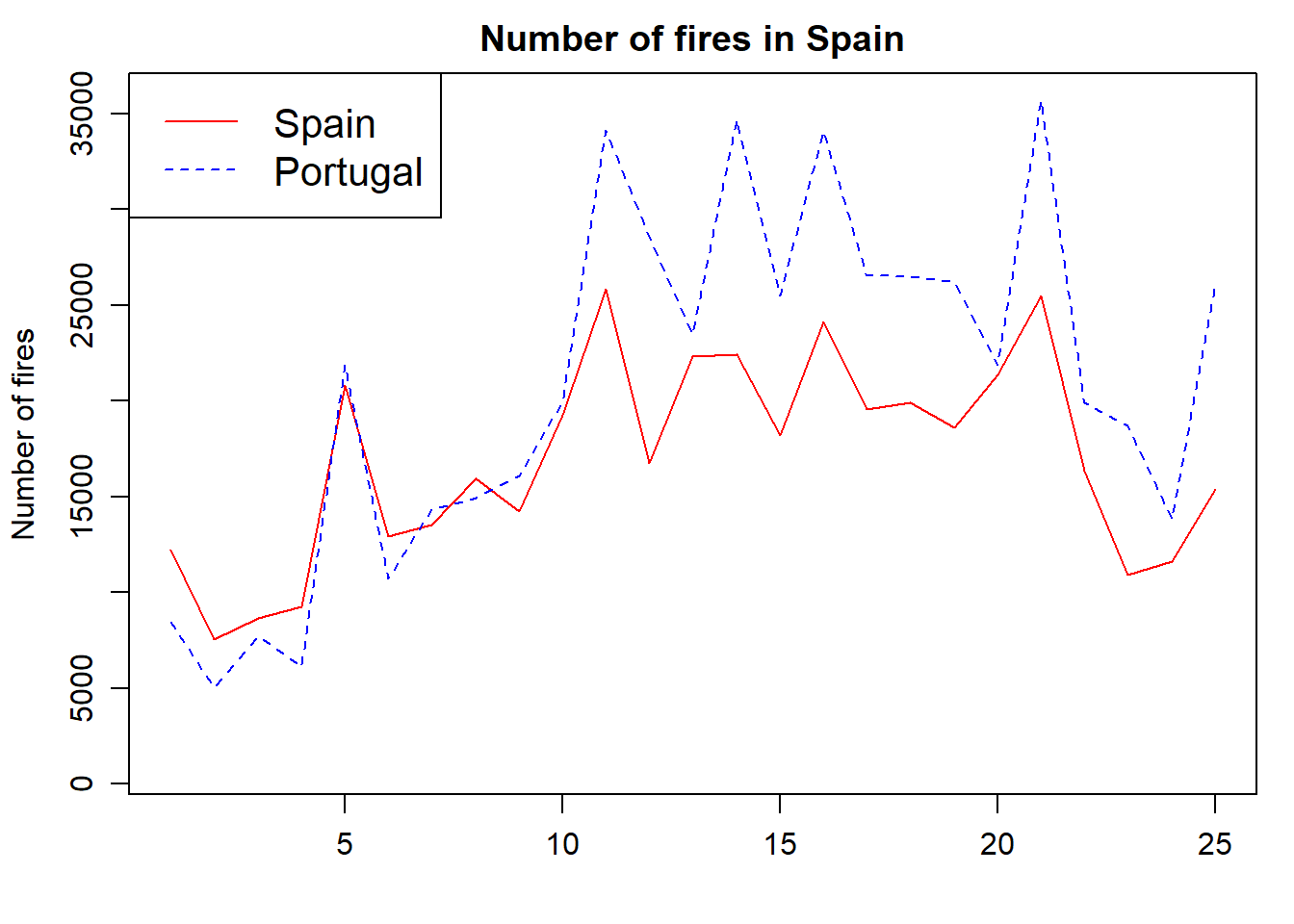
We now adapt the legend and add some titles and we are good to go:
par(mar = c(3.5, 3.5, 2, 1), mgp = c(2.4, 0.8, 0))
plot(
  fires$SPAIN,
  pch = 4,
  type = 'l',
  col = 'red',
  main = 'Number of fires in Spain',
  ylab = 'Number of fires',
  xlab = '',
  ylim = c(min(fires[, 2:6]), max(fires[, 2:6]))
)
lines(fires$PORTUGAL,
      cex = 1,
      col = "blue",
      lty = 2)

legend(
  "topleft" ,
  cex = 1.3,
  ,
  lty = c(1, 2),
  legend = c("Spain", "Portugal"),
  text.col = c("black"),
  col = c("red", "blue")
)
The next type of chart we will see is the frequency histogram. It is a bar chart that represents the number of elements of a sample (frequency) that we find within a certain range of values.
To draw this type of plot R uses the function hist(), which requires as a mandatory argument a vector (or column/row of an array) with the data to be represented. As with all other chart types we have seen, we can use main, xlab… Let’s see at an example using the example data from the regression.txt file10 (See Table 4.1):
regression <- read.table(
  "./data/Module_1/regression.txt",
  header = TRUE,
  sep = '\t',
  dec = ","
)
DT::datatable(regression,
              options = list(pageLength = 12),
caption = "Table 4.1 Structure of the regression.txt file.")| TavgMAX | Tavg | long | d_atl | d_medit | lat | elevation | |
|---|---|---|---|---|---|---|---|
| 1 | 20.3 | 14.55 | 614350 | 305753 | 152147 | 4489750 | 1423 |
| 2 | 23.8 | 16.1 | 593950 | 271251 | 183121 | 4522150 | 1100 |
| 3 | 24.4 | 18.15 | 567250 | 279823 | 204123 | 4512650 | 1229 |
| 4 | 20.1 | 14.05 | 609150 | 319257 | 150357 | 4475450 | 1610 |
| 5 | 20.3 | 13.85 | 629450 | 306673 | 138390 | 4491350 | 1402 |
| 6 | 21.9 | 16.2 | 666750 | 317312 | 103530 | 4489850 | 1022 |
| 7 | 24.4 | 17.35 | 659450 | 335694 | 102739 | 4468550 | 882 |
| 8 | 20.9 | 15.45 | 654050 | 347119 | 101473 | 4455350 | 828 |
| 9 | 21.2 | 15.2 | 666850 | 359349 | 85698 | 4446050 | 1308 |
| 10 | 24 | 17.3 | 654150 | 369714 | 91221 | 4432150 | 1186 |
| 11 | 26.8 | 19.8 | 668050 | 398728 | 71861 | 4405650 | 589 |
| 12 | 28.1 | 21.65 | 671750 | 402740 | 67917 | 4402450 | 522 |
Tavg_max: maximum average temperature in June.
Tavg: average temperature in June.
long: longitude in UTM values EPSG:23030.
lot: latitude in UTM values EPSG:23030.
d_atl: distance in meters to the Atlantic sea.
d_medit: distance in meters to the Mediterranean sea.
elevation: elevation above sea level in meters.
Then we use the arguments we have seen to customize the plot:
hist(
  regression$elevation,
  breaks = 15,
  main = "Elevation frecuency distribution",
  xlab = "Elevation",
  ylab = "Frecuency",
  col = "blue",
  border = "white",
  ylim = c(0, 40),
  xlim = c(0, 2000)
)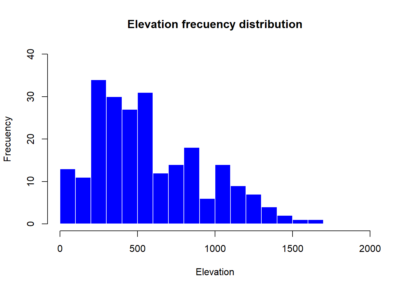
The only new parameters are:
breaks, used to specify the number of bars in the histrogram.
border, used the change the color of bar’s borders.
So far we have seen how to construct univariate graphs, ie, represent a single variable or data series. Next we will see a type of bivariate graph, the scatterplot. This type of chart is interesting to visualize relations between two variables, almost mandatory to explore correlation or collinearity in regression analysis. Let’s look at an example with our fire data.
In this case we introduce in the function plot() a second data argument (
Note that the first data series goes to
plot(
  regression$elevation,
  regression$Tavg,
  main = 'Average temperature vs elevation',
  ylab = 'Temperature (Celsius)',
  xlab = 'Elevation (m)',
  pch = 21,
  col = 'black',
  bg = 'steelblue'
)
A particularly useful function in combination withscatterplotsisabline()which allows to incorporate a trend lineto the plot. We will further explore this later.
plot(
  regression$elevation,
  regression$Tavg,
  main = 'Average temperature vs elevation',
  ylab = 'Temperature (Celsius)',
  xlab = 'Elevation (m)',
  pch = 21,
  col = 'black',
  bg = 'steelblue'
)
abline(
  lm(regression$Tavg ~ regression$elevation),
  lty = 2,
  col = 'gray20',
  lwd = 3
)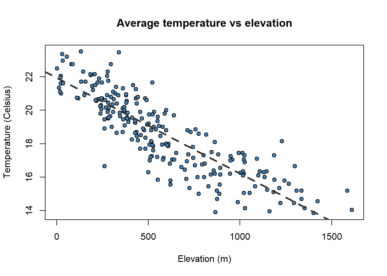
Pay attention to the order in which we have introduced the plot()andabline(). It is the opposite!!.
To finish with plot creation we will see two last possibilities. The first one is how to combine several charts in a single figure and the second how to export an image file from our graphics.
Combining several graphs in R is possible thanks to the function par(mfrow = c(rows, columns)). Using this function we prepare the display window to include several graphs simultaneously:
Since R runs on so many different operating systems, and supports so many different graphics formats, it’s not surprising that there are a variety of ways of saving your plots, depending on what operating system you are using, what you plan to do with the graph, and whether you’re connecting locally or remotely.
The first step in deciding how to save plots is to decide on the output format that you want to use. The following table lists some of the available formats, along with guidance as to when they may be useful.
Here’s a general method11 that will work on any computer with R, regardless of operating system or the way that you are connecting.
Choose the format that you want to use. In this example, I’ll save a plot as a JPG file, so I’ll use the jpeg driver.
The only argument that the device drivers need is the name of the file that you will use to save your graph. Remember that your plot will be stored relative to the current directory. You can find the current directory by typing getwd() at the R prompt. You may want to make adjustments to the size of the plot before saving it. Consult the help file for your selected driver to learn how.
Now enter your plotting commands as you normally would. You will not actually see the plot - the commands are being saved to a file instead.
When you’re done with your plotting commands, enter the dev.off() command. This is very important - without it you’ll get a partial plot or nothing at all. So if we wanted to save a jpg file called “rplot.jpg” containing a plot of x and y, we would type the following commands:
jpeg('rplot.jpg',
width = 800,
height = 600,
res = 100)
# Here goes the plot
par(
  mfrow = c(2, 1),
  mar = c(3.5, 3.5, 2, 1),
  mgp = c(2.4, 0.8, 0)
)
plot(
  fires$SPAIN,
  pch = 4,
  type = 'l',
  col = 'red',
  ylim = c(min(fires[, 2:6]), max(fires[, 2:6]))
)
plot(
  fires$PORTUGAL,
  type = 'l',
  col = "blue",
  lty = 2,
  ylim = c(min(fires[, 2:6]), max(fires[, 2:6]))
)
dev.off()png
2 Before finishing the module we would like to give you some insights into the main concepts you should have become familiar with.
You must have mastered object creation and manipulation, mainly table-like objects (array and data.frame) and vectors.
It is not that important to remember the specific syntax of the functions we have covered here but to realize the we can combine objects with function arguments.
We can create scripts to do specific tasks, we do not need to insert instructions one by one manually.
R Core Team. 2021. R: A Language and Environment for Statistical Computing. Vienna, Austria: R Foundation for Statistical Computing. https://www.R-project.org/.
In this module we will see how to fit linear regression models. This will serve as a basis for later adjusting models based on other error distributions (Poisson or logistic), focusing also on the spatialization of the results and interact with spatial information.
Regression is a mathematical method that models the relationship between a dependent variable and a series of independent variables (“Front Matter” 2014). The regression methods allow modeling the relationship between a dependent variable (term
In the case of linear regression models, the relationship between the dependent variable and the explanatory variable is linear (thus correctly specified), so that the relation is expressed as a first-order polynomial.
The underlying mathematical procedure is based on the Ordinary Least Squares, so it is common to refer to linear regression using this expression or its English equivalent OLS. In statistics, ordinary least squares (OLS) or linear least squares is a method for estimating the unknown parameters in a linear regression model, with the goal of minimizing the sum of the squares of the differences between the observed responses (values of the variable being predicted) in the given dataset and those predicted by a linear function of a set of explanatory variables. The OLS model can be expressed through the following equation:
Where:
What has to be clear is that we can predict or model the values of a certain variable
There are a number of conditions that our data has to meet in order to apply a linear regression model:
Correct specification. The linear functional form is correctly specified.
Strict exogeneity. The errors in the regression should have conditional mean - No linear dependence. The predictors in
Spherical errors: Homoscedasticity a no autocorrelation in the residuals.
Normality. It is sometimes additionally assumed that the errors have multivariate normal distribution conditional on the regressors.
If you are not familiar with the OLS just keep in mind that we cannot apply the method to any sample of data. Our data has to meet some conditions that we will explore little by little.
Most of the existing regression methods are currently available in R. The calibration of linear regression models with R is possible thanks to the stats package, installed by default in the basic version of R.
For the calibration of linear models either simple (one predictor) or multiple (several predictors) we will use the function lm(). A quick look at the help of the function (help('lm')) will allow us to know how the function works:
Of all the arguments of the function we are going to focus on the first two (formula and data), since they are the indispensable ones to be able to adjust not just linear regression but any regression or classification model in R. The data argument is used to specify the table (use data.frame object) with the information of our independent variables. Using the formula argument, we specify in the model which of our variables is the dependent variable, and which independent variables in our data.frame object we want to use to carry out the regression. Let’s take a look at the formula first:
💡v_dep ~ v_indep1 + v_indep2 + . + v_indepn
The formual is composed by two blocks of information separated with the ~ operator. On the left we found the dependent variable specified using its name as it appears on the dataobject. On the right we found the independent variables joined with the + operator. Same as with the dependent one, the independent varibles must be called using their name as it is in data.
We will normally use the above described approach with one exception. Provided we have a data object which only contains a column with our dependent variable and the remaining columns as predictors we can use . after ~ to declare that all the columns in data with the only exception of the dependent variables should be taken as predictors:
💡v_dep ~ .
The sintax of the formula argument is the same regardless of the kind of regression or classification model we want to use: - Generalized Linear Models - Regression and Classification Trees - Random Forest - Artificial Neural Networks - …
Let us now see a simple example of model fitting. We will use the data stored in the file regression.txt that we already used in one of the examples of plot creation. I will import the text file with read.table() and store the data in an object called regression
| TavgMAX | Tavg | long | d_atl | d_medit | lat | elevation | |
|---|---|---|---|---|---|---|---|
| 1 | 20.3 | 14.55 | 614350 | 305753 | 152147 | 4489750 | 1423 |
| 2 | 23.8 | 16.1 | 593950 | 271251 | 183121 | 4522150 | 1100 |
| 3 | 24.4 | 18.15 | 567250 | 279823 | 204123 | 4512650 | 1229 |
| 4 | 20.1 | 14.05 | 609150 | 319257 | 150357 | 4475450 | 1610 |
| 5 | 20.3 | 13.85 | 629450 | 306673 | 138390 | 4491350 | 1402 |
| 6 | 21.9 | 16.2 | 666750 | 317312 | 103530 | 4489850 | 1022 |
| 7 | 24.4 | 17.35 | 659450 | 335694 | 102739 | 4468550 | 882 |
| 8 | 20.9 | 15.45 | 654050 | 347119 | 101473 | 4455350 | 828 |
| 9 | 21.2 | 15.2 | 666850 | 359349 | 85698 | 4446050 | 1308 |
| 10 | 24 | 17.3 | 654150 | 369714 | 91221 | 4432150 | 1186 |
Tavg_max: maximum average temperature in June.
Tavg: average temperature in June.
long: longitude in UTM values EPSG:23030.
lat: latitude in UTM values EPSG:23030.
d_atl: distance in meters to the Atlantic sea.
d_medit: distance in meters to the Mediterranean sea.
elevation: elevation above sea level in meters.
    TavgMAX           Tavg            long            d_atl
 Min.   :18.20   Min.   :13.85   Min.   :566050   Min.   : 43783
 1st Qu.:23.00   1st Qu.:16.80   1st Qu.:628925   1st Qu.:132564
 Median :25.05   Median :18.80   Median :690750   Median :211925
 Mean   :24.79   Mean   :18.64   Mean   :687373   Mean   :216455
 3rd Qu.:26.90   3rd Qu.:20.55   3rd Qu.:738600   3rd Qu.:293938
 Max.   :30.50   Max.   :23.50   Max.   :817550   Max.   :425054
    d_medit            lat            elevation
 Min.   :   670   Min.   :4399050   Min.   :   2.0
 1st Qu.: 92912   1st Qu.:4539325   1st Qu.: 302.0
 Median :159376   Median :4638550   Median : 505.5
 Mean   :159368   Mean   :4615250   Mean   : 575.7
 3rd Qu.:227630   3rd Qu.:4700250   3rd Qu.: 813.8
Max. :325945 Max. :4757850 Max. :1610.0 'data.frame': 234 obs. of 7 variables:
$ TavgMAX : num 20.3 23.8 24.4 20.1 20.3 21.9 24.4 20.9 21.2 24 ...
$ Tavg : num 14.6 16.1 18.1 14.1 13.8 ...
$ long : int 614350 593950 567250 609150 629450 666750 659450 654050 666850 654150 ...
$ d_atl : int 305753 271251 279823 319257 306673 317312 335694 347119 359349 369714 ...
$ d_medit : int 152147 183121 204123 150357 138390 103530 102739 101473 85698 91221 ...
$ lat : int 4489750 4522150 4512650 4475450 4491350 4489850 4468550 4455350 4446050 4432150 ...
$ elevation: int 1423 1100 1229 1610 1402 1022 882 828 1308 1186 ...In regression.txt we have all the information necessary to calibrate12 a regression model, that is, variables that can operate as dependent (temperatures) and explanatory variables of the phenomenon to be modeled. Let’s see how to proceed to adjust the regression model and visualize the results. In this example we will use Tavg as the dependent variable and all the other as predictors (except Tavg_max):
Call:
lm(formula = Tavg ~ long + lat + d_atl + d_medit + elevation,
    data = regression)

Coefficients:
(Intercept)         long          lat        d_atl      d_medit    elevation
 -4.315e+02   -8.919e-05    1.099e-04    8.516e-05   -6.996e-05   -5.492e-03
By executing this instruction we simply obtain the list of regression coefficients resulting from fitting the model. These coefficients give us some information. Strictly the linear regression coefficient gives as the unitary amount of change in the dependent variable on the basis of an increase of 1 of that particular predictor.
However, same as when executing any other function without saving the result, the result is showed in the terminal and lost afterwards. It is appropriate to store the result of the regression model in an object and then apply the summary() function to obtain more detailed results. This is particularly important in this type of functions since the objects generated have much more information than we would simply see in terminal with its execution.
Call:
lm(formula = Tavg ~ long + lat + d_atl + d_medit + elevation,
    data = regression)

Residuals:
    Min      1Q  Median      3Q     Max
-4.3020 -0.6010  0.0229  0.5023  2.9665

Coefficients:
              Estimate Std. Error t value Pr(>|t|)
(Intercept) -4.315e+02  6.269e+01  -6.883 5.61e-11 ***
long        -8.919e-05  1.299e-05  -6.864 6.26e-11 ***
lat          1.099e-04  1.531e-05   7.179 9.84e-12 ***
d_atl        8.516e-05  1.139e-05   7.476 1.63e-12 ***
d_medit     -6.996e-05  1.120e-05  -6.245 2.05e-09 ***
elevation   -5.492e-03  2.080e-04 -26.403  < 2e-16 ***
---
Signif. codes:  0 '***' 0.001 '**' 0.01 '*' 0.05 '.' 0.1 ' ' 1

Residual standard error: 0.8881 on 228 degrees of freedom
Multiple R-squared:  0.8587,    Adjusted R-squared:  0.8556
F-statistic: 277.1 on 5 and 228 DF,  p-value: < 2.2e-16
Using the function summary(), in addition to the results obtained by calling the object, we obtain additional information such as:
The significance threshold of the predictors Pr(>|t|).
The overall error of the model (residual).
The degree of adjustment of the model (
Below we will see a somewhat more detailed explanation of some of the results that will allow us to better understand the results of the model. The coefficients of the predictors and the constant (intercept) are found in Estimates. These are the values we would use in the linear regression formula to obtain the model prediction13. If the a coefficient is positive it means that the higher the value of that variable the higher temperature and vice versa.
The significance thresholds of the explanatory variables determine whether the variables we have used in our model are sufficiently related. We find them in the under the name t value. This value is the Student t test, and is used to determine if a variable is significant, ie if it has relevant influence on the regression model. R automatically sets whether a variable is significant or not through the Signif. Codes. If a variable is found non-significant we should drop it from our model.
The last of the results we will see is the adjustment of the model by means of the coefficient of determination. We will use the Adjusted R-squared value. This value determines the percentage of variance explained by the model. It can be translated, in order to understand it better, as the percentage of success, although it is not exactly that. For practical purposes, the higher this value, the better the model. Their values range from 0 to 1.
Once the model is adjusted, predictions can be made on the value of the dependent variable, as long as we have data from the independent variables. For this, the predict(model, data) function is used. From this function we can not only make predictions from our models but also allow us to carry out their validation.
Let’s look at an example by applying predict() to the data matrix we used to fit the model (regression). We will compare the prediction with the value of the dependent variable (observed or actual data). In this way we can see how similar are the observed values (dependent variable) and the predicted values. However, the ideal is to apply this procedure with a sample of data that has not been used to calibrate the model, and thus to use it as a validation of the results. Generally, a random percentage of data from the total sample is usually reserved to carry out this process. We will do this later.
First we apply predict() and store the result in an object mod.pred. Since this function returns a vector with the predictions, the resulting object will be of type vector:
Then we combine the observed (dependent variable) and predicted data into a new object using cbind(). On the one hand we select the column with the dependent variable in the data object (regression) and on the other the prediction we just made (mod.pred). We save the result to a new object and rename the columns as observed and predicted.
obs.pred <- cbind(regression$Tavg, mod.pred)
colnames(obs.pred) <- c("observed", "predicted")
head(obs.pred)
observed predicted
1 14.55 14.80975
2 16.10 16.85943
3 18.15 16.74862
4 14.05 13.94983
5 13.85 14.79505
6 16.20 16.73546Now, do you remember scatterplots? They are pretty good way to see how well works our model. We can compare the prediction and the actual values like this:
obs.pred <-  data.frame(obs.pred)

plot(
  obs.pred$observed,
  obs.pred$predicted,
  main = 'Observed vs Predicted',
  ylab = 'Predicted temperature',
  xlab = 'Observed temperature',
  pch = 21,
  col = 'black',
  bg = 'steelblue'
)

abline(
  lm(obs.pred$predicted ~ obs.pred$observed),
  lty = 2,
  col = 'gray20',
  lwd = 3
)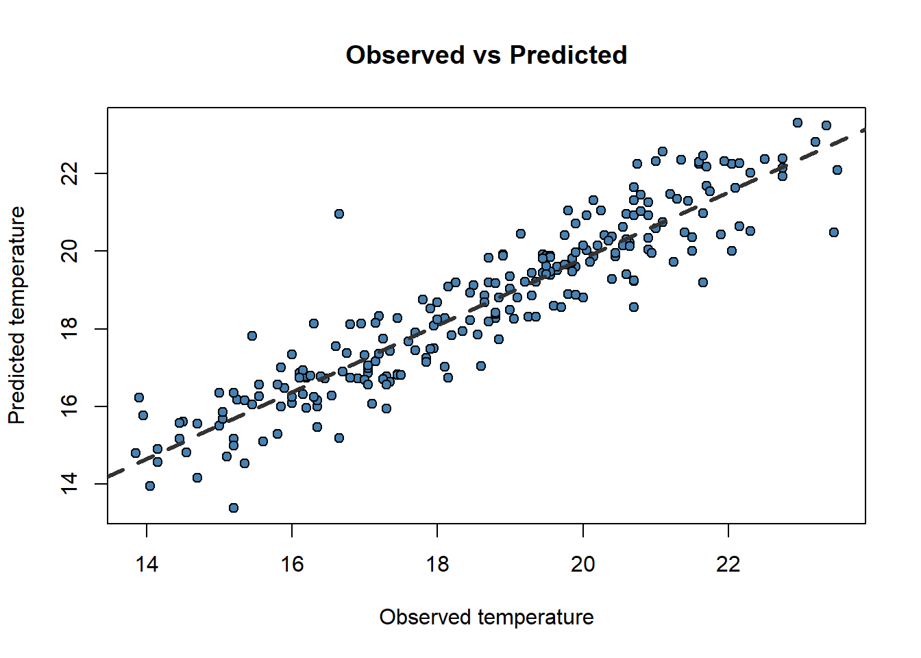
Now that weird lm() that you already noticed before makes a little more sense. We only can call abline on regression models. Ideally, the perfect fit would display all dots in a 45 degree line starting in (0,0). That would be the
Another thing we can take a look at is the Root Mean Square Error (RMSE). The RMSE is the standard deviation of the residuals (prediction errors14). Residuals are a measure of how far from the regression line data points are; RMSE is a measure of how spread out these residuals are. In other words, it tells you how concentrated the data is around the line of best fit (abline). Root mean square error is commonly used in climatology, forecasting, and regression analysis to verify experimental results. The formula is:
Where:
In this case we will create our own R formula obtained from this nice r-bloggers entry:
[1] 0.8766348So, taking into account that the RMSE takes the same units that the observed variable, our model predicts temperature with an average error of less than 1 Celsius degree.
One of the conditions our data must satisfy is the linear independence of our predictors. This means that our explanatory variables must be independent one another or what is the same, have low correlation values.
Correlation is a measure of the degree of association between to numeric variables. There are several methods to measure correlation both parametric (at least one variable must be normally distributed) and non-parametric (no assumptions in the data).
Parametric: Pearson correlation coefficient.
Non-parametric: Spearman’s ρ and Kendall’s τ rank correlation coefficients.
Regardless of the method, R uses the function cor() to calculate a coefficient of correlation. By default Pearson's R is calculated although the method argument allows to change the method to a non-parametric alternative.
             TavgMAX       Tavg       long       d_atl    d_medit         lat
TavgMAX    1.0000000  0.9384827  0.4416862  0.27237366 -0.4015863 -0.16677016
Tavg       0.9384827  1.0000000  0.4018594  0.29814899 -0.4287400 -0.22591063
long       0.4416862  0.4018594  1.0000000  0.57574513 -0.7589245 -0.29216294
d_atl      0.2723737  0.2981490  0.5757451  1.00000000 -0.9525821 -0.94604910
d_medit   -0.4015863 -0.4287400 -0.7589245 -0.95258210  1.0000000  0.83632353
lat       -0.1667702 -0.2259106 -0.2921629 -0.94604910  0.8363235  1.00000000
elevation -0.7789850 -0.8629255 -0.2375738 -0.01776881  0.1757007 -0.02359441
            elevation
TavgMAX   -0.77898498
Tavg      -0.86292553
long      -0.23757377
d_atl     -0.01776881
d_medit    0.17570069
lat       -0.02359441
elevation 1.00000000 TavgMAX Tavg long d_atl d_medit lat
TavgMAX 1.0000000 0.9430791 0.4582967 0.29512643 -0.4244320 -0.2627180
Tavg 0.9430791 1.0000000 0.4139180 0.30806962 -0.4375261 -0.3056250
long 0.4582967 0.4139180 1.0000000 0.58866202 -0.7589619 -0.3180236
d_atl 0.2951264 0.3080696 0.5886620 1.00000000 -0.9540432 -0.9390591
d_medit -0.4244320 -0.4375261 -0.7589619 -0.95404315 1.0000000 0.8499073
lat -0.2627180 -0.3056250 -0.3180236 -0.93905906 0.8499073 1.0000000
elevation -0.8044907 -0.8849362 -0.2816401 -0.09692695 0.2476985 0.1165831
elevation
TavgMAX -0.80449069
Tavg -0.88493622
long -0.28164007
d_atl -0.09692695
d_medit 0.24769852
lat 0.11658310
elevation 1.00000000Any correlation coefficient ranges from -1, indicating high inverse correlation15, to 1, indicating positive correlation. Values around 0 indicate no correlation.
Ideally, our predictors must be uncorrelated. Therefore, correlation values between -0.4 to 0.4 are rather acceptable. If correlation is higher we must drop one of those predictors from our regression model.
The usual thing is to create small scripts joining the necessary instructions to build a model that solves a specific problem. Both the standard R interface in Windows and RStudio provide interfaces for script development. If you work in terminal cmd you will have to use a text editor with ability to interpret code (Notepad++ for example). In RStudio we simply press the button under File (Figure 2.1) to access the scripting window and we will choose the option R Script:
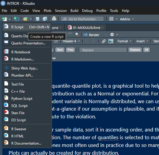
Once this is done, just write the instructions that you want to execute in the appropriate order. Then select them and press the Run button (the green one like a Play button).
So far what we have done is simply to model the relationship between a dependent variable (mean temperature) and a series of explanatory variables. We have seen that we can make “predictions” from the adjusted models. This implies that if we had spatially distributed information about the explanatory variables (raster layers for example) we could generate maps of mean temperature values from the regression model. Later we will see how to do this hand in hand with some packages for manipulation of spatial information.
As we know, regression analysis is a statistical technique to study the relationship between variables. We have seen a basic example where we have calibrated a linear regression model to predict temperatures from some explanatory variables.
In the case of linear regression, the relationship between the dependent variable and the explanatory variables has a linear profile, so the result is the equation of a line. This type of regression implies a series of assumptions our data must fulfill. Specifically, it is necessary to comply with the following:
Correct specification. The linear functional form is correctly specified.
Strict exogeneity. The errors in the regression should have conditional mean
No linear dependence. The predictors in
Spherical errors. Homoscedasticity and no autocorrelation in the residuals.
Normality. It is sometimes additionally assumed that the errors have multivariate normal distribution conditional on the regressors.
As be have already seen, correlation analysis and scatterplots are a useful tool for ascertaining whether or not the assumption of independence of explanatory variables is met. We are now going to find out whether our data fits the normal distribution.
A continuous random variable,
The variable can take any value (−∞,+∞)
The density function is the expression in terms of the mathematical equation of the Gaussian curve:
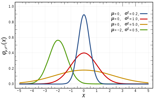
There are several ways to test whether a sample data follows a normal distribution or not. There are visual methods such as a frequency histograms, boxplot or quartile-quartile charts (qqplot). There are also several tests of statistical significance that return the probability of following the normal distribution.
Normality tests:
Shapiro-Wilk test: shapiro.test()
Kolmogorov-Smirnov
Anderson-Darling test: ad.test()
These tests are available in R included in several packages:
stats (preinstalled)
nortest (requires download and installation)
Let’s look at an example of a normality test using the data from regression.txt. We will create different plots to visualize the distribution of values of the variables. Then we will calculate some of the tests above mentioned.
We are already familiar with this kind of plot so let’s see how to use it to find out the distribution of our elevation variable in regression.txt:
regression <- read.table(
  './data/Module_2/regression.txt',
  header = TRUE,
  sep = '\t',
  dec = ','
)

hist(
  regression$elevation,
  breaks = 15,
  density = 15,
  freq = FALSE,
  col = "darkgray",
  xlab = "meters",
  main = "Elevation"
) 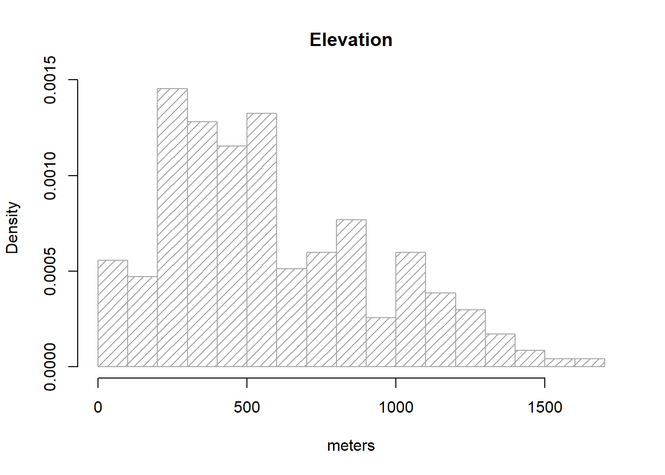
Note that I brought a couple of new arguments on hist().density=15 changes the solid filled bars with texture lines (this is just cosmetic). freq=FALSE allows expressing the y-axis in terms of probability rather than counts/frequency, which is needed to overlay the normal distribution line of our data. Other than that everything remains the same.
As we know, a normal distribution is characterized by a mean μ and a standard deviation δ. Since we can obtain that information from our elevation column:
So, to overlay the theoretical normal distribution line of our data we create a sequence of x-values (see seq()16) and then fit the expected y-value using dnorm, a command that allows to build the normal y-values sequence.
g <- regression$elevation

h <- hist(
  regression$elevation,
  breaks = 15,
  density = 15,
  freq = FALSE,
  col = "darkgray",
  xlab = "meters",
  main = "Elevation"
)

xfit <- seq(min(g), max(g), length = 100)

yfit <- dnorm(xfit, mean = mean(g), sd = sd(g))

lines(xfit, yfit, col = "black",lwd = 2)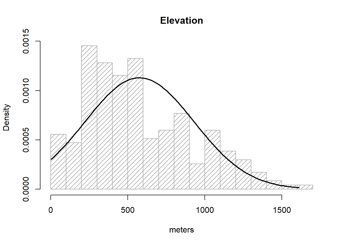
So, what we did above is:
Save elevationdata in g, just to avoid excessive typing.
Create our histogram and save it to an object called h17.
Create the a vector xfit from the minimum value of elevationto the maximum.
Use dnorm() to obtain the y values and save it into yfit.
Overlay our theoretical line resulting from xfit-yfit.
If the bar plot resembles the line then we can consider our data as normal. I am aware this is not fancy at all. We’ll see some other options.
The second graphical tool that we will see to evaluate the normality of the data is the boxplot. The boxplot is a graph, based on quartiles, by which a set of data is displayed. It is composed of a rectangle, the box, and two arms, the whiskers. It provides information on the minimum and maximum values (whiskers), the quartiles Q1, Q2 or median and Q3 (box), existence of atypical values and symmetry of the distribution (outlier dots).
In R, the box diagrams are constructed using the boxplot() function. There are several possibilities for creating variations of boxplot graphics. You can find some examples here.
How can we infer from a boxplot that our data is normally distributed? Just check Figure 2.3, which displays a theoretical boxplot of the perfect normal distribution:
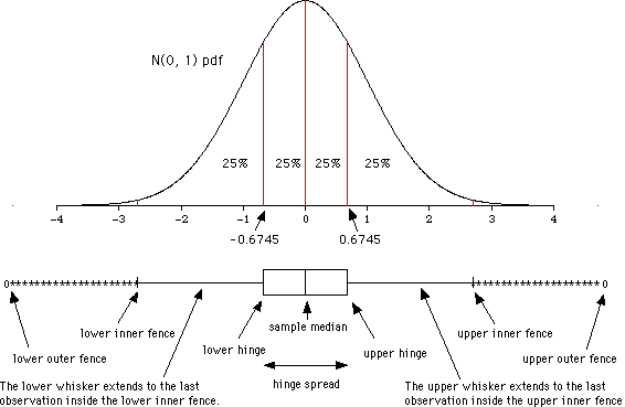
The Q-Q plot18, or quantile-quantile plot, is a graphical tool to help us assess if a set of data plausibly came from some theoretical distribution such as a Normal or exponential. For example, if we run a statistical analysis that assumes our dependent variable is Normally distributed, we can use a Normal Q-Q plot to check that assumption. It allows us to see at-a-glance if our assumption is plausible, and if not, how the assumption is violated and what data points contribute to the violation.
Q-Q plots take your sample data, sort it in ascending order, and then plot them versus quantiles calculated from a theoretical distribution. The number of quantiles is selected to match the size of your sample data. While Normal Q-Q Plots are the ones most often used in practice due to so many statistical methods assuming normality, Q-Q Plots can actually be created for any distribution.
In R, there are two functions to create Q-Q plots: qqnorm and qqplot.
qqnorm creates a Normal Q-Q plot. You give it a vector of data and R plots the data in sorted order versus quantiles from a standard Normal distribution.
The qqplot() function allows you to create a Q-Q plot for any distribution. Unlike the qqnorm function, you have to provide two arguments: the first set of data and the second set of data.
Either way the interpretation is the same, if the points follow a straight line then the sample follows the target probability distribution.
The Shapiro-Wilk Test is used to test the normality of a data set. The null-hypothesis
The function to perform the test in R is shapiro.test(). Be carefull, this command belongs to the nortest package. Remember to install and load it before you call the function.
    Shapiro-Wilk normality test

data:  regression$Tavg
W = 0.97931, p-value = 0.001683
In the previous example the p-value obtained is 0.0016 <0.05. Therefore the null hypothesis of normality of the data is rejected and therefore we conclude that the variable T_avg is NOT NORMAL.
The Anderson-Darling Test works similarly to the Shapiro-Wilk test. We test the null hypothesis of normality of the data and reject it if the p-value <0.05.
The function to perform the test is ad.test(), implemented inside the nortest package.
    Anderson-Darling normality test

data:  regression$elevation
A = 3.7835, p-value = 1.849e-09📝EXERCISE 4: The objective of this exercise is to test the normality of the data used in Linear regression section regression.txt. Therefore, we must do the following for each variables:
Histogram of frequencies.
Box plot.
Q-Q plot.
Shapiro-Wilk test.
Anderson-Darling test.
Kolmogorov-Smirnov test.
Deliverables:
Submit the commented code following the exercises portfolio template example
Additionally, write a brief report to discuss about the normality of the variables. Include plots or any other supplementary information that supports your findings.
Generalized Linear Models (GLM) are an extension of linear models that can deal with non-normal distributions of the response variable, providing an alternative way to transform the response. The distributions used include those like Poisson, binomial, negative binomial, and gamma.
GLM generalizes linear regression by allowing the linear model to be related to the response variable through a link function and allowing the magnitude of the variance of each measurement to be a function of its predicted value. GLM were formulated by John Nelder and Robert Wedderburn as a way to unify several statistical models, including linear regression, logistic regression, and Poisson regression.
For the development of this course we will focus on the calibration of binary logistic and Poisson regression models, although most of the contents are extrapolable to the different types of regression within GLM.
A generalized linear model has three basic components:
Random component: Identical the response variable and its probability distribution.
Systematic component: Specifies the explanatory variables (independent or predictor) used in the linear predictive function.
Link function: is a function of the expected value of
The primary objective of logistic regression is to model how the probability of occurrence of an event, usually dichotomous, is influenced by the presence of various factors20. Logistic regression models are regression models that allow us to study whether or not a binomial variable depends on another variable(s).
To calibrate a logistic regression model we classify the value of the dependent variable as 0 when an event does not occur and with 1 when it is present, and we try to quantify the possible relationship between that event and some independent variable(s). The value returned or predicted by the regression model is the probability associated with the occurrence of that event.
Therefore, the logistic regression models the probability of a binomial process as the logistic function of a linear combination of the independent variable(s), being a particular case of regression where the dependent variable is categorical. The technique does not impose as strong constraints on the distribution of errors as in the case of linear or Gaussian models. In fact, the only assumption is the linear independence of the predictors.
The estimation of regression coefficients is done from the data using a maximum likelihood approach rather than the ordinary least squares. Similar to linear regression, logistic regression:
Evaluates/fits explanatory models.
Estimates the significance level of the predictors.
Allows to conduct predictions.
The model is generally presented in the following format, where
The
where:
The function of R that allows to adjust GLM models is glm(). Same as linear regression, glm() requires an argument that describes the variables that are going to intervene in the process (formula), and a data.frame containing the values of the dependent and independent variables. However, it requires an additional argument that specify the type of distribution that we are going to use (family).
As stated in the help for this function the only difference from linear regression is the obligation to specify the type of error distribution that we want to use. Let’s fit a example model. We will use data from the logit.csv which contains data on forest fire occurrence in Spain from 1988 to 2008:
| logit_1_0 | Cattle | Prot_area | Powerlines | Railroads | WAI | WGI | WUI | Machinery | FAPU | Tracks | Change_pop | |
|---|---|---|---|---|---|---|---|---|---|---|---|---|
| 1 | 1 | 480 | 24031.140625 | 0 | 0 | 0 | 0 | 0 | 0.330000013113022 | 0 | 0 | -0.00600000005215406 |
| 2 | 1 | 763 | 1000000 | 0 | 0 | 452471 | 0 | 0 | 2.17000007629395 | 0 | 0 | -0.0750000029802322 |
| 3 | 1 | 495.5 | 313822.5 | 261509.59375 | 0 | 344277 | 150339 | 0 | 0.509999990463257 | 0 | 0 | 0.200000002980232 |
| 4 | 1 | 2666 | 0 | 0 | 0 | 430075 | 200063 | 0 | 0.829999983310699 | 0 | 74735.28125 | 0.148000001907349 |
| 5 | 1 | 271 | 609511.875 | 0 | 0 | 341357 | 0 | 0 | 2.85999989509583 | 0 | 15166.9599609375 | 0.24099999666214 |
| 6 | 1 | 635 | 0 | 0 | 0 | 195445 | 0 | 0 | 0.5 | 0 | 3106.92211914062 | -0.00300000002607703 |
| 7 | 1 | 1091.5 | 0 | 128627.3984375 | 0 | 296985 | 0 | 0 | 1.6599999666214 | 33863 | 0 | -0.0130000002682209 |
| 8 | 1 | 197 | 0 | 90764.7265625 | 0 | 493425 | 0 | 0 | 5.61999988555908 | 0 | 83728.5625 | 0.131999999284744 |
| 9 | 1 | 302 | 78193.4375 | 0 | 0 | 277234 | 0 | 0 | 0.699999988079071 | 0 | 0 | 0.00700000021606684 |
| 10 | 1 | 7776.5 | 1000000 | 0 | 0 | 0 | 0 | 0 | 2.8199999332428 | 857420 | 0 | -0.0570000000298023 |
'data.frame':   3582 obs. of  12 variables:
 $ logit_1_0 : int  1 1 1 1 1 1 1 1 1 1 ...
 $ Cattle    : num  480 763 496 2666 271 ...
 $ Prot_area : num  24031 1000000 313823 0 609512 ...
 $ Powerlines: num  0 0 261510 0 0 ...
 $ Railroads : num  0 0 0 0 0 0 0 0 0 0 ...
 $ WAI       : num  0 452471 344277 430075 341357 ...
 $ WGI       : int  0 0 150339 200063 0 0 0 0 0 0 ...
 $ WUI       : int  0 0 0 0 0 0 0 0 0 0 ...
 $ Machinery : num  0.33 2.17 0.51 0.83 2.86 ...
 $ FAPU      : num  0 0 0 0 0 ...
 $ Tracks    : num  0 0 0 74735 15167 ...
 $ Change_pop: num  -0.006 -0.075 0.2 0.148 0.241 ...
Where:
logit_1_0: is the dependent variable, 1-fire and 0-no fire.
Cattle: is the amount of ovine cattle individuals.
Prot_area: is the area (in
Powerlines: is the area covered by a 200 m buffer from power lines over forest areas.
Railroads: is the area (in
WAI: or Wildland-Agricultural interface is the area (in
WGI: or Wildland-Grassland interface is the area (in
WUI: or Wildland-Agricultural interface is the area (in
Machinery: density of agricultural machinery.
FAPU: area of forest areas under public management.
Tracks: is the area (in
Change_pop: relative change in population from 1990 to 2010.
All predictors are expected to show a positive relationship, ie, the higher the value, the higher the predicted probability of fire occurrence; with the only exception of Prot_area. For a more detailed description see Rodrigues et al., (2014)
So, let’s go and fit our first logit model. We have everything we need except the kid of family we have to use in the case of a logistic model which is binomial.
Call:
glm(formula = logit_1_0 ~ ., family = binomial, data = logit)

Coefficients:
              Estimate Std. Error z value Pr(>|z|)
(Intercept) -1.528e+00  9.995e-02 -15.290  < 2e-16 ***
Cattle       1.114e-05  9.975e-06   1.117  0.26407
Prot_area   -1.502e-07  1.335e-07  -1.125  0.26056
Powerlines   2.070e-06  1.299e-06   1.593  0.11113
Railroads    1.900e-06  5.890e-07   3.226  0.00125 **
WAI          1.466e-05  5.627e-07  26.060  < 2e-16 ***
WGI         -1.567e-06  2.404e-07  -6.520 7.02e-11 ***
WUI          2.698e-06  1.058e-06   2.550  0.01078 *
Machinery   -2.646e-02  1.796e-02  -1.474  0.14059
FAPU         3.445e-07  1.887e-07   1.825  0.06794 .
Tracks       8.281e-07  3.520e-07   2.353  0.01863 *
Change_pop  -2.010e+00  3.959e-01  -5.077 3.84e-07 ***
---
Signif. codes:  0 '***' 0.001 '**' 0.01 '*' 0.05 '.' 0.1 ' ' 1

(Dispersion parameter for binomial family taken to be 1)

    Null deviance: 4852.9  on 3581  degrees of freedom
Residual deviance: 2534.2  on 3570  degrees of freedom
AIC: 2558.2

Number of Fisher Scoring iterations: 6
And there it is. The output from summary() also looks familiar, doesn’t it? The main difference is that we do not obtain standard errors or Estimates,Pr(>|z|)) remains the same. However, take into account that we are not predicting the actual value of a dependent variable but the likelihood or chance of an event to happen. Therefore, the higher the coefficient the higher the chance to happen and vice versa.
Essentially this works in the same way we saw in the linear regression:
mod.logit.pred <- predict(mod.logit, logit, type = 'response')

hist(
  mod.logit.pred,
  col = 'steelblue',
  breaks = 15,
  xlab = 'Predicted probability'
) 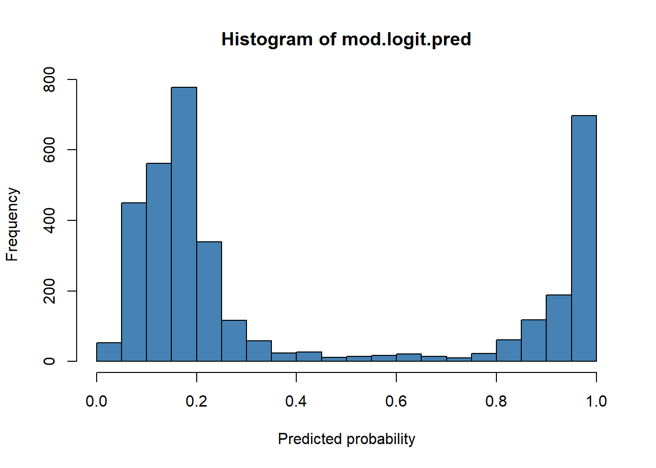
The main difference respect to what we saw in linear regression is that here our response variable is categorical, either 1 or 0. Consequently, we cannot evaluate the model performance in the same way. A classical approach here is the use of contingency tables and measuring the rate success in the classification using a reference threshold.
ctable <- data.frame(cbind(logit$logit_1_0, mod.logit.pred))

names(ctable) <-  c("Obs", "Pred")

boxplot(Pred ~ Obs,
        data = ctable,
        col = c('darkgreen', 'darkred'))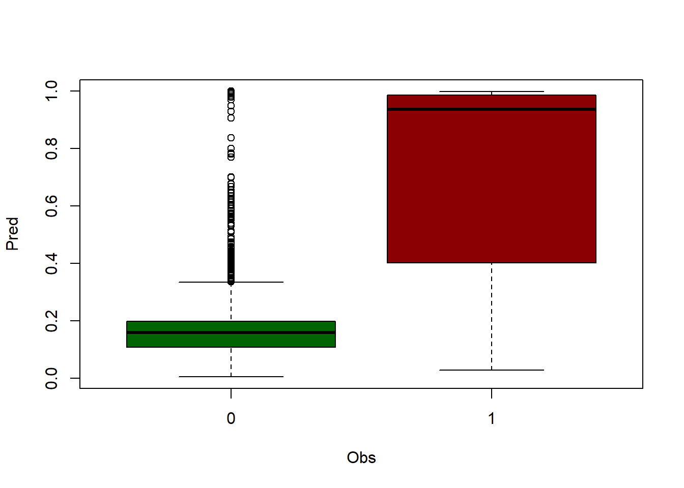
First, we create a table joining our response variable logit_1_0 and the predicted probability mod.logit.pred.
Then we rename the headers and build a boxplot grouping mod.logit.pred according to the observed event logit_1_0 (0-no fire, 1-fire).
At this point we have to determine a threshold to classify the predicted probability. The common approach is us 0.5 and consider 0.5-1.0 as 1 and 0-0.5 as 0.
Once the threshold is determined we recode the predicted probability into 0 and 1.
The final step is build the contingency table with table() and calculate the rate o of success by dividing the sum of correctly classified events (diagonal) by the sample size (sum(diag(accuracy))/sum(accuracy)).
ctable$Pred <- ifelse(ctable$Pred < 0.5, 0, 1)

accuracy <- table(ctable$Pred, ctable$Obs)

print('Correctly classified:')
[1] "Correctly classified:"
       0    1
  0 2044  375
1 64 1099[1] 0.8774428In this case we obtained a 0.88 success rate or what is the same, the model classifies well 88% of the events. Note that this measure of performance or validation is not adequate since we are using the input data. To do it properly we must split the original data into several samples, at least one to calibrate the model and another to conduct the validation.
There are many other measures of performance for glm and logit models but they are kind of specific. In following modules we will cover other options much more refined which are can be applied to any kind of binary model.
📝EXERCISE 5: Try to optimize the example from above to drop variables which are not needed (non-significant or collinear) and also minimizing the AIC.
Once you have your final model build the contingency table and create a boxplot.
Deliverable:
Submit the commented code following the exercises portfolio template example
Once seen the operation of linear and logistic regression models, we will see another possibility within GLM. Specifically, this is the case of the Poisson regression. These regression models are mainly characterized by using count data as dependent variable.
If we recall the case of Logistic regression, in that regression model the dependent variable was expressed in terms of occurrence (1) or non-occurrence (0) of an event in a given time interval.
In the case of the Poisson regression we will use as a dependent variable the number of times a given event occurs in a given time interval. In statistics, Poisson regression is a type of generalized linear model in which the response variable follows a Poisson distribution and the logarithm of its expected value can be modeled by a linear combination of unknown parameters, ie, the logarithm is the canonical link function.
Let’s look at a simple example of fitting a Poisson regression model using the sample data taken from:
https://stats.idre.ucla.edu/stat/data/poisson_sim.csv
In this example, num_awards is the outcome variable and indicates the number of awards earned by students at a high school in a year, math is a continuous predictor variable and represents students’ scores on their math final exam, and prog is a categorical predictor variable with three levels indicating the type of program in which the students were enrolled. It is coded as 1 = “General”, 2 = “Academic” and 3 = “Vocational”. Let’s start with loading the data and looking at some descriptive statistics.
'data.frame':   200 obs. of  4 variables:
 $ id        : int  45 108 15 67 153 51 164 133 2 53 ...
 $ num_awards: int  0 0 0 0 0 0 0 0 0 0 ...
 $ prog      : int  3 1 3 3 3 1 3 3 3 3 ...
$ math : int 41 41 44 42 40 42 46 40 33 46 ... id num_awards prog math
1 45 0 3 41
2 108 0 1 41
3 15 0 3 44
4 67 0 3 42
5 153 0 3 40
6 51 0 1 42
Call:
glm(formula = num_awards ~ math + prog, family = poisson, data = data)

Coefficients:
             Estimate Std. Error z value Pr(>|z|)
(Intercept) -5.578057   0.676823  -8.242   <2e-16 ***
math         0.086121   0.009586   8.984   <2e-16 ***
prog         0.123273   0.163261   0.755     0.45
---
Signif. codes:  0 '***' 0.001 '**' 0.01 '*' 0.05 '.' 0.1 ' ' 1

(Dispersion parameter for poisson family taken to be 1)

    Null deviance: 287.67  on 199  degrees of freedom
Residual deviance: 203.45  on 197  degrees of freedom
AIC: 385.51

Number of Fisher Scoring iterations: 6
In this case we use poisson as family the rest is as we have seen before, nothing new. We can obtain predictions, RMSE and work with the AIC to calibrate the model.
So far we have seen how to calibrate or adjust regression models using a few approaches. However, it has already been discussed that measuring the degree of fit or performance of the models with the same sample we fit our model is not appropriate. We must use an independent data sample to conduct that evaluation.
The process of measuring the degree of adjustment of a model is also known under the term validation. Therefore, from now on we will always distinguish between calibration and validation samples and, thus, between model calibration (using the calibration sample) and validation (using the validation sample).
As previously mentioned, in order to carry out a validation process, it is mandatory to use an independent data sample. What does this mean? Basically, we can not use the data with which we calibrated the model.
By using the calibration sample to validate a model we are skewing the result, forcing the validation to be better than it should be. This is because the model that would be adapted to the data itself and, therefore, it is not realistic to validate with the same sample. This is particularly important in the case of predictive models, such as the linear regression model of temperature prediction we fitted in Fitting a linear regression model.
The solution is simple, it is enough to split the original data into two sub-samples, using one to adjust/calibrate the model, reserving the other to carry out the validation procedure21. There are different ways to carry out this process. The most common is to randomly separate our data, using different percentages:
75% calibration and 25% validation.
70% calibration and 30% validation.
60% calibration and 40% validation.
But what percentage share is appropriate? The truth is that there is no single answer to this question, although there is some consensus that the larger the sample of data, the greater the proportion of data that we can allocate for validation.
How do we conduct the sampling process in R? No wonder there is an specific function to do this. The most basic process involves using sample() on a data.frame (or any table-like object ) to obtain a vector with random row indexes and later split the data accordingly. The basic syntax of the function looks like this:
💡 sample(vector, size=number_of_elements)
The result is a vector with n = size random data selected from the vector. To apply this to an array or data.frame, we will select a random sample of the column with the row numbers by calling nrow(). Once this is done, we will select the data from our array or data.frame that corresponds to the randomly selected row numbers. Let’s look at an example. Execute the following instructions:
regression<-read.table('./data/Module_2/regression.txt', header= TRUE, sep='\t',dec = ',')

sample(nrow(regression), size = 50)
[1] 199 201 69 105 171 188 62 42 45 125 13 214 141 144 61 197 15 131 221
[20] 33 44 195 209 40 119 94 54 32 126 207 174 6 51 217 18 11 79 179
[39] 187 92 233 193 97 71 192 216 139 200 196 12Here we randomly selected 50 rows from the object regression. If you are doing this at home do not expect to obtain the same numbers, this is RANDOM and thus most likely looks different to your output.
To apply transform this into an effective random selection we will store row numbers in an object and the use that object to extract data from regression. On the one hand we will extract 50 records as validation sample and the remaining as calibration.
val.sample <- sample(nrow(regression), size = 50)

regression.val <- regression[val.sample, ]

nrow(regression.val)
[1] 50Once we retrieved the validation sample we go for the calibration one:
Now we have two samples that we can use to calibrate a model with lm() (regression.cal) and another to use predict() on (regression.val). The only issue here is that we have specified the sample size using a number and I was previously talking about percentage. Well, we can work this out using a couple of functions:
nrow(): returns the number of rows, ie records of a table-like object.
floor(): return the integer part of a number.
Therefore, if we use nrow() to retrieve the number of records, multiply that number by a percentage/ratio and then get the integer part of that operation we will obtain the corresponding size of a given ratio.
[1] 234[1] 93Then we modify the sample extraction as follows:
numberOfRows <- nrow(regression)
ratio <- 0.4 #40% of records

sizeValue <- floor(numberOfRows * ratio)
val.sample <- sample(nrow(regression), size = sizeValue)

regression.val <- regression[val.sample, ]
nrow(regression.val)
[1] 93[1] 141📝EXERCISE 6: Modify the script for linear regression to include a random sample procedure:
Use a calibration sample with 75% of the data to fit the model.
Use the remaining 25% as validation sample and calculate the RMSE.
Deliverables:
Submit the commented code following the exercises portfolio template example.
We have seen how to split or randomize data, but if we want to make sure that our result is not influenced by random effects in the sampling we must repeat the process several times and check to what extent the result varies.
This can be done manually or by designing some procedure or script that performs this process recursively. As alternative to that, which in addition requires less effort and knowledge, is to use some predesigned function. Specifically, we will use a function that performs a cross-validation process. Cross-validation (CV) is a technique used to evaluate the results of a statistical analysis and ensure that they are independent of the partition between training (calibration) and test (validation) data. It consists of repeating and calculating the arithmetic mean obtained from the evaluation measures on different partitions. It is used in environments where the main objective is prediction for we most likely need to estimate the accuracy of our model in some way.
CV is a technique widely used in artificial intelligence projects to validate models. In our case, we can apply this procedure to any of the regression types we have seen so far. To do this in R, we will install an additional package called boot. Follow the steps below to carry out the process:
The execution might take a while. At this stage I will assume that before you ran the above chunk of code you already took a look to help(cv.glm) which is a new instruction and most important, the one that allows to conduct the CV. Just to summarize it:
We need our data object (logit in the example) as first parameter.
We also need a fitted regression model (mylogit).
If we use cv.glm() using these two parameters alone we are then conduction a leave-one-out (LOO) cross-validation. This is the most basic form of CV which is based on using all records but one to fit a model and then predict the result and calculate the residual on the one-left-out record. That is repeated for each record and at the end we get the average residual.
Another option is to use an optional argument K and pass it an integer number. By doing this we are changing to a k-fold CV, based on determining a number of groups
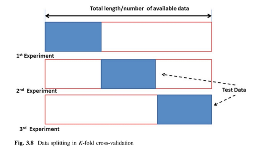
The later approach is significantly faster. In any case, we will see later how to conduct a more appropriate k-fold CV, improving the error measurement. Using this function we just calculate the average value of the residuals which is informative but not more.
Again, before finishing the module I would like to give you some insights into the main concepts you should have become familiar with.
It is important to know how to work with the formula argument. Most modeling tools available in R use this kind of argument.
Mastering data manipulation and sampling is a must.
Distinguishing between calibration and validation samples is also mandatory.
You should begin to become familiar with model calibration and variable selection for model fitting, ie, retrieving the best parameters for our model on the basis of the validation.
Accessing spatial data in addition to the functions for statistical calculation that we have already seen, in R we can find several packages that allow to interact with spatial data, both in vector and raster format.
sf and terra are a libraries (packages) that allow reading and managing spatial data objects, such as ESRI shapefiles or raster files in ASCII format or any other GDAL supported format. These packages also allow you to create thematic maps from spatial data or to perform most of the geoprocesses of a Geographic Information System (GIS).
For the moment we will focus on packages sfand terra. We will see how to include some of their functions to automate some data extraction tasks. Specifically we will look at some examples of how to include these packages in regression models.
The sf package will allow us, among other things, to access information contained in spatial vector layers (points, lines and polygons). This package incorporates many other functions, but for the moment we will focus on the creation / import of space objects in R.
Vector information is characterized by representing elements by points, lines and polygons. Each of these elements is related to a record within an attribute table associated with spatial information. If you are not familiar with GIS or spatial data take a quick look to http://gisgeography.com/spatial-data-types-vector-raster/.
The sf package will allow us to import shapefiles and store them in spatial R objects.
In this way we can access both the spatial information (location) and thematic (attribute table). Let’s see an example using the stations.shp layer that you will find in the “MODULE 3” folder on the course platform. This layer corresponds to the spatial location of part of the meteorological stations from which the information was obtained for the development of the linear regression practice.
We will begin with installing and loading the packages:
We find several alternatives in the sf package to access spatial vector information. Some of them are specific for each type of vector geometry (points, lines or polygons). There is, however, a generic function that operates on any geometry. This is thest_read()function.
Reading layer `weather_stations' from data source
  `C:\Users\pjgel\OneDrive - udl.cat\Sync\01 - Docencia\111019 - Introduction to Spatial Statistics (MEUFOR)\INTRO_R\QMD_book\INTROR\data\Module_3\weather_stations.shp'
  using driver `ESRI Shapefile'
Simple feature collection with 95 features and 10 fields
Geometry type: POINT
Dimension:     XY
Bounding box:  xmin: 574966 ymin: 4514365 xmax: 818327 ymax: 4635648
Projected CRS: ED50 / UTM zone 30N
When using this function we create an object of type Spatial (sf) object. In this case, since the weather_stations.shp layer is a points layer, the wStation object is of type sf. Spatial objects store all kinds of information related to spatial position (reference systems, extension …) and thematic features or attributes of objects.
To access the different parts of a spatial dataframe we have to call the object name, inside st_coordinates() function. Thus, if we wanted to access the coordinates (Table 1.1) of the object station we would proceed as follows:
          X       Y
[1,] 593975 4522166
[2,] 600216 4632520
[3,] 622021 4632336
[4,] 627162 4624836
[5,] 644107 4635648
[6,] 574966 4571541
This coordinates are used to infer the real spatial location of each point. An example of this may be calling the plot() function over the geometry of wStation layer and observe the resulting plot:
Finally, we can access the attribute table. In a vector layer, each feature (point in our case) is linked to a row of an attribute table. Both points and table are together in the sf but we can access them separately. We have already seen how access coordinate information. To obtain the attribute table (Table 1.2) we do as follows:
| ID | YEAR | MONTH | STATION | ELEV | TABS_MAX | TABS_MIN | TAVG_MAX | TAVG_MIN | T_AVG | geometry | |
|---|---|---|---|---|---|---|---|---|---|---|---|
| 1 | 3013 | 2012 | 6 | MOLINA DE ARAGON | 1063 | 32.8 | 3.2 | 23.8 | 8.4 | 16.1 | [object Object] |
| 2 | 9307A | 2012 | 6 | SAN MARTIN DEL MONCAYO (D.G.A. | 816 | 33 | 6.5 | 22.8 | 10.7 | 16.75 | [object Object] |
| 3 | 9311C | 2012 | 6 | BORJA (AYUNTAMIENTO) | 440 | 36.5 | 9 | 26.8 | 14.6 | 20.7 | [object Object] |
| 4 | 9336L | 2012 | 6 | FUENDEJALON (D.G.A. | 455 | 35 | 11 | 26.7 | 14.7 | 20.7 | [object Object] |
| 5 | 9337A | 2012 | 6 | PRADILLA DE EBRO | 228 | 35 | 10 | 27.9 | 15.1 | 21.5 | [object Object] |
| 6 | 9349A | 2012 | 6 | MONREAL DE ARIZA (GRANJA) | 765 | 34 | 6 | 25 | 10.6 | 17.8 | [object Object] |
| 7 | 9354E | 2012 | 6 | ALHAMA DE ARAGON (DGA) | 703 | 33 | 8 | 23.8 | 12.9 | 18.35 | [object Object] |
| 8 | 9359 | 2012 | 6 | CUBEL (CASAS ALTAS) | 1108 | 33 | 4 | 23.2 | 9.5 | 16.35 | [object Object] |
| 9 | 9364E | 2012 | 6 | MILMARCOS | 1065 | 34 | 4 | 22.7 | 10.3 | 16.5 | [object Object] |
| 10 | 9366 | 2012 | 6 | LA TRANQUERA (EMBALSE) | 660 | 34 | 7 | 25.4 | 12 | 18.7 | [object Object] |
We have seen how to access the attributes of vector layers. This opens the door to a basic process in the field of spatial information processing, such as the selection of entities according to their attributes. At this point you will have already realized that the R philosophy is based on “recycling” functions. With this in mind, and knowing that the attribute table of a vector layer behaves in the same way as a data.frame does, you can get an idea of how the selection queries are implemented. In fact, it is done exactly the same as in the case of a normal data.frame. Let’s look at an example on the layer stations. We will select the points with an average temperature (Tmed_MES) greater than 20:
Classes 'sf' and 'data.frame':  0 obs. of  11 variables:
 $ ID      : chr
 $ YEAR    : num
 $ MONTH   : num
 $ STATION : chr
 $ ELEV    : num
 $ TABS_MAX: num
 $ TABS_MIN: num
 $ TAVG_MAX: num
 $ TAVG_MIN: num
 $ T_AVG   : num
 $ geometry:sfc_GEOMETRY of length 0 - attr(*, "sf_column")= chr "geometry"
 - attr(*, "agr")= Factor w/ 3 levels "constant","aggregate",..: NA NA NA NA NA NA NA NA NA NA
  ..- attr(*, "names")= chr [1:10] "ID" "YEAR" "MONTH" "STATION" ...
So, according to the output from str() on wStation.Sel 46 points (or weather stations) recorded an average temperature (in June) above 20
In some cases we could have the data stored in a table which contains X, and Y coordinates. To transform it in a spatial data.frame we could use the st_as_sf() function. In this function we have the argument coords where the name of the columns that contains the longitude and latitude values have to be provided under quotations. Additionally, the native CRS have to be set using the EPSG code.
fire_logit <- read.csv2("./data/Module_3/fire_logit.csv") %>% drop_na() %>%
  st_as_sf(coords = c("X_INDEX", "Y_INDEX")) %>%
  st_set_crs(25830)

print(fire_logit)
Simple feature collection with 3493 features and 1 field
Geometry type: POINT
Dimension: XY
Bounding box: xmin: -3500 ymin: 3993500 xmax: 1017500 ymax: 4851500
Projected CRS: ETRS89 / UTM zone 30N
First 10 features:
logit_1_0 geometry
1 0 POINT (149500 4379500)
2 0 POINT (537500 4126500)
3 0 POINT (193500 4558500)
4 0 POINT (397500 4138500)
5 0 POINT (239500 4745500)
6 0 POINT (212500 4800500)
7 0 POINT (229500 4231500)
8 0 POINT (212500 4666500)
9 0 POINT (221500 4778500)
10 0 POINT (45500 4699500)Additionally, in a second step you could project to the data to other CRS. Remember, the CRS first have to be set and, in the case you need to change to other CRS, after you can project
We have already seen how to access spatial information (GIS) in vector format using the sf package. With this we could already read information from a layer in shapefile format and include it in a regression script as input data to create the dependent variable. In the next section we’ll do that.
The only thing we would have to do is to introduce the information related to the independent variables. For this we will use some of the functionalities available in the raster package. In this way we will also automate the obtaining of the independent variables.
The terra package provides utilities for manipulating geographic information in raster format. This package, along with maptools, converts R into a pseudo-GIS environment, allowing you to use most basic raster analysis functions. The raster package allows:
Create raster objects.
Manipulation of very heavy files.
Map algebra and overlay functions.
Distances and connection analysis.
Conversion of polygons, lines and points to raster.
Calculate spatial predictions of regression models.
Mapping from raster maps.
Reading and writing various types of raster files.
Of all these functionalities available we will focus on:
Creating raster objects.
Calculate predictions of regression models.
Elaboration of maps.
Reading and writing various types of raster files.
The remaining functions can be found in a more intuitive way in any desktop GIS software. However, in some cases it may be more operative to use them directly in R.
The information in raster format is basically a 2-dimensional matrix, in which each of the grids or pixels is given a numerical value that represents either a category o parameter. This type of structure is particularly suitable to represent information about phenomena that has value in any location (continuous) such as elevation, temperature, distances… If we recall the independent variables used in the regression practice, they referred to phenomena of this nature. What we will do next is using the shapefile layer of weather stations to get information regarding the independent variables from raster layers.
Again, the most first thing to do is reading a raster layer. Once terra package is installed and load we can call the rast() function and load any raster layer. Let’s see an example using the layer dem_rioja.tif that you can find in the folder Raster. It is a Digital Elevation Model (DEM)22 of the Autonomous Community of La Rioja23.
The first thing is to install the package. Unlike in other occasions this time we will specify the argument dep = TRUE. The terra package has many dependencies, ie, needs functions from other packages in order to work properly. It could be very annoying installing them one by one so we use that extra argument to ensure everything will work fine:
Once installed and activated we can call therast()function to read raster layer. Next we will use theplot()function to create a simple map of the raster layer we just read:
Thanks to some of the utilities of the raster package we will be able to generate table-like objects with the values of multiple raster layers at once. We will use these data as input for our independent variables, but this is just an example. This procedure combines the location information of some input points (our weather stations) and raster layers with the information we want to retrieve. To do this we will use the rast() and extract() functions. ras The rast() function also allows us to store several raster layers into a raster array. Then we can interact with the rast to extract information using the function extract(). The only thing we need to carry out this process is a list of coordinates that represent the locations from which we want to obtain the information. The most obvious example would be the location of the weather stations, for which we have already seen how to obtain in Working with vector layers. The process also involves using an specific function to build a list with the location folder of the raster layers we want to load. Let’s begin with this last piece:
[1] "./data/Module_3/variables_weather/d_atl.txt"
[2] "./data/Module_3/variables_weather/d_medit.txt"
[3] "./data/Module_3/variables_weather/lat.txt"
[4] "./data/Module_3/variables_weather/long.txt"
[5] "./data/Module_3/variables_weather/mde.txt"
list.files is the most common approach in R to interact with our folder structure. It returns a vector with the names of the files in a given folder. In the first argument we pass a string with the location of the target folder. This is the only mandatory parameter, the remaining are optional. Among those optional we find:
full.names: TRUE or FALSE parameter that determines whether the function returns just file names or the complete path to each file. It is needed TRUE by stack()’.
pattern: parameter that allows filtering files by name.
Files containing txt:
[1] "./data/Module_3/variables_weather/d_atl.txt"
[2] "./data/Module_3/variables_weather/d_medit.txt"
[3] "./data/Module_3/variables_weather/lat.txt"
[4] "./data/Module_3/variables_weather/long.txt"
[5] "./data/Module_3/variables_weather/mde.txt"
Files containing l:
[1] "./data/Module_3/variables_weather/d_atl.txt"
[2] "./data/Module_3/variables_weather/lat.txt"
[3] "./data/Module_3/variables_weather/long.txt"
Once we have our target list of files we can proceed with rast():
Then we can manipulate it and inspect our new object:
   d_atl d_medit     lat   long mde
1  35106  336329 4758150 561250  NA
2  35117  336255 4758150 561350  NA
3  35128  336181 4758150 561450  NA
4  35140  336107 4758150 561550  NA
5  35151  336033 4758150 561650  NA
6  35163  335959 4758150 561750  NA
7  35176  335885 4758150 561850  NA
8  35188  335812 4758150 561950  NA
9  35201  335738 4758150 562050  NA
10 35215  335664 4758150 562150  NA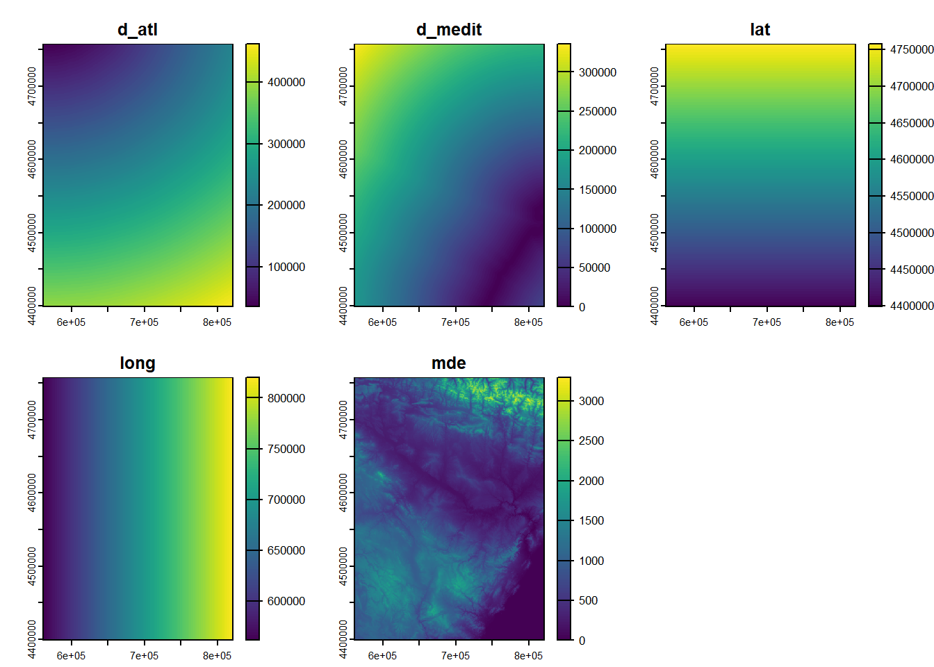
To end the basics of access to spatial layers let’s focus on seeing some fundamental properties that share all spatial layers. In essence we will see how to obtain and modify some parameters such as the extension of the layers or the reference system. In future modules we will go deeper into these concepts.
The layer extent is the rectangle that surrounds spatial features, ie, the limits of data region. We can access the spatial extent of any layers with the extent() function. This function, which is common for both vector and raster layers, returns the coordinates of the ends of the layers:
SpatExtent : 488974.834204424, 609103.437943318, 4641288.30783146, 4721312.23891389 (xmin, xmax, ymin, ymax)SpatExtent : 574966, 818327, 4514365, 4635648 (xmin, xmax, ymin, ymax)What good is this for us? Well, this can be used to know if our layers spatially match, to save this information and use it to cut layers or create empty raster “canvases” on which to dump information, for example the result of an interpolation process. In the short term, the greater utility of this function is to find out the units of the reference system in case we do not know the information.
The reference system (CRS) is a key element of spatial information. So far we have worked the spatial information without paying attention to this parameter. However, sooner or later we’ll have to deal with it. Not having taken this into account will give us problems. For example, we will not be able to overlay or combine layers by the absence or difference of reference systems, so we need to know how assign or re-project a layer to a different reference system.
A Coordinate Reference System or CRS must only be assign when a spatial layer lacks this information. Therefore, first we will see if our layers have or have not been assigned a reference system. A single function to do allows check and assign the CRS, crs(). We will apply this function on the layers wStations and dem:
[1] ""[1] "PROJCRS[\"ED50 / UTM zone 30N\",\n BASEGEOGCRS[\"ED50\",\n DATUM[\"European Datum 1950\",\n ELLIPSOID[\"International 1924\",6378388,297,\n LENGTHUNIT[\"metre\",1]]],\n PRIMEM[\"Greenwich\",0,\n ANGLEUNIT[\"degree\",0.0174532925199433]],\n ID[\"EPSG\",4230]],\n CONVERSION[\"UTM zone 30N\",\n METHOD[\"Transverse Mercator\",\n ID[\"EPSG\",9807]],\n PARAMETER[\"Latitude of natural origin\",0,\n ANGLEUNIT[\"degree\",0.0174532925199433],\n ID[\"EPSG\",8801]],\n PARAMETER[\"Longitude of natural origin\",-3,\n ANGLEUNIT[\"degree\",0.0174532925199433],\n ID[\"EPSG\",8802]],\n PARAMETER[\"Scale factor at natural origin\",0.9996,\n SCALEUNIT[\"unity\",1],\n ID[\"EPSG\",8805]],\n PARAMETER[\"False easting\",500000,\n LENGTHUNIT[\"metre\",1],\n ID[\"EPSG\",8806]],\n PARAMETER[\"False northing\",0,\n LENGTHUNIT[\"metre\",1],\n ID[\"EPSG\",8807]]],\n CS[Cartesian,2],\n AXIS[\"(E)\",east,\n ORDER[1],\n LENGTHUNIT[\"metre\",1]],\n AXIS[\"(N)\",north,\n ORDER[2],\n LENGTHUNIT[\"metre\",1]],\n USAGE[\n SCOPE[\"Engineering survey, topographic mapping.\"],\n AREA[\"Europe - between 6°W and 0°W - Channel Islands (Jersey, Guernsey); France offshore; Gibraltar; Ireland offshore; Norway including Svalbard - offshore; Spain - onshore; United Kingdom - UKCS offshore.\"],\n BBOX[35.26,-6,80.49,0.01]],\n ID[\"EPSG\",23030]]"In this particular case none of the layers were assigned a reference system. To give one first we have to know what system corresponds to them and how to assign it. The system that corresponds to them is the EPSG: 23030 - UTM ED50 30N. You can get a list of the different ways of coding reference systems at http://spatialreference.org/. In this case we will use the parameters according to the EPSG code:
To assign the CRS we proceed as follows:
Finally, we check the CRS again:
                 name authority  code
1 ED50 / UTM zone 30N      EPSG 23030
                                                                                                                                                                                                    area
1 Europe - between 6°W and 0°W - Channel Islands (Jersey, Guernsey); France offshore; Gibraltar; Ireland offshore; Norway including Svalbard - offshore; Spain - onshore; United Kingdom - UKCS offshore
                     extent
1 -6.00, 0.01, 35.26, 80.49 name authority code
1 ED50 / UTM zone 30N EPSG 23030
area
1 Europe - between 6°W and 0°W - Channel Islands (Jersey, Guernsey); France offshore; Gibraltar; Ireland offshore; Norway including Svalbard - offshore; Spain - onshore; United Kingdom - UKCS offshore
extent
1 -6.00, 0.01, 35.26, 80.49But, what if we want to change the CRS? Obviously in this case we can not use the above procedure. Furthermore, in this case, the same procedure is not used for each data model (vector or raster), but there is a function for the case of vector layers and another for raster layers. In the case of the vector layers we proceed as follows:
                   name authority  code
1 ETRS89 / UTM zone 30N      EPSG 25830
                                                                                                                                                              area
1 Europe between 6°W and 0°W: Faroe Islands offshore; Ireland - offshore; Jan Mayen - offshore; Norway including Svalbard - offshore; Spain - onshore and offshore
                     extent
1 -6.00, 0.01, 35.26, 80.49
For raster layers the procedure is similar but the function changes:
                   name authority  code
1 ETRS89 / UTM zone 30N      EPSG 25830
                                                                                                                                                              area
1 Europe between 6°W and 0°W: Faroe Islands offshore; Ireland - offshore; Jan Mayen - offshore; Norway including Svalbard - offshore; Spain - onshore and offshore
                     extent
1 -6.00, 0.01, 35.26, 80.49
Note that in the raster example we retrieved the CRS from an existing layer rather than specify the CRS raw.
Something that is worth mention now is that we cannot project a layer that lacks CRS, first we have to assign it one.
Now that we have become somewhat familiar with the use of spatial information, we will incorporate them into our linear regression code. The objective is to retrieve the information necessary to calibrate (and validate) the regression model from the original GIS layers and produce a spatialized prediction. Note that the data from regression.txt was originally retrieved from these GIS layers.
What we are going to do is to replicate the process of obtaining the information by incorporating some functions from the packages sf and terra. In order to carry out this process, we will use the layer weather_stations.shp and a series of raster layers in ASCII format (mde.txt, lat.txt, long.txt, d_medit.txt, d_atl.txt).
To some extent we will incorporate part of the code from Accesing spatial data into the linear regression model. Take into account that this is just an example and any regression model is a valid candidate for this procedure.
We will start by getting the information about the dependent variable. The information we used in the previous version was a column named Tavg. Well, this piece of information is located within the attribute table of weather_stations.shp, specifically in the attribute called Tmed_MES. What we have to do now is loading the vector layer and get that column:
Reading layer `weather_stations' from data source
  `C:\Users\pjgel\OneDrive - udl.cat\Sync\01 - Docencia\111019 - Introduction to Spatial Statistics (MEUFOR)\INTRO_R\QMD_book\INTROR\data\Module_3\weather_stations.shp'
  using driver `ESRI Shapefile'
Simple feature collection with 95 features and 10 fields
Geometry type: POINT
Dimension:     XY
Bounding box:  xmin: 574966 ymin: 4514365 xmax: 818327 ymax: 4635648
Projected CRS: ED50 / UTM zone 30NSimple feature collection with 5 features and 10 fields
Geometry type: POINT
Dimension: XY
Bounding box: xmin: 593975 ymin: 4522166 xmax: 644107 ymax: 4635648
Projected CRS: ED50 / UTM zone 30N
ID YEAR MONTH STATION ELEV TABS_MAX TABS_MIN
1 3013 2012 6 MOLINA DE ARAGON 1063 32.8 3.2
2 9307A 2012 6 SAN MARTIN DEL MONCAYO (D.G.A. 816 33.0 6.5
3 9311C 2012 6 BORJA (AYUNTAMIENTO) 440 36.5 9.0
4 9336L 2012 6 FUENDEJALON (D.G.A. 455 35.0 11.0
5 9337A 2012 6 PRADILLA DE EBRO 228 35.0 10.0
TAVG_MAX TAVG_MIN T_AVG geometry
1 23.8 8.4 16.10 POINT (593975 4522166)
2 22.8 10.7 16.75 POINT (600216 4632520)
3 26.8 14.6 20.70 POINT (622021 4632336)
4 26.7 14.7 20.70 POINT (627162 4624836)
5 27.9 15.1 21.50 POINT (644107 4635648) [1] 16.10 16.75 20.70 20.70 21.50 17.80 18.35 16.35 16.50 18.70 18.00 15.85
[13] 15.80 18.85 18.30 19.35 18.10 16.95 17.40 18.00 19.55 20.85 19.85 18.80
[25] 21.90 21.95 16.80 22.15 22.15 19.85 20.30 20.55 20.90 20.55 20.90 16.15
[37] 19.60 16.40 19.60 17.25 17.00 19.00 20.65 22.30 22.05 20.60 17.90 21.75
[49] 17.45 18.45 16.70 20.70 19.90 19.90 23.50 22.30 20.15 22.05 21.20 22.10
[61] 21.75 21.00 21.60 21.75 20.70 20.05 20.00 20.20 21.00 19.80 20.80 21.70
[73] 18.75 18.90 18.80 19.75 18.75 20.80 20.35 19.75 19.70 22.15 20.80 23.35
[85] 19.15 22.95 21.30 21.65 22.75 23.20 22.45 16.10 17.30 16.25 16.30Now we have the dependent variable stored in the object vdep.
Creating the dependent variable is really easy. Obtaining the predictors is a bit much more difficult. The steps we are going to follow are:
Get the coordinates of the weather stations from wStation.
Load the raster layers in a rast() object.
Extract the values of the rasters in the stations location.
wStation.coords <- data.frame(st_coordinates(wStation))

library(terra)
list.rasters <- list.files("./data/Module_3/variables_weather/", full.names = TRUE)
rasters <- rast(list.rasters)
names(rasters)
[1] "d_atl" "d_medit" "lat" "long" "mde" vindep <- extract(rasters, wStation.coords)
colnames(vindep) <- c("ID,", 'd_atl', 'd_medit', 'lat', 'long', 'elevation')
vindep <- vindep[, -c(1)] #Delete ID column
head(vindep, n = 5) d_atl d_medit lat long elevation
1 271251 183121 4522150 593950 1100
2 162508 232762 4632550 600250 794
3 167966 213217 4632350 622050 432
4 176676 205230 4624850 627150 434
5 171488 195728 4635650 644150 211We brought a new function here which was already mentioned in Loading multiple raster layers but not yet described. I am talking about extract(). This function takes a raster or RasterStack and a set of location defined with a pair of coordinates to get the value of the pixels on the given locations. We use this function to build a table with our independent variables.
Now we have our dependent and independent variables. We just need to put them together in a table and proceed with the regression:
[1] "vdep" "d_atl" "d_medit" "lat" "long" "elevation"Remember we can merge vector and table objects with cbind(). As we can see, the recently created regression object is actually the combination of vdep and vindep. There are however a couple of minor issues. One is that the name of the dependent variable in regression which is named vdep. This is not a problem per se but we better give it a name that reflects best the information and that matches the one we saw in the linear regression example (Tavg). The other problem comes from the fact that the data argument in lm() and most regression algorithms require a data.frame object. We may have not noticed that the regression object is a matrix24. Before using regression in lm() we must transform it into a data.frame using data.frame():
[1] "Tavg" "d_atl" "d_medit" "lat" "long" "elevation"Now we are good to go and perform the regression as we did before
The main difference between what we did in the linear regression example and what we are going to do now comes from the prediction. Now we are ready to make a spatial prediction using our rasters object rather than apply predict() to a table object. First let’s fit the model25:
Call:
lm(formula = Tavg ~ long + lat + d_atl + d_medit + elevation,
    data = regression)

Residuals:
     Min       1Q   Median       3Q      Max
-1.78337 -0.54167  0.02639  0.52917  1.53176

Coefficients:
              Estimate Std. Error t value Pr(>|t|)
(Intercept) -1.860e+02  8.473e+01  -2.195   0.0307 *
long        -4.534e-05  1.836e-05  -2.469   0.0155 *
lat          5.120e-05  2.078e-05   2.464   0.0157 *
d_atl        4.112e-05  1.562e-05   2.632   0.0100 *
d_medit     -3.497e-05  1.643e-05  -2.129   0.0361 *
elevation   -6.325e-03  4.685e-04 -13.501   <2e-16 ***
---
Signif. codes:  0 '***' 0.001 '**' 0.01 '*' 0.05 '.' 0.1 ' ' 1

Residual standard error: 0.7295 on 89 degrees of freedom
Multiple R-squared:  0.8793,    Adjusted R-squared:  0.8725
F-statistic: 129.7 on 5 and 89 DF,  p-value: < 2.2e-16
Had we had a validation sample we’ll now proceed and calculate some perfomance indexes and keep improving and optimizing the model. Since I skipped that part I’ll focus on the new prediction approach, the so-called spatial prediction. It is no easy to distinguish between regular and spatial prediction because the name of the function we use is the same, predict(). But, they are not the same. The predict() we are going to use right now comes from the terra package whereas the other is in stats. Best way to tell them apart, well, the new predict has more arguments than the original. Furthermore the order of the required arguments is different:
See, the new predict() has more stuff to deal with:
The order of the first 2 arguments (model and data) are switched.
The data argument is now a rast.
We can specify a file to save the prediction into a spatial raster layer (filename=tavg.tif).
The remaining arguments are used to ensure that we obtain a prediction in the same units that the dependent variable (type="response"26)
And now we can plot the prediction as we do with any raster in R:
plot(
  mod.pred,
  ylab = "Latitude",
  xlab = "Longitude",
  main = "Linear regression",
  col = heat.colors(15)
)
points(wStation, pch = 21)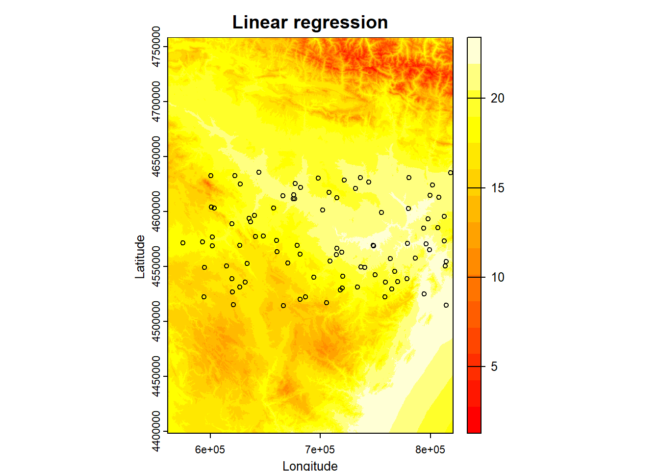
📝EXERCISE 7: Modify the script for logistic regression of fire occurrence to adapt it to spatial regression model. Use the file fire_logit.csv to obtain the coordinates of the presence and absence points and the raster layers in the folder variables_fire.
In addition:
Use a calibration sample with 75% of the data to fit the model.
Use the remaining 25% as validation sample and calculate the RMSE.
Create a spatial prediction of the model with lowest AIC.
Deliverables:
Submit the commented code using the exercises portfolio template example.
IMPORTANT: the prediction process may take a while or even crash depending on your computer power. If that is the case do not hesitate to contact me. For regression it should run fine but in the case of the logit regression and more complex models, the computational demand scales quite a bit.
Spatial analysis packages not only provide the necessary means for accessing and manipulating spatial information, but also provide us with functions aimed at creating cartography. Although it is possible to create really aesthetic maps, doing so is quite difficulty and we will probably be more comfortable designing our cartography in a desktop GIS. However, we can create maps that meet the minimum standards of cartographic design within R with not too many lines of code.
In my view, these functions will help us to quickly and easily ensure that we have properly accessed spatial information or that our results are adequate.
Let’s go from the simple to the complex little by little. Getting a graphical representation of spatial information (we still can not call this map) is very easy. Do you remember the plot() function? Actually we have already seen it applied to spatial information in the previous topic, so you should remember it. The different packages of spatial information (Maptools, raster …) add functionalities so that we can use this function to represent spatial information.
We can use plot() function with both raster and vector layers, although the result is somewhat different in each case. In vector layers we will get a “map” representing spatial features in black and white. Raster layers are plotted as an image with a default color ramp. Let’s look at an example. In the mapping folder you will find a layer called la_rioja.shp (representing the location of several agro-climatic stations in La Rioja) and an image called mde_rioja.tif27. We will load these layers into 2 objects and then use plot() on each one:
Reading layer `la_rioja' from data source
  `C:\Users\pjgel\OneDrive - udl.cat\Sync\01 - Docencia\111019 - Introduction to Spatial Statistics (MEUFOR)\INTRO_R\QMD_book\INTROR\data\Module_3\la_rioja.shp'
  using driver `ESRI Shapefile'
Simple feature collection with 1 feature and 3 fields
Geometry type: POLYGON
Dimension:     XY
Bounding box:  xmin: -3.134271 ymin: 41.91903 xmax: -1.678701 ymax: 42.64426
Geodetic CRS:  Unknown datum based upon the GRS 1980 ellipsoid
Since we are using the plot() function we can use the arguments that we saw in the Module 1. We can add titles to axis, change colors, change the symbol for points, etc. Let’s look at an example with the station layer stations_rioja.shp. This is a layer of points with which we will see how to change the type of symbol for points and even a brief incursion to combine differnt spatial layers:
Reading layer `stations_rioja' from data source
  `C:\Users\pjgel\OneDrive - udl.cat\Sync\01 - Docencia\111019 - Introduction to Spatial Statistics (MEUFOR)\INTRO_R\QMD_book\INTROR\data\Module_3\stations_rioja.shp'
  using driver `ESRI Shapefile'
Simple feature collection with 21 features and 3 fields
Geometry type: POINT
Dimension:     XY
Bounding box:  xmin: 496143 ymin: 4651108 xmax: 603302.1 ymax: 4718094
CRS: NAplot(
st_geometry(stations.rioja),
pch = 21,
bg = "black",
main = 'Agro-climatic station in La Rioja'
)
We can add the limits of the region already stored inrioja using lines(). But first we have to specify the CRS and reproject one of them:
                                             name authority code          area
1 Unknown datum based upon the GRS 1980 ellipsoid      EPSG 4019 Not specified
              extent
1 -180, 180, -90, 90 name authority code area extent
1 unknown <NA> <NA> <NA> NA, NA, NA, NASpatExtent : -3.13427138999998, -1.67870149499998, 41.919033954, 42.644264701 (xmin, xmax, ymin, ymax)SpatExtent : 496142.9785, 603302.1224, 4651107.66, 4718094.29 (xmin, xmax, ymin, ymax)After checking CRS and extent we can definetely say that one layer has geographic coordinates (rioja) and the other projected (stations.rioja). In fact one uses WGS84 (EPGS:4326) and the other UTM ED50 (EPSG:23030). We can check the appropriate reference in http://spatialreference.org/. Let’s assign them projections and the project rioja to EPSG:23030:
Warning: st_crs<- : replacing crs does not reproject data; use st_transform for
thatplot(
st_geometry(stations.rioja),
pch = 21,
bg = "black",
main = 'Agro-climatic station in La Rioja'
)
plot(st_geometry(rioja.ED50), add = T)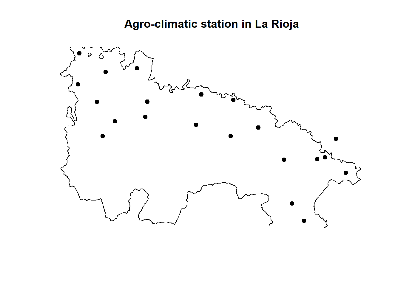
If we proceed in this way the plot we get is somewhat cut-off on the borders. This is the same that happened in the line plots we saw in Module one. The easiest way to solve it is calling plot() on the biggest layer (rioja.ED50 in this particular case). Doing so implies we have to call first stations.rioja:
plot(st_geometry(rioja.ED50), main = 'Agro-climatic station in La Rioja')
plot(
  st_geometry(stations.rioja),
  pch = 21,
  bg = "black",
  add = T
)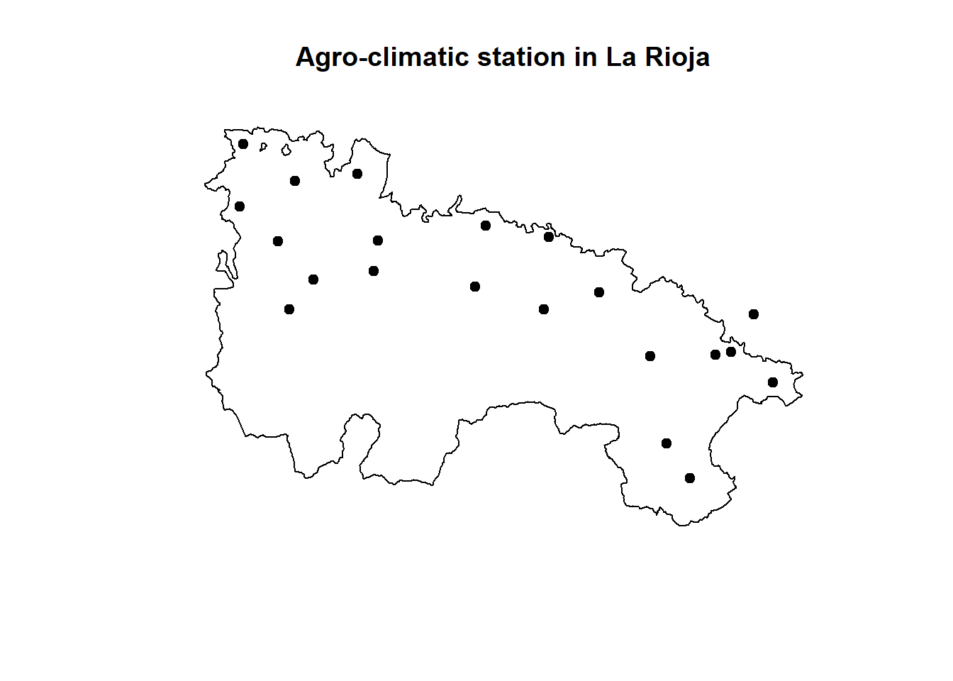
We can also start by plotting dem.rioja and overlay rioja.ED50and stations.rioja28:
plot(dem.rioja,
     main = 'Agro-climatic stations in La Rioja',
     xlab = 'Longitude' ,
     ylab = 'Latitude')
plot(st_geometry(rioja.ED50), add = T)
plot(
  stations.rioja,
  pch = 21,
  bg = 'red',
  color = "black",
  add = T
)
Warning in plot.sf(stations.rioja, pch = 21, bg = "red", color = "black", :
ignoring all but the first attribute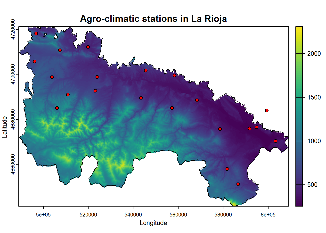
This is kind of a nice map, but it lacks several features such as north-arrow or a proper legend. Indeed we can do that and continue using plot() but there much nicer ways to go.
ggplot() (package ggplot2) is probably the most powerful plotting tool in R. In addition to create plots and charts of all kinds, it also allows mapping. Unfortunately it is also the most complex alternative in terms of the number of instructions and data format required. Additionally, tidyterra package allows plotting efficiently raster data. The ggplot2 includes the param geom_sf() that allow plotting sf vectorial data.
Here we will just see a simple example of how to create a map from a raster layer and overlay a polygon layer:
library(ggplot2)
library(tidyterra)
ggplot() +
  geom_spatraster(data = dem.rioja) +
  geom_sf(data = rioja.ED50, fill = NA) +
  geom_sf(data = stations.rioja, size = 3) +
  scale_fill_gradient2(
    low = "red",
    mid = "yellow",
    high = "green",
    limits = c(min(values(dem.rioja), na.rm = T), max(values(dem.rioja), na.rm =
                                                        T)),
    midpoint = 1250,
    na.value = "transparent"
  ) +
  theme_bw() +
  labs(title = "Agro-climatic stations",
       subtitle = "La Rioja (Spain)",
       caption = "Msc European Forestry") +
  xlab("Longitude") +
  ylab("Latitude")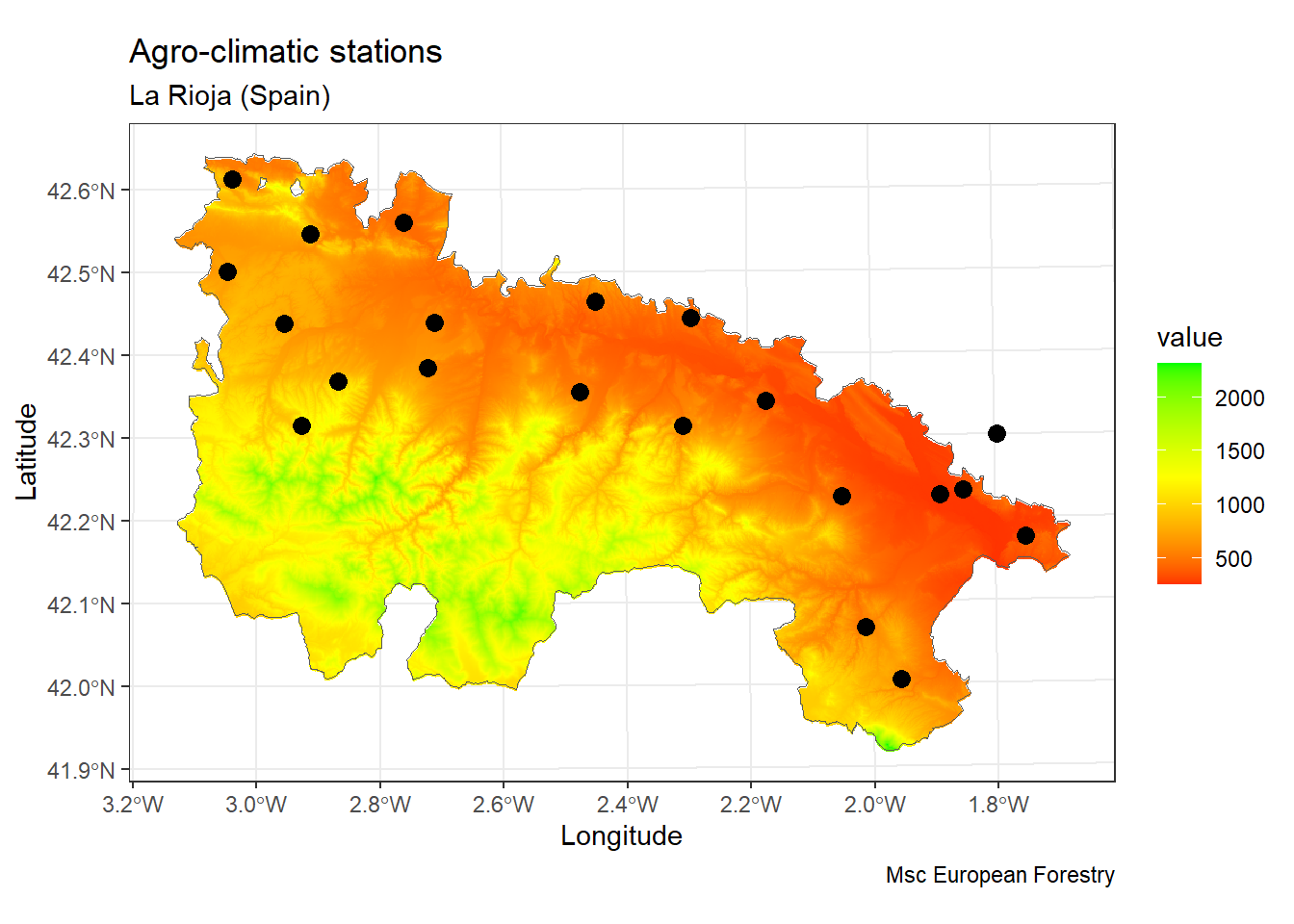
Again, before finishing the module I would like to give you some insights into the main concepts you should have become familiar with.
You must be able to access spatial layers, both vector and raster.
Be aware we can use vector layers as a source of information of point-like events to later interact with raster data.
rast objects can be used as source data for predict() so that we can produce a spatial prediction from any regression model .
The validation procedure based on random samples remains the same. We do not use spatial prediction on them since it does not make any sense.
Control structures are blocks of code that allow you to modify the execution flow of a program or script. Thanks to them, our scripts can make decisions depending on whether one or more conditions are met, repeat code fragments, etc.
The control structures are structures present in any programming language and therefore operate in a similar way regardless of the language. R is no exception. Fundamentally there are two types of control structures:
Conditional: according to one condition, execute one group or another of instructions (if).
Iteration: Execute a group of statements while a condition is met (while) or a certain number of times (for).
The first type of structures we will cover are the conditionals and their different variants. These are constructed using conditional operators:
if - else
if - else if - else
Ifelse
By means of this type of structure we will control the execution of a block of instructions depending on whether or not a condition is met. An if statement in R consists of three elements:
The keyword if
A single logical value between parentheses (or an expression that leads to a single logical value)
A block of code between braces that has to be executed when the logical value is TRUE.
The basic syntax of an if-else conditional structure is as follows:
We must distinguish the condition that must be met (condition == true), the block of instructions to execute in case the condition is met (cmd1) and the block of instructions to execute if it isn’t met (cmd2).
To construct the condition we use logical/comparison operators:
Greater than: >
Less than: <
Equal: ==
Greater than or equal to: >=
Less than or equal to: <=
Other than: !=
In addition, we can concatenate conditions using the logical operators:
And (&), if we want all conditions to be met.
Or (|), if we want any of the conditions to be met.
Not (!), If we do not want any.
For example:
This code fragment shows an example of conditional structure. In this case the condition to be met is that the number 1 is equal to 0, something that will NEVER be fulfill. This means that the instructions in the first block (print(1)) are ignored and the second block (else - print (2)) is executed.
So, is there any example more useful. It sure is. For instance, we can check whether a file does exist and thus prevent execution errors:
You can check more examples on http://www.dummies.com/programming/r/how-to-use-if-statements-in-r/.
Just for the record, it is possible to specify additional conditions using the if - else if - else structure. The syntax in this case would be the following:
In this variant we still have thecond1 and the else statement. The difference is that a second condition (cond2) has been specified to be evaluated before the statement else. The execution scheme in this case would be as follows:

Note that in this second option of conditional structure I have included a second condition but there is no limit on the number we can use before else. The additional conditions are evaluated in order from top to bottom, interrupting the process at the time that one of the conditions is met. This means that once a condition is found TRUE the rest are ignored.
The last of the possibilities that we are going to see is the ifelse function. This structure lies within what in R is known as vectorized structures, and offers a quick solution to some situations in which conditions are to be evaluated. It would be the equivalent of the apply function with respect to the iteration loops that we will see in the following section. The syntax of this type of structure is as follows:
💡ifelse(condition, valueTRUE, valueFALSE)
Basically a condition is evaluated and a value is specified if it is true (value TRUE) and another value if it is not met (value FALSE). Let’s look at a simple example:
The above example of ifelse()replaces with 0 (FALSE value) those numbers within x that do not meet the condition of being less than 5 or greater than 8 (x <5 | x> 8), leaving as they were the values that do comply with the condition (value TRUE, x).
📝 EXERCISE 8: The purpose of this exercise is to familiarize yourself with the use of conditional type control structures.
To do this you have to modify the code from the Poisson regression example in Module 2 to transform the dependent variable (num_awards), expressing it in binary terms (1/0 or absence presence).
Deliverable: Submit the commented code using the exercises portfolio template example.
The iteration control structures allow us to execute blocks of instructions a certain number of times. We have already seen something similar when we talk about the apply() function. apply() and derived functions (sapply, tapply …) allow us to execute a function iterating on the rows or columns of an array or data.frame object. These are vectorized functions, ideal for iterating or repeating functions over those objects.
However, there are other options that will allow us to construct more complex iterations. In any case, the use of vectorized iteration functions is recommended, as these require less execution time.
In R there are several iterative control structures:
for: execute a block of instructions a certain number of times.
while: Execute an instruction block while a certain condition is met.
repeat: repeats an instruction block indefinitely.
In this course we will focus on the use of for and while loops, and their possible use in regression models. Specifically we will use a for loop to optimize the k-fold validation process. The repeat loops are not very useful and can be easily replaced with while loops.
The first iterative structure we are going to see is while. As already mentioned, this structure repeats a block of code as long as a condition is met. The structure of the code is similar to what we have seen in the case of the if conditional structure. The basic syntax of the while structure is as follows:
💡while(cond) {cmd}
So, as long as cond is TRUE the instructions in cmd will keep running.
The first step is to create a variable a with value 1 that will be used to specify the condition within the while loop. Next, a loop is created whichi will be repeated as long as the value of a is less than 10 (a <10). The instruction block to be repeated within the loop is a print(a) function that shows the value of the variable a at each step of the loop. Then 1 (a <-a + 1) is added to the value of a and the loop is restarted.
This process is repeated by adding 1 to a until it reaches = 10 and the code is no longer executed within the while because a is no longer less but equal to 10.
In the example, the variable a changes value inside the loop. Otherwise, that is, its value would always be 1 (as specified when creating the variable a = 1), the condition would always be fulfilled and we would enter an infinite loop.
The last of the control structures we are going to see is the for loop. This structure, just like while, repeats a block of code, but this time the code runs a certain number of times we can specify.
There are two fundamental differences from what we have seen in the while loop. First, the for loop requires an auxiliary variable (or counter) that changes value at each step of the loop; and second, it needs a structure or sequence from which the values of the auxiliary variable (usually a vector) will be obtained. To better understand these differences let’s see an example of the syntax in R:
💡for(counter in vector) {commands}
counter is the auxiliary variable and vector the vector from which the values of counter will be obtained. commadsrepresents the instructions that are executed at each step of the loop. Let’s look at a simple example:
In the above example, the auxiliary variable or counter is called i, and takes the values of the vector created by the instruction 1:10. The instruction to be executed at each step of the loop is print(i) which simply shows the value of i at each step of the loop in the terminal. The vector created contains correlative values from 1 to 10. It has therefore 10 positions and consequently the loop is executed that number of times. This is how we control how many times the code is executed.
It is important to note that the counter variable (i in the example) is created by us so we can name it as best we can.
In this example we have used variables and objects with numeric values. However, for loops can be used with variables or objects that store values of another type such as text strings.
An example of this is to use for on list with paths to files, so that we can recursively access all or part of those files and perform a set of operations with each of them. For instance, calibrate a regression model for several data files.
Tree models are computationally intensive techniques for recursively partitioning response variables into subsets based on their relationship to one or more (usually many) predictor variables. Classification trees involve a categorical response variable and regression trees a continuous response variable; the approaches are similar enough to be referred to together as CART (Classification and Regression Trees). Predictors can be any combination of categorical or continuous variables.
All tree-based techniques produce one or more tree objects that represent a series of splits from the root or top of the tree. In one popular implementation (from the tree package), each split is based on finding the one predictor variable (and a given threshold of that variable) that results in the greatest change in explained deviance (for Gaussian error, this is equivalent to maximizing the between-group sum of squares (i.e,. minimizing SSE), as in an ANOVA). Tree functions do this using an exhaustive search of all possible threshold values for each predictor. Once a split is made, the routine is repeated for each group separately until all deviance (or some low threshold) is explained or there are too few samples in the remaining subset.
When would you use a CART model rather than a GLM or GAM? The recursive structure of CART models is ideal for uncovering complex dependencies among predictor variables. If the effect of, say, soil moisture content depends strongly on soil texture in nonlinear fashion, CART models of species occurrences have a better shot at detecting this than interaction terms in GLMs or even GAMs. When you have good reason to suspect non-additive interactions among variables, or have many variables and don’t know what to expect, try a tree model. If you only have a few variables and generally expect simple linear or curvilinear functions with relatively simple (or no) interactions, tree models will only return approximations of the actual relationship (bumpy as opposed to smooth) using too many parameters. Tree models also have a tendency to overfit (i.e., error is fitted along with the data), and thus lead to over-interpretation. Finally, because they do not involve fitting a smooth function to data, tree model output can be overly sensitive to small changes in the input variables.
There are two common packages for CART models in R: tree and rpart. I find tree easier to use because it is based on our familiar deviance statistics; rpart output is more difficult to compare to GLM and GAM alternatives. As we’ll see below, these routines can produce very different result for the same dataset, so use carefully!
You will notice that from now on regression (and classification) models are quite similar as far as it comes to model fitting and validation. That is one of the most powerfull advantages of using R for modeling purposes. It is quite easy going from one model to another by changing a few code lines.
First of all, installing and loading the package(s). The mandatory package here is rpart, rpart.plot is only used to produce nicer plots.
The following examples are constructed using the R14EbroBasin.csv dataset. This dataset has a first column with a binary dependent variable called logit.1 and a large set of predictor variables described in……
Similar to our previous dataset logit.csv, this file contains the necessary information to fit a regression model of forest fire danger. The difference lies in the fact that now we have way more choices to make in terms of variable selection. Other than that, the procedure is quite similar to the logistic regression with the difference we are going to use a different method to fit the model:
Let`s get started and load our data and fit (grow) our first tree-based model:
r14 <- read.csv("./Data/Module_4/R14EbroBasin.csv", header = T)
tree <- rpart(
Plogit.1 ~ h1 + FFMC + DENS_VIAS,
data = r14,
method = "class",
control = rpart.control(minsplit = 5, cp = 0.003)
)
plot(tree)
text(tree,
use.n = T,
all = T,
cex = .6)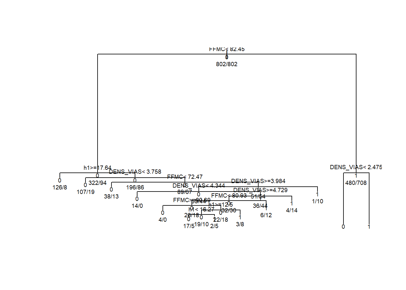
tree, we use:
💡rpart(formula, data, method,control)
where:
formula is the regular formula argument we already know.
data specifies the data frame.
method, either "class" for a classification tree or "anova" for a regression tree.
control. Optional parameters for controlling tree growth. For example, control=rpart.control(minsplit=30, cp=0.001) requires that the minimum number of observations in a node be 30 before attempting a split and that a split must decrease the overall lack of fit by a factor of 0.001 (cost complexity factor) before being attempted29.
If you prefer a more colorful and nicer plot run the following:
rpart.plot(
tree,
# middle graph
box.palette = "GnBu",
branch.lty = 3,
shadow.col = "gray",
nn = TRUE
)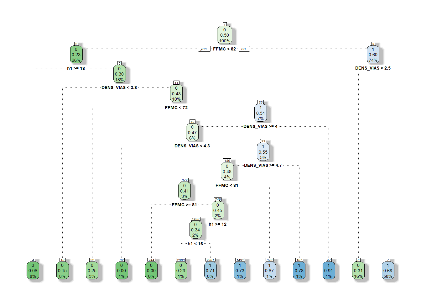
You can also check https://www.statmethods.net/advstats/cart.html for more details on how to explore tree objects. For now let’s prune our tree to optimize the model and prevent over-fitting. Over-fitting occurs when a model is excessively complex, such as having too many parameters relative to the number of observations. A model that has been over-fitted has poor predictive performance, as it overreacts to minor fluctuations in the training data. In our case, the tree has too many branches and most likely it can be optimized.
tree.pruned <- prune(tree, cp = tree$cptable[which.min(tree$cptable[, "xerror"]), "CP"])
rpart.plot(
tree.pruned,
# middle graph
box.palette = "GnBu",
branch.lty = 3,
shadow.col = "gray",
nn = TRUE
)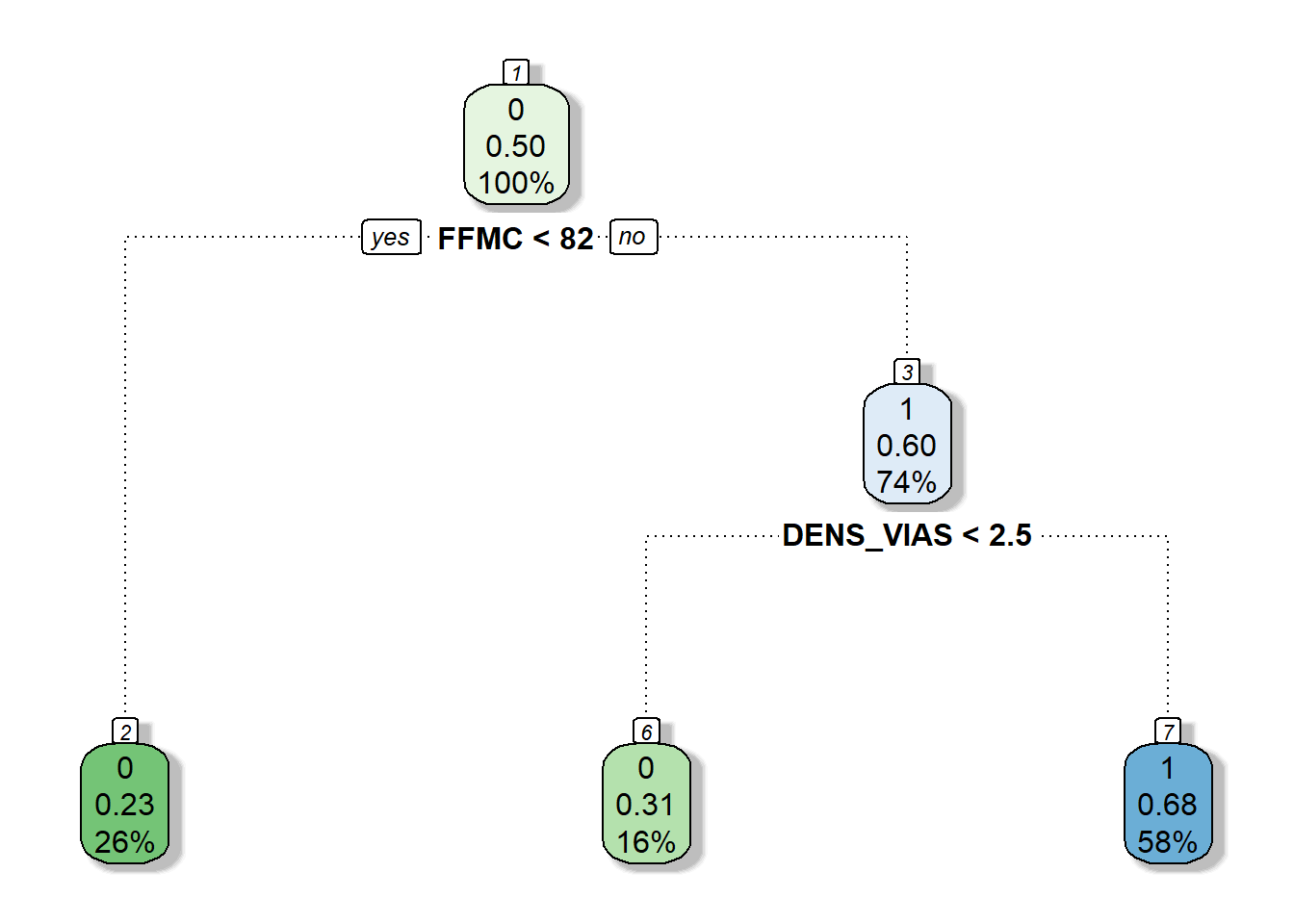
You see? The pruned version of the model is much more straightforward and simple. I basically splits according to fine fuel moisture content (FFMC) and predicts no fire occurrence (0) when FFMC<82. If FFMC > 82 and the density of road network (DENS_VIAS) is above 2.5 it predicts fire occurrence (1). Otherwise, predicts no occurrence. As you can see, the tree-based model recursively splits data according to predictors and threshold detection. This kind of model works pretty well and is easy to understand.
Same as any other type of regression/classification model, a tree-based model has to be evaluated so that we can determine its performance. We will proceed in a way similar to what we saw in the case of logistic regression. No wonder we are using the same kind of response variable, ie, a binary dependent variable. Therefore, outputs should be comparable.
One of the most basic ways to evaluate a classification model is the use of confusion matrix and some kind of agreement index. We already saw a confusion matrix in the validation of logistic models. In the following chunk of code we have the equivalent instructions using a tree model. Is mostly the same but for the fact that since we are already classifying (method="class") to obtain a categorical response (either 0 or 1). That means we do not have to reclassify the predicted response.
In any case, we use predict as we did before and join together predicted and observed values. Then we construct a confusion matrix and we are ready to evaluate the prediction:
| 0 | 1 | |
|---|---|---|
| 0 | 502 | 300 |
| 1 | 176 | 626 |
We can calculate the proportion of correctly classified records as we did before, obtaining a 70% of successfully classified records:
Nevertheless, that is not the most appropriate way to do it. A better approach is using the Cohen’s Kappa Agreement index. Kappa measures the percentage of data values in the main diagonal of the table and then adjusts these values for the amount of agreement that could be expected due to chance alone. Kappa is always less than or equal to 1. A value of 1 implies perfect agreement and values less than 1 imply less than perfect agreement.
There are several packages in R to calculate Kappa. Here we will use fmsb which provides a fair interpretation of the index:
$Result
Estimate Cohen's kappa statistics and test the null hypothesis that the
extent of agreement is same as random (kappa=0)
data: fit.table
Z = 16.28, p-value < 2.2e-16
95 percent confidence interval:
0.3617712 0.4511964
sample estimates:
[1] 0.4064838
$Judgement
[1] "Moderate agreement"We are going to see how to grow a regression tree model rather than a classification one. We can proceed almost in the same way than we saw for logit model except for the calibration of the model. The only thing we have to do is change the method in the rpart function. We use method="anova" instead of method="class":
Again, we prune the resulting tree so it gets simplified and optimized:
tree.pruned <- prune(tree, cp = tree$cptable[which.min(tree$cptable[, "xerror"]), "CP"])
tree.pruned.pred <- predict(tree.pruned, r14, type = "vector")
ctable <- data.frame(cbind(r14$Plogit.1, tree.pruned.pred))
names(ctable) <- c("Obs", "Pred")
boxplot(Pred ~ Obs,
data = ctable,
col = c('darkgreen', 'darkred'))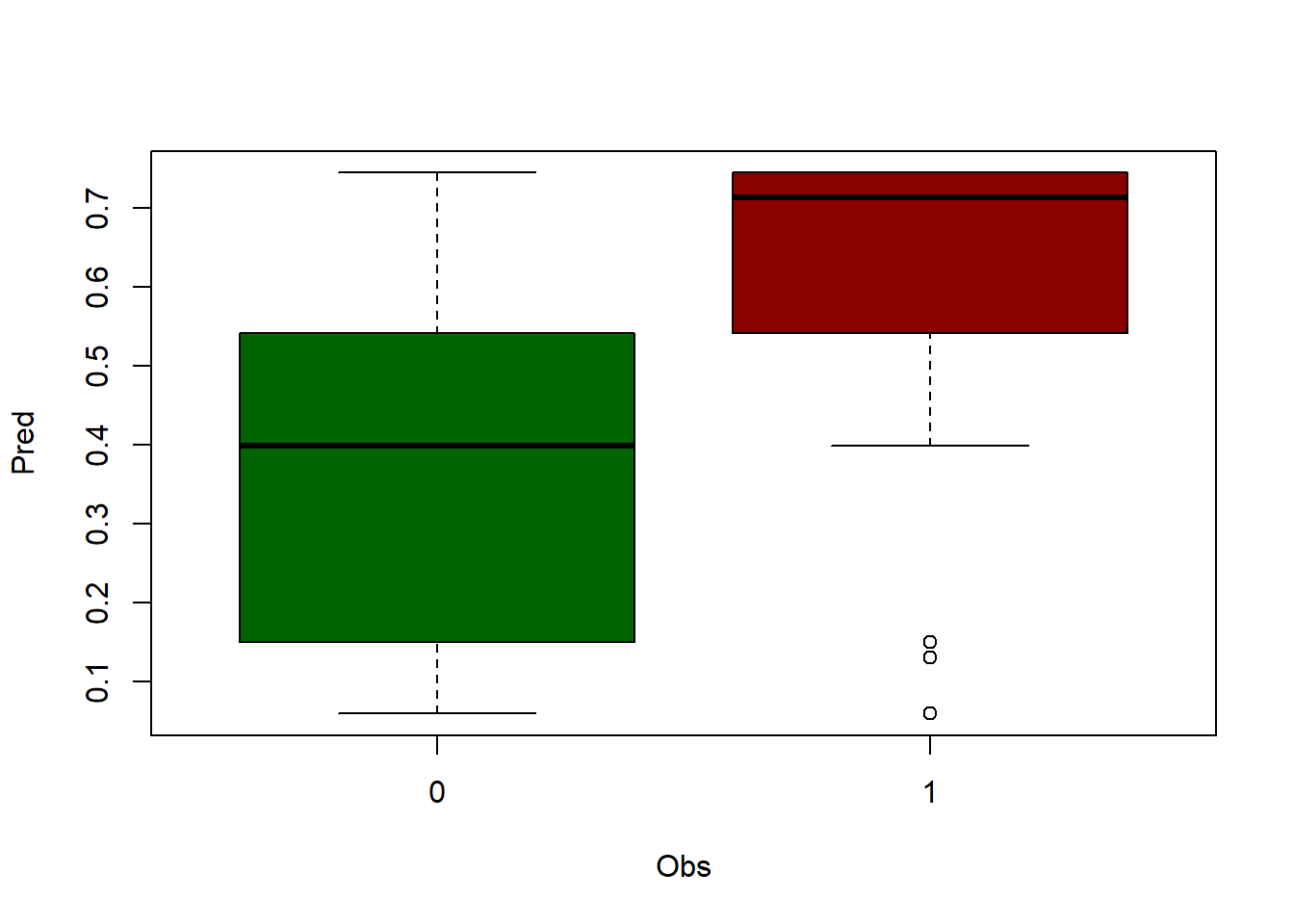
threshold <- 0.5
ctable$Pred[ctable$Pred > threshold] <- 1
ctable$Pred[ctable$Pred < threshold] <- 0
accuracy <- table(ctable$Pred, ctable$Obs)
print('Correctly classified:')[1] "Correctly classified:"[1] 0.7032419| 0 | 1 | |
|---|---|---|
| 0 | 502 | 176 |
| 1 | 300 | 626 |
$Result
Estimate Cohen's kappa statistics and test the null hypothesis that the
extent of agreement is same as random (kappa=0)
data: accuracy
Z = 16.28, p-value < 2.2e-16
95 percent confidence interval:
0.3617712 0.4511964
sample estimates:
[1] 0.4064838
$Judgement
[1] "Moderate agreement"As you can see, the output from the regression alternative is a bit better but not that different. Let’s see another regression example using our weather data from regression.txt30.
tree.pruned.pred <- predict(tree.pruned, regression, type = "vector")
obs.pred <- data.frame(regression$Tavg, tree.pruned.pred)
names(obs.pred) <- c('observed', 'predicted')
plot(
obs.pred$observed,
obs.pred$predicted,
main = 'Observed vs Predicted',
ylab = 'Predicted temperature',
xlab = 'Observed temperature',
pch = 21,
col = 'black',
bg = 'steelblue'
)
abline(
lm(obs.pred$predicted ~ obs.pred$observed),
lty = 2,
col = 'gray20',
lwd = 3
)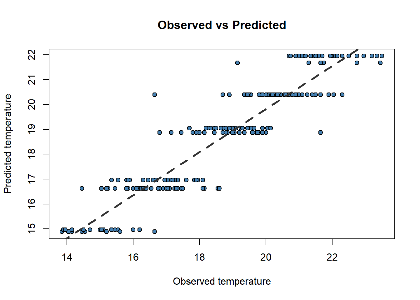
[1] 0.8550267Well, in this case the overal RMSE is 0.72 vs the 0.87 we obtained with linear regression so apparently the tree-based approach works better than linear regression. I mean apparently because we haven’t split our data into calibration and validation sample to conduct a proper validation to keep the example simple.
Note that we can also produce spatial predictions if we use spatial data adapting the spatial regression example. We proceed almost in the same way, changing only the method (vector instead of response) in the predict() function, and obviously the calibration method:
library(sf)
library(ggplot2)
library(terra)
library(tidyterra)
library(rpart)
library(rpart.plot)
wStation <- st_read('./data/Module_4/weather_stations.shp')Reading layer `weather_stations' from data source
`C:\Users\pjgel\OneDrive - udl.cat\Sync\01 - Docencia\111019 - Introduction to Spatial Statistics (MEUFOR)\INTRO_R\QMD_book\INTROR\data\Module_4\weather_stations.shp'
using driver `ESRI Shapefile'
Simple feature collection with 95 features and 10 fields
Geometry type: POINT
Dimension: XY
Bounding box: xmin: 574966 ymin: 4514365 xmax: 818327 ymax: 4635648
Projected CRS: ED50 / UTM zone 30NSimple feature collection with 5 features and 10 fields
Geometry type: POINT
Dimension: XY
Bounding box: xmin: 593975 ymin: 4522166 xmax: 644107 ymax: 4635648
Projected CRS: ED50 / UTM zone 30N
ID YEAR MONTH STATION ELEV TABS_MAX TABS_MIN
1 3013 2012 6 MOLINA DE ARAGON 1063 32.8 3.2
2 9307A 2012 6 SAN MARTIN DEL MONCAYO (D.G.A. 816 33.0 6.5
3 9311C 2012 6 BORJA (AYUNTAMIENTO) 440 36.5 9.0
4 9336L 2012 6 FUENDEJALON (D.G.A. 455 35.0 11.0
5 9337A 2012 6 PRADILLA DE EBRO 228 35.0 10.0
TAVG_MAX TAVG_MIN T_AVG geometry
1 23.8 8.4 16.10 POINT (593975 4522166)
2 22.8 10.7 16.75 POINT (600216 4632520)
3 26.8 14.6 20.70 POINT (622021 4632336)
4 26.7 14.7 20.70 POINT (627162 4624836)
5 27.9 15.1 21.50 POINT (644107 4635648) [1] 16.10 16.75 20.70 20.70 21.50 17.80 18.35 16.35 16.50 18.70 18.00 15.85
[13] 15.80 18.85 18.30 19.35 18.10 16.95 17.40 18.00 19.55 20.85 19.85 18.80
[25] 21.90 21.95 16.80 22.15 22.15 19.85 20.30 20.55 20.90 20.55 20.90 16.15
[37] 19.60 16.40 19.60 17.25 17.00 19.00 20.65 22.30 22.05 20.60 17.90 21.75
[49] 17.45 18.45 16.70 20.70 19.90 19.90 23.50 22.30 20.15 22.05 21.20 22.10
[61] 21.75 21.00 21.60 21.75 20.70 20.05 20.00 20.20 21.00 19.80 20.80 21.70
[73] 18.75 18.90 18.80 19.75 18.75 20.80 20.35 19.75 19.70 22.15 20.80 23.35
[85] 19.15 22.95 21.30 21.65 22.75 23.20 22.45 16.10 17.30 16.25 16.30wStation.coords <- data.frame(st_coordinates(wStation))
names(wStation.coords) <- c('x', 'y')
list.rasters <- list.files('./data/Module_3/variables_weather/', full.names = TRUE)
rasters <- rast(list.rasters)
crs(rasters) <- "epsg:23030"
# plot(rasters[[1]])
# plot(st_geometry(wStation),add=T)
vindep <- terra::extract(rasters, wStation.coords) %>% dplyr::select(-ID)
colnames(vindep) <- c('d_atl', 'd_medit', 'lat', 'long', 'elevation')
head(vindep, n = 5) d_atl d_medit lat long elevation
1 271251 183121 4522150 593950 1100
2 162508 232762 4632550 600250 794
3 167966 213217 4632350 622050 432
4 176676 205230 4624850 627150 434
5 171488 195728 4635650 644150 211[1] "vdep" "d_atl" "d_medit" "lat" "long" "elevation"tree <- rpart(
Tavg ~ long + lat + d_atl + d_medit + elevation,
data = regression,
method = "anova",
control = rpart.control(minsplit = 5, cp = 0.003)
)
tree.pruned <- prune(tree, cp = tree$cptable[which.min(tree$cptable[, "xerror"]), "CP"])
names(rasters) <- names(regression)[2:6]
mod.pred <- predict(rasters, tree.pruned, type = "vector", index = 1)[1] "PROJCRS[\"ED50 / UTM zone 30N\",\n BASEGEOGCRS[\"ED50\",\n DATUM[\"European Datum 1950\",\n ELLIPSOID[\"International 1924\",6378388,297,\n LENGTHUNIT[\"metre\",1]]],\n PRIMEM[\"Greenwich\",0,\n ANGLEUNIT[\"degree\",0.0174532925199433]],\n ID[\"EPSG\",4230]],\n CONVERSION[\"UTM zone 30N\",\n METHOD[\"Transverse Mercator\",\n ID[\"EPSG\",9807]],\n PARAMETER[\"Latitude of natural origin\",0,\n ANGLEUNIT[\"degree\",0.0174532925199433],\n ID[\"EPSG\",8801]],\n PARAMETER[\"Longitude of natural origin\",-3,\n ANGLEUNIT[\"degree\",0.0174532925199433],\n ID[\"EPSG\",8802]],\n PARAMETER[\"Scale factor at natural origin\",0.9996,\n SCALEUNIT[\"unity\",1],\n ID[\"EPSG\",8805]],\n PARAMETER[\"False easting\",500000,\n LENGTHUNIT[\"metre\",1],\n ID[\"EPSG\",8806]],\n PARAMETER[\"False northing\",0,\n LENGTHUNIT[\"metre\",1],\n ID[\"EPSG\",8807]]],\n CS[Cartesian,2],\n AXIS[\"(E)\",east,\n ORDER[1],\n LENGTHUNIT[\"metre\",1]],\n AXIS[\"(N)\",north,\n ORDER[2],\n LENGTHUNIT[\"metre\",1]],\n USAGE[\n SCOPE[\"Engineering survey, topographic mapping.\"],\n AREA[\"Europe - between 6°W and 0°W - Channel Islands (Jersey, Guernsey); France offshore; Gibraltar; Ireland offshore; Norway including Svalbard - offshore; Spain - onshore; United Kingdom - UKCS offshore.\"],\n BBOX[35.26,-6,80.49,0.01]],\n ID[\"EPSG\",23030]]"ggplot() +
geom_spatraster(data = mod.pred, alpha = .8) +
geom_sf(
data = wStation %>% st_transform(4326),
pch = 21,
col = "grey1",
fill = "grey"
) +
scale_fill_distiller(palette = "Spectral", direction = 2) +
theme_classic() +
ylab("Latitude") +
xlab("Longitude") +
labs(title = "CART regression")<SpatRaster> resampled to 500633 cells.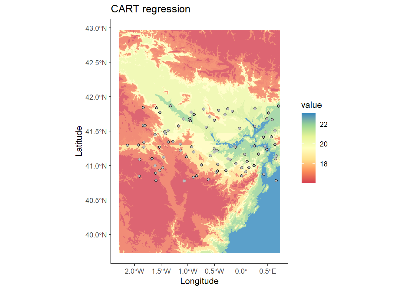
Random Forest (RF) is a prediction algorithm that uses a set of binary rules to calculate a target value. It can be used for classification (categorical variables) or regression (continuous variables).
The Random Forest algorithm is based on the decision tree method (CART), based on using training data to fit a model. The tree-generator algorithm:
Determines which variable to use to divide a node and the value to be used.
Decide when to stop (terminal node) or continue division.
Assign one class to each termination.
In this regard, RF is quite similar to CART. RF is an assembler classifier. These type of classifiers are based on calibrating several submodels, in this case decision trees (Figure 4.2), and aggregating the results of the different models to determine the final prediction. RF also provides information on the accuracy of the model and the importance of the predictive variables.
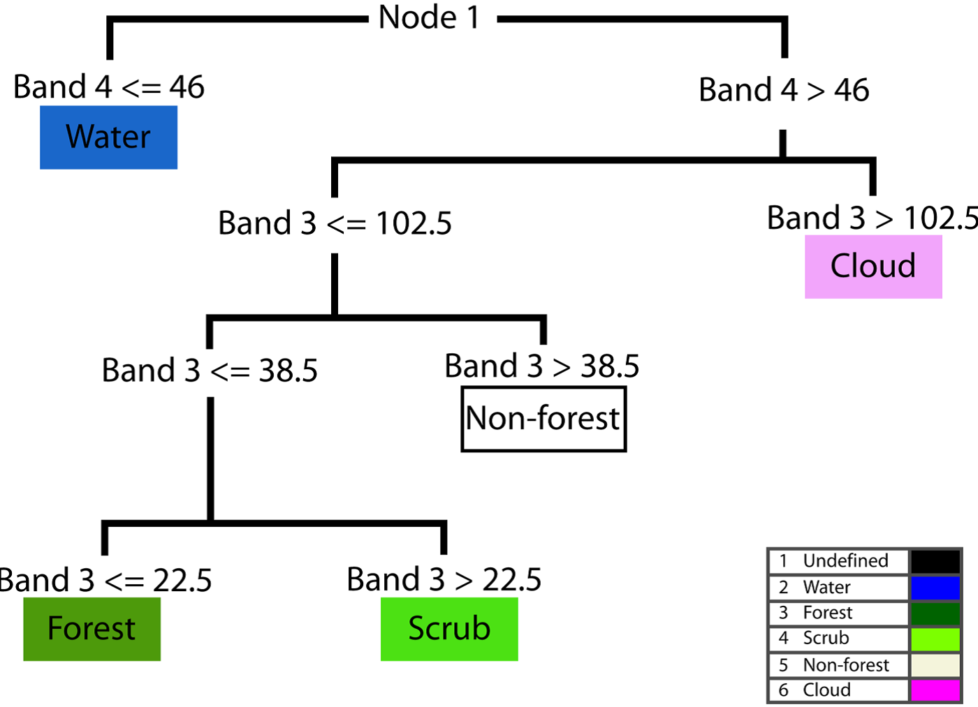
The algorithm randomly selects 2/3 of the calibration sample data in successive steps (each step represents a decision tree) to fit the model. The remaining sample (called Out-Of-Bag or OOB) is used it to measure error and importance of variables. The allocation of the final value is done according to the votes obtained from the different trees. This OOB procedure which radomly subsets the data on each iteration (tree) has some implications. One of them is that given that random component, two (or more) RF models will never be exactly equal since data subsetting is random. Therefore RF falls within the so-called stochastic models. Another outcome from the OBB selection is that it works as a cross-validation. Therefore we can skip CV if we want, although it is still recommended to conduct it.
Each tree is constructed using the following process:
Let
Let
Choose a training set for this tree and use the rest of the test cases to estimate the error.
For each node in the tree, randomly choose m variables on which to base the decision. Calculate the best partition from the m variables of the training set.
For the prediction a new case is pushed down following the tree structure, and it is assigned the label or value of its terminal node. This process is iterated by all the trees and the result that obtains the greater number of incidents (terminal node in which it finishes more times) is used as prediction.
The randomForest package provides the functions for working with Ranfom Forest models in R. We will mainly focus on using the randomForest() function, which allows the adjustment of both regression or classification models.
💡help(randomForest)
randomForest(formula, data, mtry, importance=TRUE, ntree)
The syntax of the formula argument is, again, the same we already know from other regression models such as lm() or glm(). However there are other specific arguments such as:
mtry: number of variables considered to separate each node.
importance: determines whether or not the importance of predictive variables in the model is calculated.
ntree: number of trees used to grow for the prediction.
You can find a detailed description of fitting RF (and other machine learning algorithms) in (Rodrigues & de la Riva, 2014)
We are almost done with regression (and classification) models so we are going see how to conduct a full comparison of models. For comparison purposes we are going to fit a logistic regression model and a RF one and conduct a k-fold cross-validation to evaluate models and, thus, determine which one works best.
Note that we are comparing models based on binary response variables so what we are going to see next is model-specific. This means we can only apply this procedure to binary models.
First of all, we load (and install) the randomForest package and the data stored in logit.csv31.
randomForest 4.7-1.1Type rfNews() to see new features/changes/bug fixes.
Attaching package: 'randomForest'The following object is masked from 'package:dplyr':
combineThe following object is masked from 'package:ggplot2':
margin#Read and check data for regression
mydata <- read.csv2("./data/Module_4/logit.csv", header = TRUE)
knitr::kable(head(mydata), booktabs = TRUE, caption = 'Contingency table of prediction accuracy.')| logit_1_0 | Cattle | Prot_area | Powerlines | Railroads | WAI | WGI | WUI | Machinery | FAPU | Tracks | Change_pop |
|---|---|---|---|---|---|---|---|---|---|---|---|
| 1 | 480.0 | 24031.14 | 0.0 | 0 | 0 | 0 | 0 | 0.33 | 0 | 0.000 | -0.006 |
| 1 | 763.0 | 1000000.00 | 0.0 | 0 | 452471 | 0 | 0 | 2.17 | 0 | 0.000 | -0.075 |
| 1 | 495.5 | 313822.50 | 261509.6 | 0 | 344277 | 150339 | 0 | 0.51 | 0 | 0.000 | 0.200 |
| 1 | 2666.0 | 0.00 | 0.0 | 0 | 430075 | 200063 | 0 | 0.83 | 0 | 74735.281 | 0.148 |
| 1 | 271.0 | 609511.88 | 0.0 | 0 | 341357 | 0 | 0 | 2.86 | 0 | 15166.960 | 0.241 |
| 1 | 635.0 | 0.00 | 0.0 | 0 | 195445 | 0 | 0 | 0.50 | 0 | 3106.922 | -0.003 |
logit_1_0 Cattle Prot_area Powerlines
Min. :0.0000 Min. : 0 Min. : 0 Min. : 0
1st Qu.:0.0000 1st Qu.: 302 1st Qu.: 0 1st Qu.: 0
Median :0.0000 Median : 1077 Median : 0 Median : 0
Mean :0.4115 Mean : 3588 Mean : 218721 Mean : 12961
3rd Qu.:1.0000 3rd Qu.: 4324 3rd Qu.: 192465 3rd Qu.: 0
Max. :1.0000 Max. :32130 Max. :1000000 Max. :395122
Railroads WAI WGI WUI
Min. : 0 Min. : 0 Min. : 0 Min. : 0
1st Qu.: 0 1st Qu.: 0 1st Qu.: 0 1st Qu.: 0
Median : 0 Median : 0 Median : 0 Median : 0
Mean : 15531 Mean :118215 Mean :157418 Mean : 4302
3rd Qu.: 0 3rd Qu.:265614 3rd Qu.:281098 3rd Qu.: 0
Max. :828983 Max. :977458 Max. :997742 Max. :767285
Machinery FAPU Tracks Change_pop
Min. : 0.000 Min. : 0 Min. : 0 Min. :-0.39900
1st Qu.: 0.700 1st Qu.: 0 1st Qu.: 0 1st Qu.:-0.04800
Median : 1.910 Median : 0 Median : 0 Median : 0.01000
Mean : 3.136 Mean : 103649 Mean : 71129 Mean : 0.03808
3rd Qu.: 4.090 3rd Qu.: 0 3rd Qu.: 61762 3rd Qu.: 0.09500
Max. :44.500 Max. :1000000 Max. :798414 Max. : 1.50000 Next we fit a logit regression and a random forest one. Nothing new with the logistic model. To fit the RF model we can leave parameters as defaults, just be sure to at least use theimportance=TRUE:
mylogit <- glm(logit_1_0 ~ WAI + WUI + FAPU + Machinery + Change_pop,
data = mydata,
family = "binomial")
myrf <- randomForest(
logit_1_0 ~ WAI + WUI + FAPU + Machinery + Change_pop,
data = mydata,
mtry = 3,
importance = TRUE,
ntree = 500
)Warning in randomForest.default(m, y, ...): The response has five or fewer
unique values. Are you sure you want to do regression?Before we go any further let’s take a look to the model output. Just by calling the object containing the model (myrf) we get two useful outputs. The Mean of squared residuals, similar to the RMSE, and % Var explained similar to the
Call:
randomForest(formula = logit_1_0 ~ WAI + WUI + FAPU + Machinery + Change_pop, data = mydata, mtry = 3, importance = TRUE, ntree = 500)
Type of random forest: regression
Number of trees: 500
No. of variables tried at each split: 3
Mean of squared residuals: 0.09815658
% Var explained: 59.47There are several functions in R to evaluate the performance of binary models, regardless of the modeling approach we follow. This is quite useful to obtain indexes and common parameter to establish comparisons. In this example we will compare logit and RF using the AUC and some graphical approaches. I haven’t included here the confusion matrix we saw before but we can use them as well if we want to. We can even calculate the Kappa index but we already know how to do that so let’s focus on what’s new.
Some of the commands we need come from the package plotmo. Remember to install and load it before you continue. First of all, we are going to build a graphical output called logistic response curves (LRC). LRC are line plots showing the relationship between a given variable (in the x-axis) and the predicted probability (y-axis). Using this we can determine more complex patterns in the explanatory behavior of our predictors. For instance, we saw in Module 3 how to interpret the coefficients (Estimates) of the logistic model. Using LRC we kind go into that, but in a more detailed way.
Loading required package: FormulaLoading required package: plotrix
Attaching package: 'plotrix'The following object is masked from 'package:terra':
rescale plotmo grid: WAI WUI FAPU Machinery Change_pop
0 0 0 1.91 0.01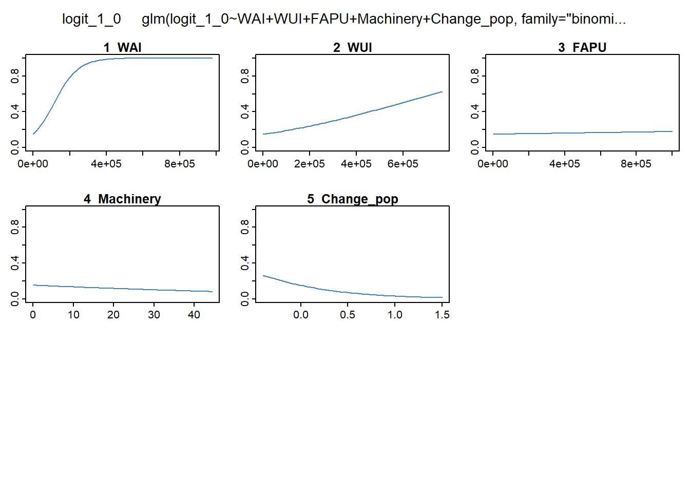
If we take a look to the slope of the curves we can determine the kind of relationship. Increasing slopes imply postive relationship, ie, the greater the value of the predictor, the higher the probability (in this cas wildfire occurrence probability); and viceversa. But, why do we want to use this if we already know how to get the coefficients. Because RF does not produce coefficientes, thus this is the only way to understand how predictors behave in RF.
As we can see, the profile of the RF curves is much more complex. You sure have noticed that in addition to the curves, RF also produces bivariate surface plots combinig two predictors and the predicted probability. That’s one of the reasons why RF is considered quite powerfull. It is not only that Rf can use any kind of predictor, regardless collinearity or lack of normality, but it is also able to take into account variable interaction while modeling. In any GLM we just model the relationship between a set of predictors and a response variable but RF is much more powerful, going beyond individual relationships.
Here we are going to use the AUC again, but we will use the plotmo package to calculate and plot it. We will also produce several charts showing the separability in the prediction of presence and absence. Ideally, we want that our models predicts high probaility in presence locations and low in absence. That is what determines the performance of the model. In statistics, a receiver operating characteristic curve, i.e. ROC curve, is a graphical plot that illustrates the diagnostic ability of a binary classifier system as its discrimination threshold is varied. The area under the curve (often referred to as simply the AUC) is equal to the probability that a classifier will rank a randomly chosen positive instance higher than a randomly chosen negative one (assuming ‘positive’ ranks higher than ‘negative’)(see this entry for more information)[https://en.wikipedia.org/wiki/Receiver_operating_characteristic#Area_under_the_curve].
Let’s begin with plotting the curves and getting the AUC’s values. To do that firt we need to build and evaluate object from package dismo. This is a quite useful object to explore and compare the performance of models. evaluate works in a similar way as predict does, but in this case the function splits predictions from presence and absence. It takes 3 arguments:
p, which stands for the vector of presence in the original data table.
a, which stands for the vector of absence in the original data table.
model, our fitted binary model.
Next, we evaluate both mylogit and myrf:
Loading required package: rasterLoading required package: sp
Attaching package: 'raster'The following object is masked from 'package:tidyterra':
selectThe following object is masked from 'package:dplyr':
selectOnce we have our evaluate objects we are ready to get the AUCs:
par(mfrow = c(1, 2))
boxplot(mylogit.eval, col = c('darkgreen', 'red'))
boxplot(myrf.eval, col = c('darkgreen', 'red'))Warning in (function (z, notch = FALSE, width = NULL, varwidth = FALSE, : some
notches went outside hinges ('box'): maybe set notch=FALSE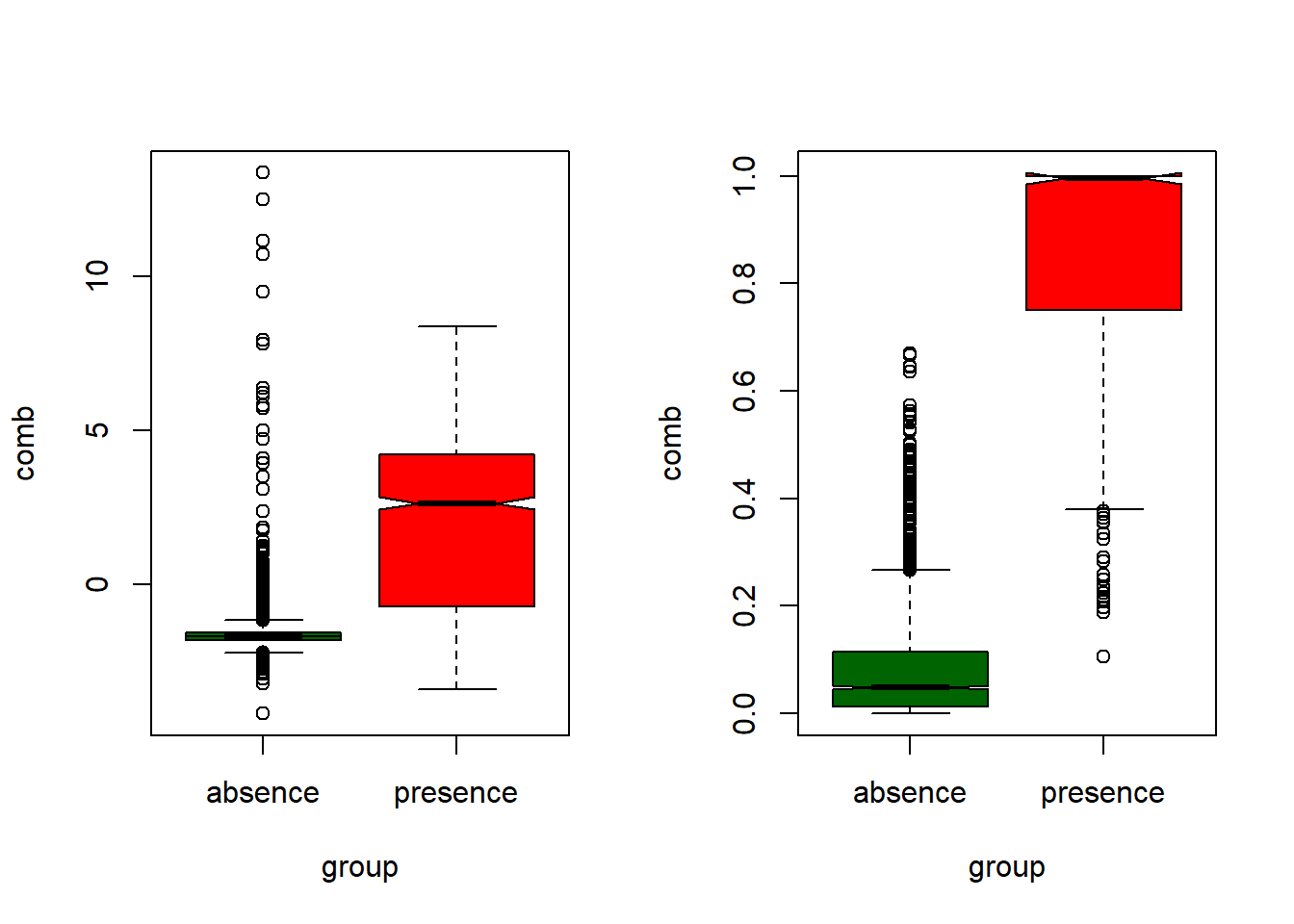
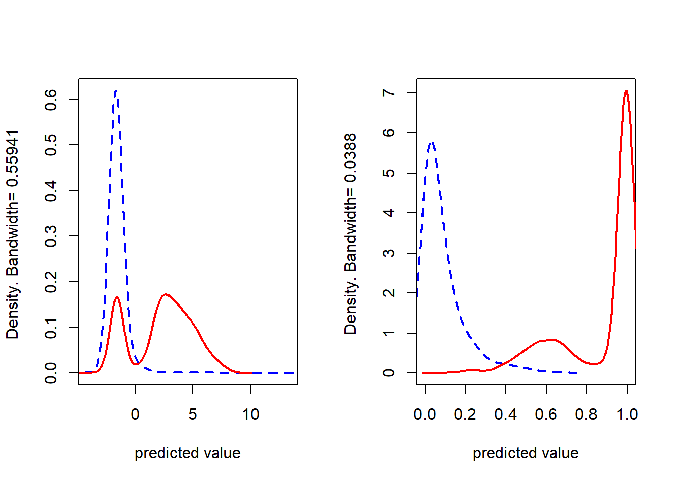
Exploring these two last plots allow to determine to which extent we have wrong predictions in our models. We already know from the AUC that RF works better (with a suspicious 0.99 AUC value) so we expect predictions to behave properly. But, if we focus on logistic plots (the ones on the left) we can see much more anomalous (outliers) points in the boxplots, and a second mode (red line from left density plot) peak in presence locations with low predicted probabilities.
We can get the explantory sense of our variables from plotmo() but, which ones are more important? I mean, how can I know if a given variable actually contributes to the model? In GLM is easy, we have the significance codes, but RF doesn’t. Instead of that we can access variable importance like this:
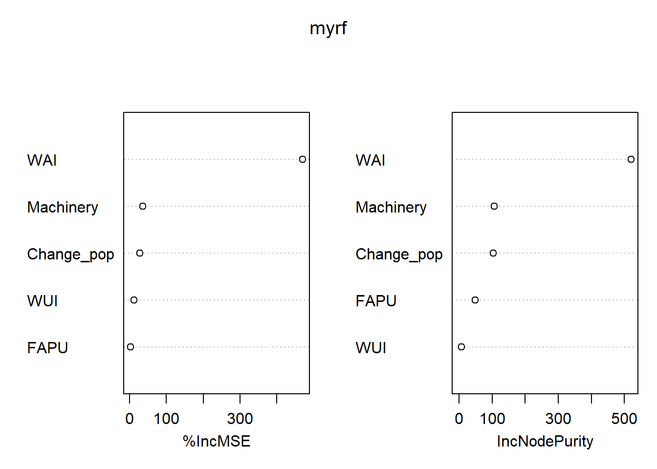
%IncMSE IncNodePurity
WAI 0.2987728772 520.338192
WUI 0.0010351069 7.969288
FAPU 0.0008062731 48.306852
Machinery 0.0151711471 106.668467
Change_pop 0.0108809831 103.843488This gives us two indicators of variable importance. The one I like the most is the %IncMSE which reports the percent increase in the Mean Square Error if we drop a given variable. Thus, the greater the %IncMSE the higher the contribution of that variable.
Cross validation is a model evaluation method that is better than residuals. The problem with residual evaluations is that they do not give an indication of how well the model will do when it is asked to make new predictions for data it has not already seen. One way to overcome this problem is to not use the entire data set when training a learner. Some of the data is removed before training begins. Then when training is done, the data that was removed can be used to test the performance of the learned model on new’’ data. This is the basic idea for a whole class of model evaluation methods called cross validation.
K-fold cross validation is one way to improve over the holdout method. The data set is divided into k subsets, and the holdout method is repeated k times. Each time, one of the
We are going to use the function kfold() from dismo and use a forloop to build four models using differnt folds for each one. This is probably the most complex workflow we are going to see in the course. Since, we will get four models, we will calculate four evaluations. To save all the outputs we will create to void lists and store models and evaluations in them. Once the process finishes we will construct plots for each model iteration to determine to which extent predictions depend on data subsets.
The k-fold procedure is thus based on the kfold() function. In fact, it works similar to sample() and we will use it accordingly. The main difference is that instead of creating a vector with random row names (as sample() does) it creates a vector with
Here we create two lists. m will store RF models and e model evaluations:
Here comes the magic. We create a loop to iterate over our sample()but using our new created groups. We fit our model using the training subset and evaluate using the test (validation) one.
for (i in 1:k) {
train <- mydata[group != i, ]
test <- mydata[group == i, ]
myrf <- randomForest(
logit_1_0 ~ WAI + WUI + FAPU + Machinery + Change_pop,
data = mydata,
mtry = 3,
importance = TRUE,
ntree = 500
)
m[[i]] <- myrf
e[[i]] <- evaluate(p = test[test$logit_1_0 == 1, ], a = test[test$logit_1_0 ==
0, ], model = myrf)
}Once models are calibrated and, more importante, evaluated we create the plots. I have combined loops with par(mrfrow) so I get a cleaner code but you can call the plots manually if you want.
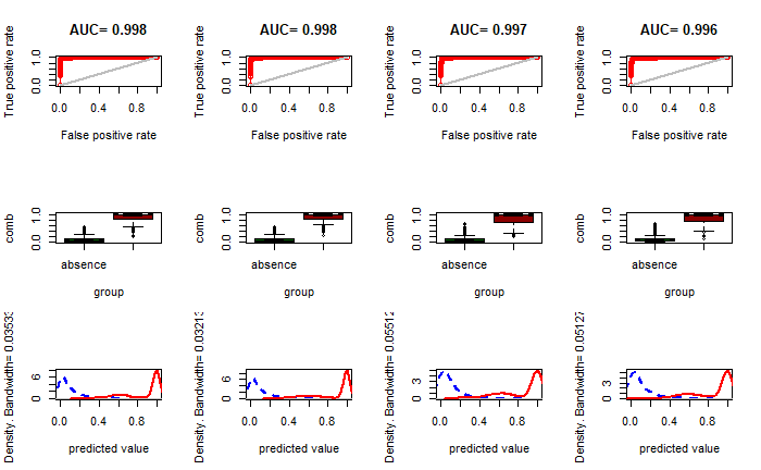
📝 EXERCISE 9: Use the information from the spatial version of the logistic regression model to fit a CART and a RF model. You must:
Adapt the code to fit a RF, replacing the glm() instruction from the logit model.
Remember you must implement a validation procedure using a 75% and 25% split for calibration and validation, respectively.
Create a spatial raster layer with the prediction.
Deliverable:
Submit the commented code using the exercises portfolio template example.
Finally, we will see how to conduct a classification procedure instead of regression. Classification is a process in which we try to predict a categorical response variable. In CART we had to use a parameter (method) to specify we want to conduct a classification. In RF it is easier. It suffices to use a categorical (factor) variable instead of a numerical one and it will fit a calibration model. The outputs are different from regression. In fact we will retrieve a confusion matrix and a % of success directly extracted from the OOB. Let’s see an example using the ifn3_clc_fcc70.csv file. It contains information about vegetation species in Aragon (Spain) and land cover information. This data comes from forest inventories from the Spanish Ministry of Environment combined with Corine Land Cover data. That will set our response variable. As predictors we will use several raster layers from the clas_rf folder in Data in bands.rar. These raster layers contain information about:
pmm: precipitation in
pet: potential evapotranspiration
greeness: vegetation index from remote sensing L7 (adimensional).
wetness: wetness index from remote sensing L7 (adimensional).
brightness: brightness index from remote sensing L7 (adimensional).
elevation: altitude in
As always we start by loading the required packages:
Then we read the data and rename the columns and store coordinates:
We access the raster layers and extract the values in the forest inventor locations:
list.rast <- list.files("./data/Module_4/clas_rf/",
pattern = ".asc$",
full.names = T)
rasters <- rast(list.rast)
fni.rasters <- extract(rasters, coord)
fni.table <- data.frame(cbind(fni.rasters, fni))
fni.table <- subset(fni.table) %>% dplyr::select(-c(POINT_X, POINT_Y, ID))
#Cleansing NA values
fni.table[fni.table == 0] = NA
fni.table <- na.omit(fni.table)Now we calibrate the model. The dependent variable is called species:
We can take a look at the performance of the model and the confusion matrix:
| Bare soil | Fagus sylvatica | Irrigated crops | Pinus halepensis | Pinus nigra | Pinus pinaster | Pinus sylvestris | Pinus uncinata | Quercus coccifera | Quercus faginea | Quercus ilex | Quercus pubescens | Rainfed crops | Riparian vegetation | Shrubs | Urban | Water bodies | class.error | |
|---|---|---|---|---|---|---|---|---|---|---|---|---|---|---|---|---|---|---|
| Bare soil | 0 | 0 | 0 | 0 | 1 | 0 | 1 | 0 | 0 | 0 | 0 | 0 | 2 | 0 | 0 | 0 | 0 | 1.0000000 |
| Fagus sylvatica | 0 | 0 | 0 | 0 | 0 | 0 | 5 | 0 | 0 | 1 | 0 | 0 | 0 | 0 | 0 | 0 | 0 | 1.0000000 |
| Irrigated crops | 0 | 0 | 15 | 1 | 0 | 0 | 0 | 0 | 0 | 0 | 0 | 0 | 10 | 5 | 0 | 0 | 0 | 0.5161290 |
| Pinus halepensis | 0 | 0 | 2 | 90 | 0 | 2 | 0 | 0 | 0 | 0 | 1 | 0 | 7 | 0 | 4 | 0 | 0 | 0.1509434 |
| Pinus nigra | 0 | 0 | 0 | 6 | 33 | 1 | 22 | 0 | 0 | 0 | 3 | 0 | 0 | 0 | 2 | 0 | 0 | 0.5074627 |
| Pinus pinaster | 0 | 0 | 0 | 1 | 0 | 6 | 0 | 0 | 0 | 0 | 2 | 0 | 0 | 0 | 0 | 0 | 0 | 0.3333333 |
| Pinus sylvestris | 0 | 2 | 0 | 0 | 13 | 0 | 226 | 1 | 0 | 2 | 3 | 0 | 0 | 0 | 1 | 0 | 0 | 0.0887097 |
| Pinus uncinata | 0 | 1 | 0 | 0 | 0 | 0 | 2 | 1 | 0 | 0 | 0 | 0 | 0 | 0 | 0 | 0 | 0 | 0.7500000 |
| Quercus coccifera | 0 | 0 | 0 | 3 | 1 | 0 | 0 | 0 | 0 | 2 | 2 | 0 | 0 | 0 | 1 | 0 | 0 | 1.0000000 |
| Quercus faginea | 0 | 1 | 0 | 0 | 1 | 0 | 5 | 0 | 1 | 7 | 6 | 0 | 0 | 0 | 1 | 0 | 0 | 0.6818182 |
| Quercus ilex | 0 | 0 | 0 | 4 | 5 | 1 | 9 | 0 | 0 | 1 | 15 | 0 | 2 | 1 | 1 | 0 | 0 | 0.6153846 |
| Quercus pubescens | 0 | 0 | 0 | 0 | 1 | 0 | 6 | 0 | 0 | 0 | 0 | 0 | 0 | 0 | 0 | 0 | 0 | 1.0000000 |
| Rainfed crops | 0 | 0 | 3 | 5 | 0 | 0 | 0 | 0 | 0 | 0 | 0 | 0 | 128 | 2 | 8 | 0 | 0 | 0.1232877 |
| Riparian vegetation | 0 | 0 | 6 | 0 | 0 | 0 | 0 | 0 | 0 | 0 | 1 | 0 | 1 | 28 | 0 | 0 | 0 | 0.2222222 |
| Shrubs | 0 | 0 | 0 | 9 | 3 | 0 | 6 | 0 | 0 | 2 | 1 | 0 | 14 | 0 | 12 | 0 | 0 | 0.7446809 |
| Urban | 1 | 0 | 0 | 2 | 0 | 0 | 0 | 0 | 0 | 0 | 0 | 0 | 4 | 0 | 0 | 8 | 0 | 0.4666667 |
| Water bodies | 0 | 0 | 0 | 0 | 1 | 0 | 0 | 0 | 0 | 0 | 0 | 0 | 0 | 0 | 0 | 0 | 41 | 0.0238095 |
Get the importance of our predictors:
And finally, get the spatial prediction map. Be carefull!! This will take a long time to execute:
ggplot() +
geom_spatraster(data = clas_rfo_pred) +
scale_fill_manual(
values = c(
"orange3",
"#B3E0A6FF",
"darkgreen" ,
"#99D789FF",
"#87CB79FF",
"#77BE6BFF",
"#6AB25FFF",
"#5DA554FF",
"#4E9A50FF",
"#3F8D4CFF",
"#2F8243FF" ,
"#27753DFF",
"gold3",
"#24693DFF",
"#5DA554FF",
"red",
"lightblue"
),
na.value = "transparent"
) +
theme_minimal()<SpatRaster> resampled to 501160 cells.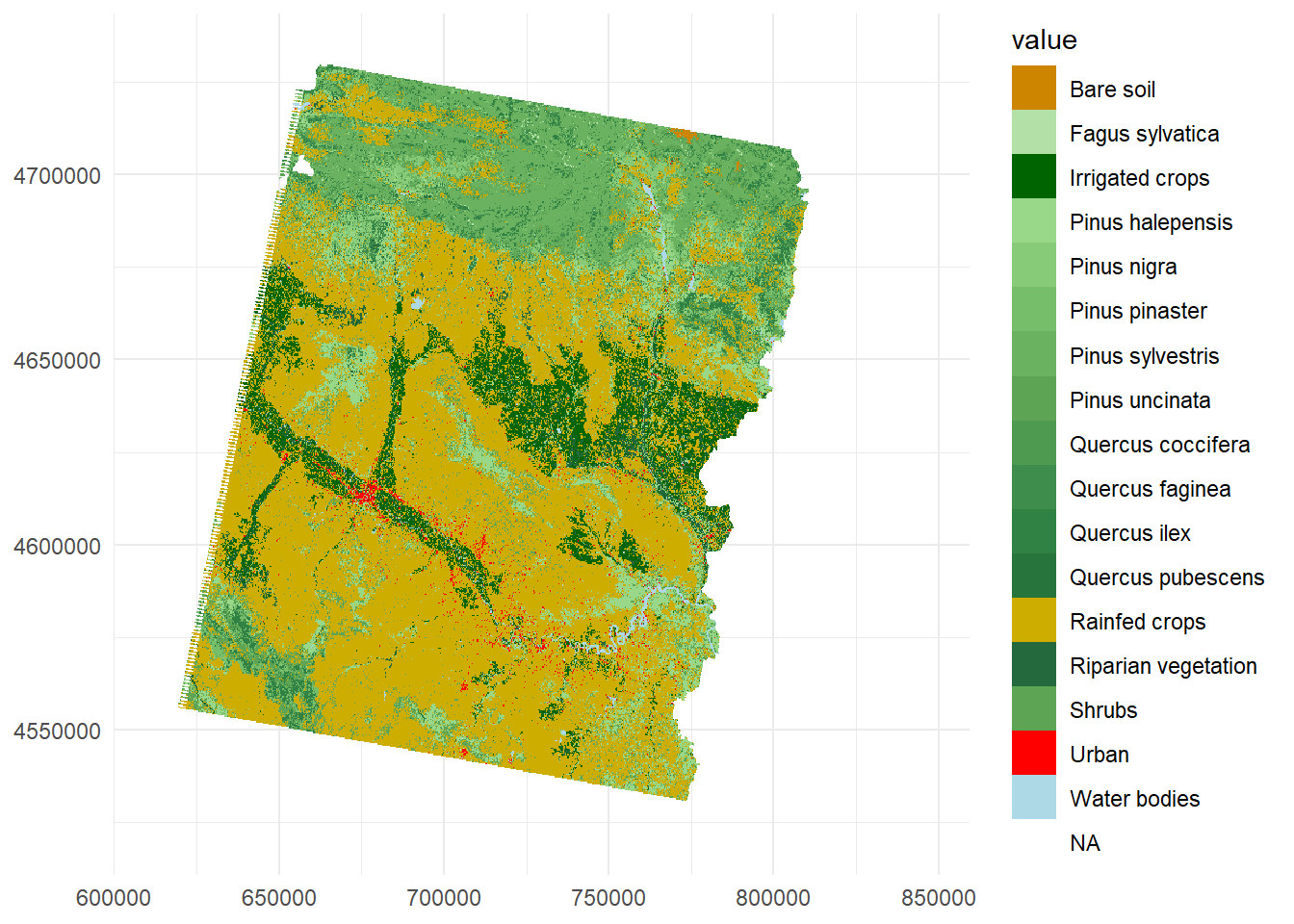
Again, before finishing the module I would like to give you some insights into the main concepts you should have become familiar with.
The spatial approach for any regression or classification model works mostly in the same way.
CART and RF algorithms allow both regression and classification with slight modifications.
We can compare outpus from any binary regression/classification tool.
We can build our own k-fold cross-validation approach.
As we know, spatial information can be analyzed statistically as any other type of information. In this sense, interpolation methods stand out among the different possibilities available, being the process most frequently associated with geostatistics. Interpolate is predict values at locations where no measurements have been made, from information in known locations.
Traditionally, GIS software applications incorporates utilities and tools to carry out interpolation processes based on one or several variable point measurements. R is no exception, and provides a full set of procedures that allow interpolating using several approaches.
Within spatial information there is a particular type of phenomena or variable that is characterized by taking value in any location. These variables are known as continuous phenomena, as opposed to objects or entities with easily recognizable limits (variables or discrete features). For example:
Continuous: temperature, elevation, atmospheric pressure…
Discreet: streets of a city, trees, plots…
Continuous variables are usually represented using the raster data model which allows values to be continuously associated in the territory provided each pixel has value. However, is not always measured continuously, but we take a measurement in certain locations. An exception to this is information from remote sensing, although its use is limited and may not fit what we need (period of time, frequency, resolution, lack of information). That is why on numerous occasions the only information we have is a sample taken at a certain number of locations. By means of geostatistical techniques it is possible to model or construct continuous surfaces from this type of information through interpolation or regression processes. For instance, we have used data on temperature in our regression examples to build a continuous surface of temperature values. In that example, we take point location data to build a raster surface by modelling the relationship among temperature and a set of predictors. Interpolation allows doing the same but without requiring associated predictors. Rather, it is based in the concept of spatial autocorrelation.
Spatial autocorrelation is an important concept in spatial statistics. It is a both a nuisance, as it complicates statistical tests, and a feature, as it allows for spatial interpolation. Its computation and properties are often misunderstood. This chapter discusses what it is, and how statistics describing it can be computed.
Autocorrelation (whether spatial or not) is a measure of similarity (correlation) between nearby observations. To understand spatial autocorrelation, it helps to first consider temporal autocorrelation.
Autocorrelation is also known as the First Law of Geography according to Waldo Tobbler:
Everything is related to everything else, but near things are more related than distant things.
This first law is the foundation of the fundamental concepts of spatial dependence and spatial autocorrelation and is utilized specifically for the inverse distance weighting method for spatial interpolation and to support the regionalized variable theory for kriging.
Measures of spatial autocorrelation describe the degree two which observations (values) at spatial locations (whether they are points, areas, or raster cells), are similar to each other. So we need two things: observations and locations.
A commonly used statistic that describes spatial autocorrelation is Moran’s I, and we’ll discuss that here in detail. Other indices include Geary’s C and, for binary data, the join-count index. The semi-variogram also expresses the amount of spatial autocorrelation in a data set (see the chapter on interpolation).
Moran’s autocorrelation coefficient (often denoted as
where
Quite not so intuitively, the expected value of
We can calculate spdep or ape. We are going to use the last one to measure spatial autocorrelation in temperature from weather_stations.shp:
Reading layer `weather_stations' from data source
`C:\Users\pjgel\OneDrive - udl.cat\Sync\01 - Docencia\111019 - Introduction to Spatial Statistics (MEUFOR)\INTRO_R\QMD_book\INTROR\data\Module_5\weather_stations.shp'
using driver `ESRI Shapefile'
Simple feature collection with 95 features and 10 fields
Geometry type: POINT
Dimension: XY
Bounding box: xmin: 574966 ymin: 4514365 xmax: 818327 ymax: 4635648
Projected CRS: ED50 / UTM zone 30NTo calculate Moran’s I, we will need to generate a matrix of inverse distance weights. In the matrix, entries for pairs of points that are close together are higher than for pairs of points that are far apart. For simplicity, we will treat the latitude and longitude as values on a plane rather than on a sphere–our locations are close together and far from the poles. When using latitude and longitude coordinates from more distant locations, it’s wise to calculate distances based on spherical coordinates (the geosphere package can be used).
We can first generate a distance matrix, then take inverse of the matrix values and replace the diagonal entries with zero:
coords.wstation <- st_coordinates(wstations)
dists <- as.matrix(dist(coords.wstation))
dists.inv <- 1 / dists
diag(dists.inv) <- 0
dists.inv[is.infinite(dists.inv)] <- 0
knitr::kable(dists.inv[1:5, 1:5], booktabs = TRUE, caption = 'Distance matrix.')| 1 | 2 | 3 | 4 | 5 |
|---|---|---|---|---|
| 0.0e+00 | 9.00e-06 | 8.80e-06 | 9.30e-06 | 8.10e-06 |
| 9.0e-06 | 0.00e+00 | 4.59e-05 | 3.57e-05 | 2.27e-05 |
| 8.8e-06 | 4.59e-05 | 0.00e+00 | 1.10e-04 | 4.48e-05 |
| 9.3e-06 | 3.57e-05 | 1.10e-04 | 0.00e+00 | 4.97e-05 |
| 8.1e-06 | 2.27e-05 | 4.48e-05 | 4.97e-05 | 0.00e+00 |
We have created a matrix where each off-diagonal entry Moran.I:
$observed
[1] 0.2929226
$expected
[1] -0.0106383
$sd
[1] 0.02076697
$p.value
[1] 0Based on these results, we can reject the null hypothesis that there is zero spatial autocorrelation present in the variableT_AVG at alpha = .05, ie, there is spatial autocorrelation among weather stations.
The above example is based on a weigthing scheme based on distance between stations. We can follow other approaches like the binary distance matrix. For instance, we can only consider those stations within a 10000 meters range.
$observed
[1] 0.7919163
$expected
[1] -0.0106383
$sd
[1] 0.1607139
$p.value
[1] 5.923762e-07📝 EXERCISE 10: On of the main uses we can make of spatial autocorrelation is check whether residuals from our regression models are spatially correlated. Ideally, residual must not be autocorrelated but, since now, you weren’t aware of this neither knew how to check spatial autocorrelation.
Go back to our first model of spatial regression and apply Moran’s I to the residuals of the prediction. You must:
Use spatial layers to retrieve the information.
Build a calibration and validation sample.
Fit the model.
Obtain the prediction on the validation sample.
Calculate the residuals on the validation sample.
Check for spatial autocorrelation using Moran’s I.
The growing need for spatially-continuous information has led to the integration of interpolation methods in GIS.
Interpolation methods allow the generation of continuous surfaces from measurements at point locations (sample or sample points). Interpolation is essentially a mathematical procedure that has been translated into GIS and allows predicting values for the cells of a raster from a limited number of sample data points. Therefore, surface interpolation tools create a continuous (or predicted) surface from sample point values. The different interpolation methods can be initially classified according to the type of result they produce:
Exact interpolators: those that predict a value identical to that which the variable actually adopts at the sampling point.
Inexact interpolators: those in which the resulting value does not match that of the sample data and therefore there is difference between actual and estimated values.
However, the classification of interpolation methods that we can find in some GIS applications, such as ArcGIS, differentiates two other main groups of techniques:
Deterministic: generate continuous surfaces by degree of similarity or smoothing. Within this category we find the global, local, IDW and splines methods.
Geostatistical: generate continuous surfaces from the statistical properties of the starting data. Within this category we find Kriging and Co-kriging.
For the development of this course we will focus mainly on IDW (Inverse distance Weigthing) and Kriging methods. The first is framed within the deterministic methods, being in turn an exact interpolator; and the second is part of the geostatistical methods, also belonging to the set of inexact interpolators. We will see in detail the procedure for their calculation using the gstat package in addition to some aspects about validation and estimation of the error in the prediction.
As it can be inferred from their name, nearest neighbor inteporpolation is based on using only the closest locations in the interpolation procedure. The most basic approach to do this are proximity polygons, also known as voronoi polygons. It basically consist on assign the value of the closet location to build a constant value polygon.
bbox <- st_as_sfc(st_bbox(wstations))
v_pols = st_collection_extract(st_voronoi(do.call(c, st_geometry(wstations))))
plot(st_intersection(v_pols %>% st_set_crs(st_crs(wstations)), bbox))
plot(st_geometry(wstations), col = "red", add = T)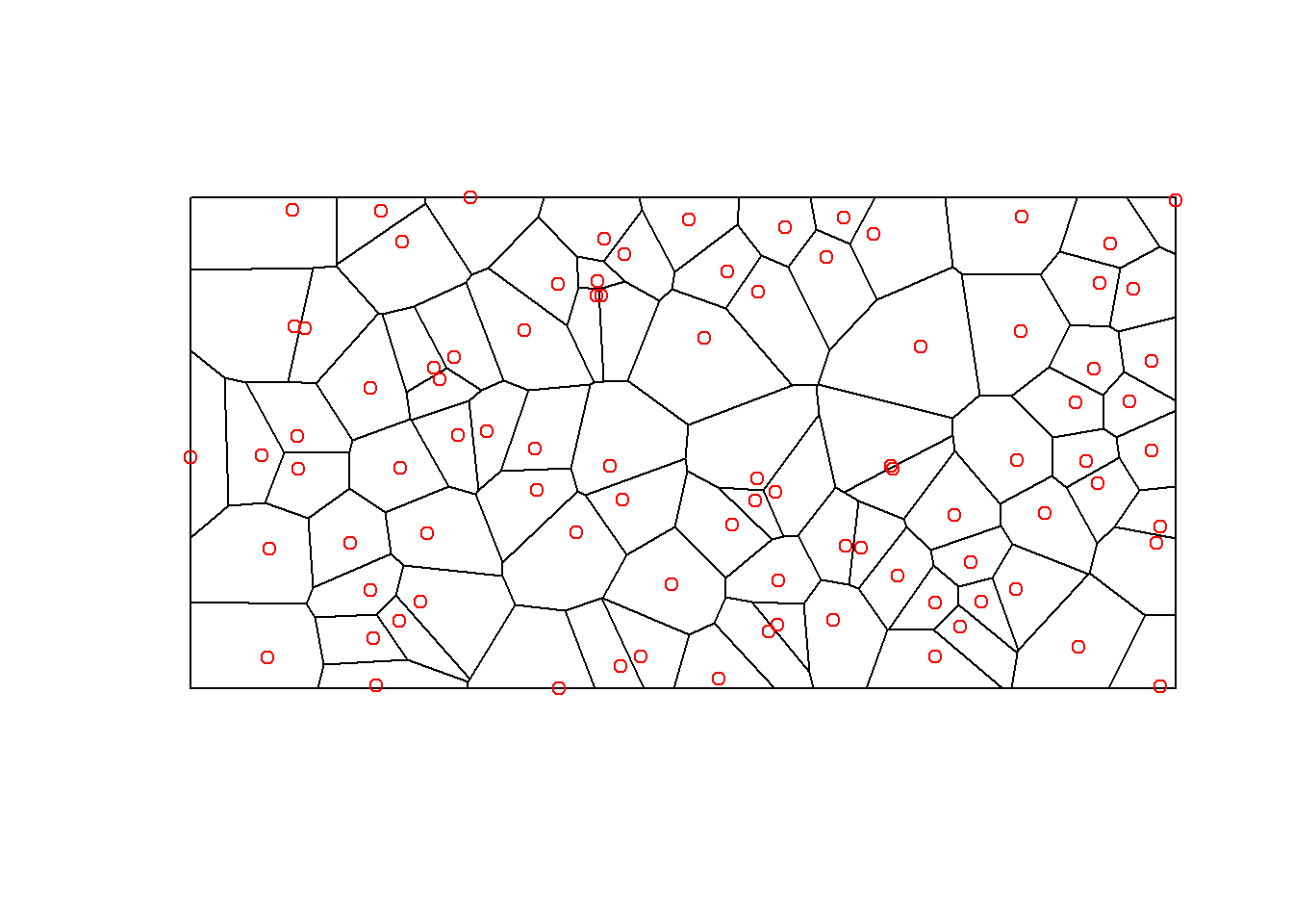
💡This procedure is not often employed since it has many drawbacks:
It strongly depends on an even distribution of the point sample.
The result is not realistic, producing ackward edge and discontinuities effects.
It combines ideas of proximity (autocorrelation) with gradual changes that, related to distance, occur in almost any environmental variable.
The estimated value
As an example, the Spanish provinces, designed between 1820 and 1833 during the Enlightenment era, exemplify Thiessen polygons. These regions were strategically organized to ensure each province maintained close spatial equidistance from its capital city. This rationalist approach aimed for efficient governance and communication, reflecting the Enlightenment’s emphasis on reason and systematic organization. As a result, these provinces stand as a well example of spatial planning for effective administration and connectivity.
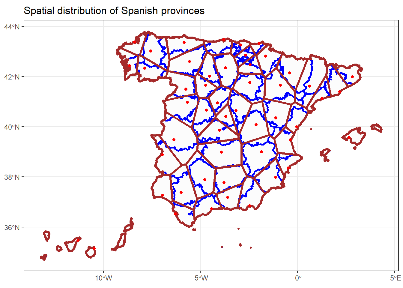
In this example we will see how to calibrate an interpolation model. We will start by loading the necessary packages. Since we are going to generate the interpolation from the prec.shp point vector layer we will need the sf package. prec.shp contains data of average monthly and annual precipitation.
On the other hand, we need the package that gives access to interpolation methods. In this case we will use the package gstat. Finally we will need the packages sf and terra to be able to generate a raster layer from the interpolation result.
Reading layer `prec' from data source
`C:\Users\pjgel\OneDrive - udl.cat\Sync\01 - Docencia\111019 - Introduction to Spatial Statistics (MEUFOR)\INTRO_R\QMD_book\INTROR\data\Module_5\prec.shp'
using driver `ESRI Shapefile'
Simple feature collection with 205 features and 18 fields
Geometry type: POINT
Dimension: XY
Bounding box: xmin: 586710 ymin: 4445844 xmax: 796907 ymax: 4741136
Projected CRS: International_1924_UTM_Zone_30N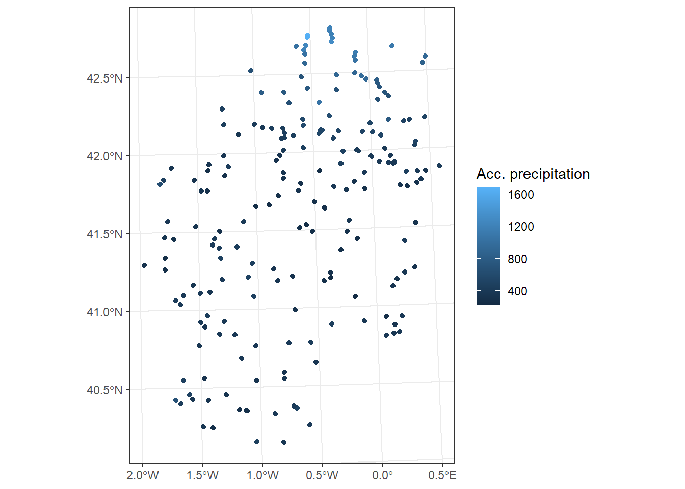
Next we create the raster matrix in which we are going to store the interpolation What we do here is create a blank canvas in which we will stamp the result from the interpolation procedure. We get the spatial extent from the point layer and choose the desired pixel size:
Once we have the raster we generate a raster matrix (gridded). This is a specific type of spatial object of R. For practical purposes we will treat it as if it were a normal raster:
p <- as.data.frame(r, xy = T)
p <- st_as_sf(p, coords = c("x", "y")) %>% st_set_crs(st_crs(r))
idw = idw(Total ~ 1, pstations, p)[inverse distance weighted interpolation]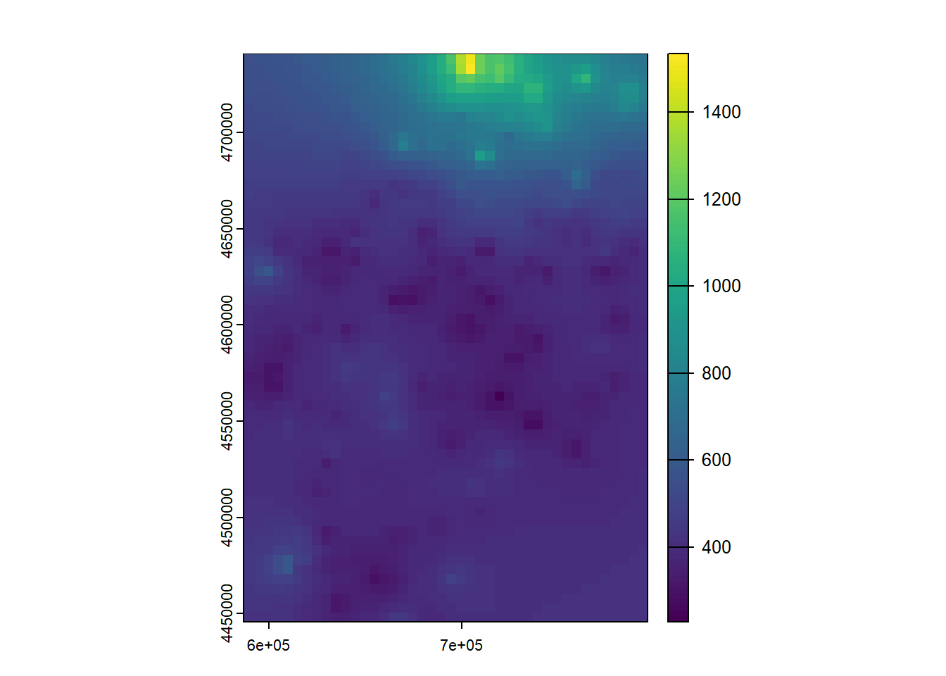
With this we have already completed the interpolation process. However, we can play with some parameters of the method as the number of neighbors nmax the value of the exponent of distance idp:
[inverse distance weighted interpolation]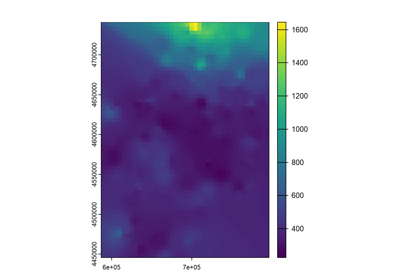
This is all we need to know to adjust interpolation models with IDW. However, we have adjusted the model with all the points. From the experience we already have in the case of regression models, you should know that this is not correct at all. We should do some kind of quality control of the result. The simplest and most common way is to divide the sample in the same way as we did with the linear regression models and calculate the RMSE. As simple as that.
The IDW (inverse distance weighted) and Spline interpolation tools are referred to as deterministic interpolation methods because they are directly based on the surrounding measured values or on specified mathematical formulas that determine the smoothness of the resulting surface. A second family of interpolation methods consists of geostatistical methods, such as kriging, which are based on statistical models that include autocorrelation that is, the statistical relationships among the measured points. Because of this, geostatistical techniques not only have the capability of producing a prediction surface but also provide some measure of the certainty or accuracy of the predictions.
Kriging assumes that the distance or direction between sample points reflects a spatial correlation that can be used to explain variation in the surface. The Kriging tool fits a mathematical function to a specified number of points, or all points within a specified radius, to determine the output value for each location. Kriging is a multistep process; it includes exploratory statistical analysis of the data, variogram modeling, creating the surface, and (optionally) exploring a variance surface. Kriging is most appropriate when you know there is a spatially correlated distance or directional bias in the data. It is often used in soil science and geology33.
Complex from a mathematical standpoint, Kriging interpolation requires solving a set of matrix equations systems. These integrate the distance
Attributes with spatial variations do not usually show a preferential direction in spatial variation (trend surfaces obtained by polynomial functions). Kriging introduces the analysis of the spatial variations of attributes measured at different points in a sampling network through the semi-variogram.
A semi-variogram is a statistical procedure that tries to give us a more complete view of the structure of the spatial variability in space of an attribute measured on a limited set of data. When modeling the semivariogram, the autocorrelation can be examined and quantified. The experimental variogram is a discrete function calculated using a measure of variability between pairs of points at various distances. This means for a given set of measurement locations we plot paired-combinations of those points, ploting the distance between them in the x-axis and the differnce in the mesurement in the y-axis. This produces a graphical representation of spatial autocorrelation.
The interpretation of the semi-variogram uses three fundamental concepts: nugget, sill and range.
The nugget is the value of the semi-variogram at source. Random component of the attribute we are analyzing.
The sill, on the other hand, is the minimum value that the semivariogram adopts for high distances, beyond which there is no spatial autocorrelation in the information.
The range, is the distance that sill, ie, the distance beyond which the measurements of the sample can be considered independent.
The Kriging method calculates the weights to perform the interpolation from the semivariogram (empirical), offering a series of functions to choose the modeling of the empirical semivariogram:
Circular
Spherical
Exponential
Gaussian
Linear
…
The model selected influences the prediction of unknown values, particularly when the shape of the curve near the origin differs significantly. The more pronounced the curve near the origin, the closer the neighbors will influence the prediction. As a result, the output surface will be less smooth. Each model is designed to fit different types of phenomena more accurately.
We have already seen how the calibration and validation process with the IDW method works. Many of the parameters we have seen are common to other methods. Now we will see how to adjust models with Kriging. This geostatistic technique is based on probability models to calculate the value of the response variable. Kriging is based on the semi-variogram to perform the adjustment and parameterization of the model so it requires a high spatial autocorrelation in the variable to interpolate. It is also a very customizable method that allows you to generate good predictions if properly characterized.
We will see how to adjust different types of Kriging. The basic case will be the Ordinary Kriging, although with slight modifications in the instruction we will be able to adapt the method to Universal Kriging and other types.
The process is similar to what we have seen in the IDW. We need to create a blank raster canvas to save the interpolation model. The main difference is that to fit a model with Kriging we have to first generate a semi-variogram model:
Obtain the empirical semivariogram from the starting data.
Determine the parameters of the theoretical semivariogram:
Rank
Nugget
Sill
Build the (theoretical) semivariogram model
Apply the theoretical semivariogram to the data.
Adjust the Kriging model.
This is the basic most common approach for Kriging. The first thing is to load the necessary libraries:
Load the vector point layer:
Reading layer `prec' from data source
`C:\Users\pjgel\OneDrive - udl.cat\Sync\01 - Docencia\111019 - Introduction to Spatial Statistics (MEUFOR)\INTRO_R\QMD_book\INTROR\data\Module_5\prec.shp'
using driver `ESRI Shapefile'
Simple feature collection with 205 features and 18 fields
Geometry type: POINT
Dimension: XY
Bounding box: xmin: 586710 ymin: 4445844 xmax: 796907 ymax: 4741136
Projected CRS: International_1924_UTM_Zone_30N
At this point we can already calculate our empirical semivariogram using the variogram () function, see what form it has and determine the parameters for the theoretical semivariogram (rank, nugget and sill). If you look, the syntax of variogram () is similar to what we have seen in IDW and in regression models.
The formula argument will also allow us to specify the type of Kriging (ordinary, universal …) that we will use. In this example we implemented an Ordinary Kriging (Total ~ 1).
So, we fit the empirical34 variogram:
We can also inspect ve to determine the values of nugget, sill and range to build the variogram model afterwards:
| np | dist | gamma | dir.hor | dir.ver | id |
|---|---|---|---|---|---|
| 119 | 5088.259 | 3583.889 | 0 | 0 | var1 |
| 270 | 12497.985 | 9418.306 | 0 | 0 | var1 |
| 440 | 20398.179 | 11403.971 | 0 | 0 | var1 |
| 553 | 28328.585 | 14448.547 | 0 | 0 | var1 |
| 708 | 36492.435 | 19799.840 | 0 | 0 | var1 |
| 813 | 44391.165 | 24040.573 | 0 | 0 | var1 |
| 877 | 52482.852 | 29741.718 | 0 | 0 | var1 |
| 943 | 60378.935 | 44578.817 | 0 | 0 | var1 |
| 1021 | 68519.174 | 53385.494 | 0 | 0 | var1 |
| 1030 | 76551.614 | 64026.416 | 0 | 0 | var1 |
| 1012 | 84435.071 | 67270.444 | 0 | 0 | var1 |
| 1053 | 92774.101 | 65232.415 | 0 | 0 | var1 |
| 995 | 100691.642 | 75779.646 | 0 | 0 | var1 |
| 991 | 108723.681 | 63994.462 | 0 | 0 | var1 |
| 926 | 116644.793 | 71435.674 | 0 | 0 | var1 |
The nugget will be the minimum gamma value (3583.889). We reach the sill when gamma gets stable (67270.444) and retrieve the range from the dist correspondint to sill (84435.071). We must also determine the shape of the theoretical semivariogram (VT) model. We can access a sample of the model types as follows:
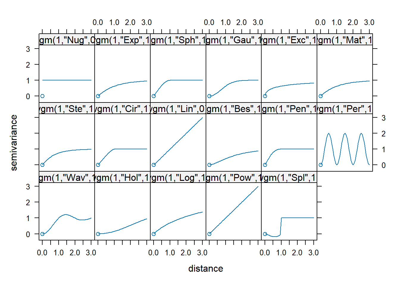
We choose the shape that suits out empirical variogram. I will go with Sph. Then we use all the above information to construct our theoretical variogram:
vt <- vgm(
psill = 67270.444,
model = "Sph",
range = 84435.071,
nugget = 3583.889
)
plot(ve, vt, cutoff = 100000)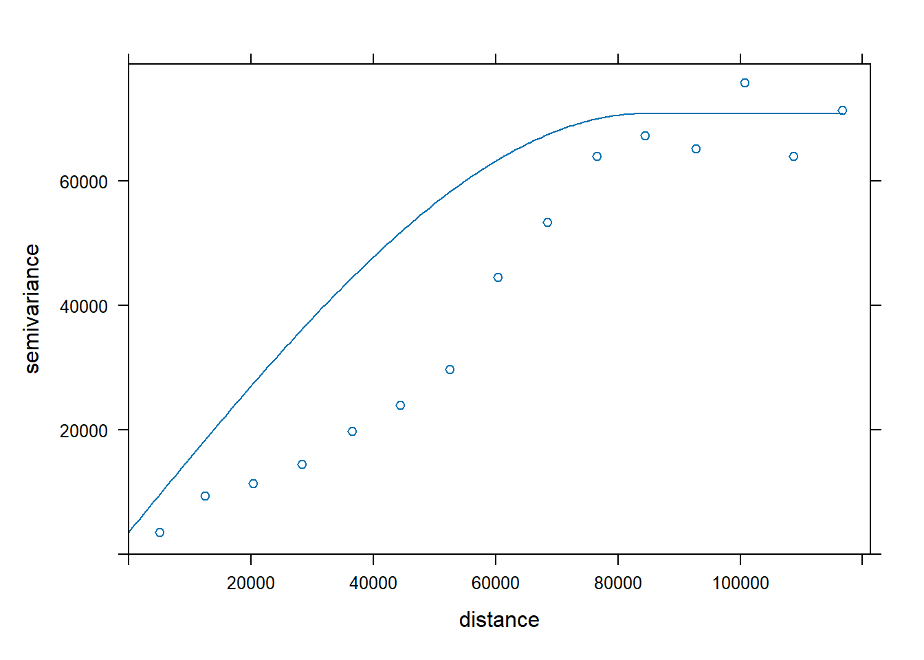
In case we are not convinced with the adjustment we can change any parameter. Here I decided to change the shape of the variogram to Wav:
vt <- vgm(
psill = 67270.444,
model = "Wav",
range = 84435.071,
nugget = 3583.889
)
plot(ve, vt, cutoff = 100000)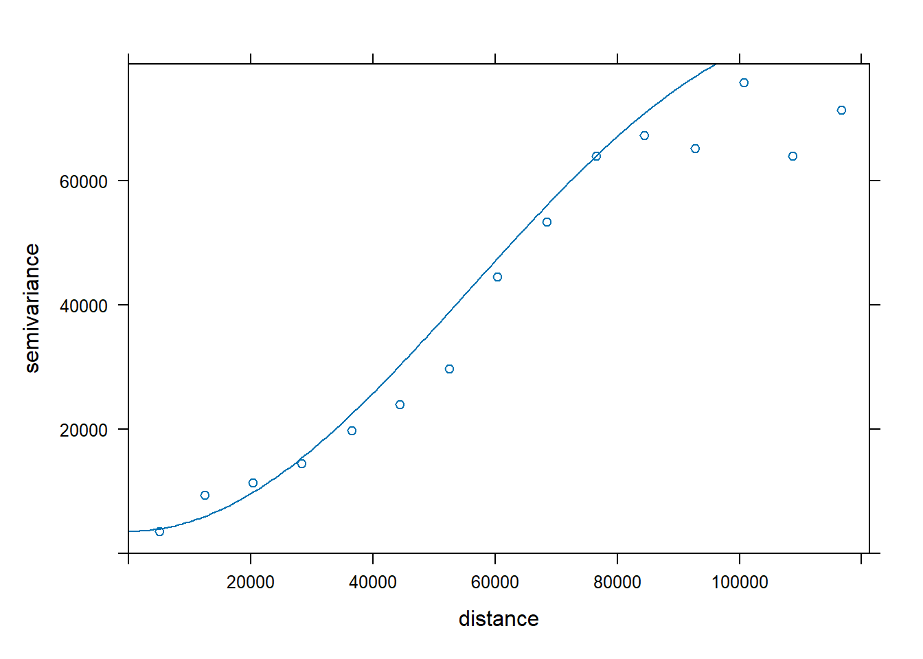
Once we are happy with our theoretical variogram we apply fit the variogram to our data to get our semivariogram model:
va <- fit.variogram(ve,
vgm(
psill = 67270.444,
"Wav",
range = 84435.071,
nugget = 3583.889
))
plot(ve, cutoff = 100000, model = va)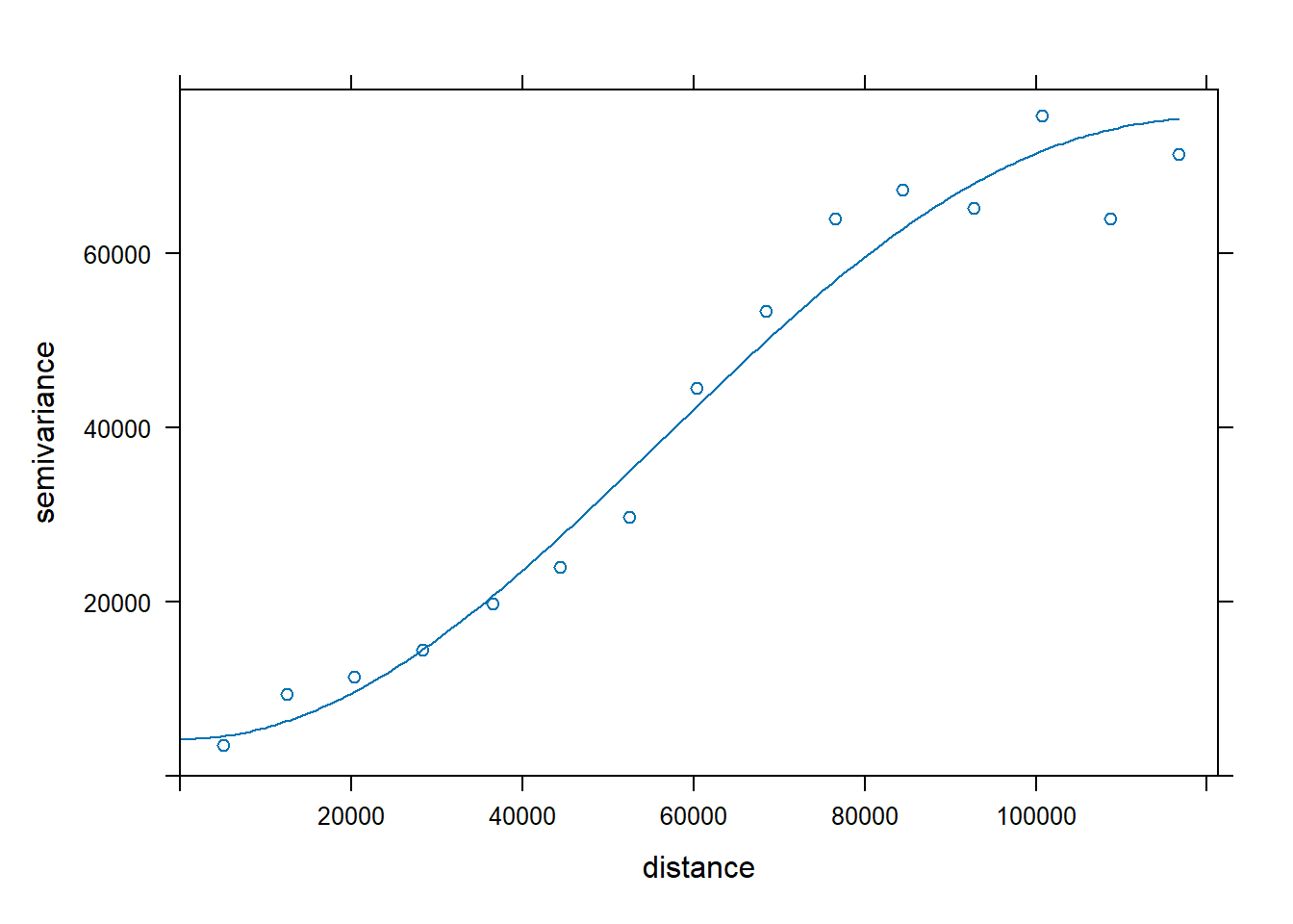
ext <- ext(pstations)
resol <- 5000
r <- rast(ext, res = resol, crs = crs(pstations))
values(r) <- 1
p <- as.data.frame(r, xy = T)
p <- st_as_sf(p, coords = c("x", "y")) %>% st_set_crs(st_crs(r))
ok <- krige(Total ~ 1, pstations, p, va)[using ordinary kriging]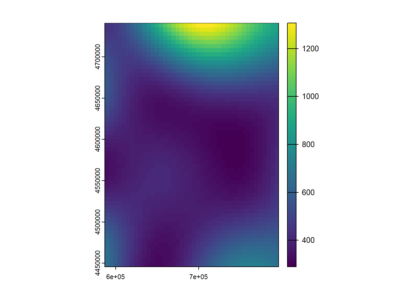
As for validation, well, in this case there is an explicit function in the gstat package to perform the cross-validation (LOO - Leave-one-out):
Map algebra operations comprise a set of techniques and procedures that, operating (logical, arithmetical or statistically) on one or more raster layers creates new data layers. In general, in the daily use of GIS, the concept of map algebra is associated with the development of arithmetic and/or logical operations on raster layers. This is a common conceptual error derived from the existence of raster calculator like tools. In fact, although it is true that this operations are framed within map algebra, they are not the only ones, but there are other operations to consider.
There are 4 main types of functions that can be defined:
Local. The value in each cell of the resulting layer is a function only of the values in that same cell location in the starting layers. Within this category we find the arithmetic and / or logical operations mentioned above.
Focal. The value in each cell of the resulting layer is a function of the value in that cell and in those located in its neighborhood.
Zonal or regional. A zonal operation is a spatial function that computes an output value of each cell using the zone containing that cell..
Global. The resulting value of the function is obtained from all the cells in the layer, for example, the sum of all pixel values.
You can find a nice description and examples of map algebra functions in http://gisgeography.com/map-algebra-global-zonal-focal-local/.
In the case of R, the terra package is the one that gives us access to this type of functions. In addition, we will also see some utilities to resize or trim raster layers so that they are more attractive for the purposes of creating cartography.
Within this group of functions we find calculator-like operations and other operations that operate pixel by pixel, as in the case of reclassification. The examples that we will see in this module start from what was seen in the interpolation module. We will use the results from IDW and Kriging interpolation.
First, we have to create a raster object with the results from the interpolation. We have already seen this in Module 3, which dealt with access to spatial information. In that case we saw how to load an existing rast layer file. What we are going to do now is convert the result of the interpolation into a rast layer. The process is similar. Just use the rast() function on the objects with the interpolated data, creating a new object:
Reading layer `prec' from data source
`C:\Users\pjgel\OneDrive - udl.cat\Sync\01 - Docencia\111019 - Introduction to Spatial Statistics (MEUFOR)\INTRO_R\QMD_book\INTROR\data\Module_5\prec.shp'
using driver `ESRI Shapefile'
Simple feature collection with 205 features and 18 fields
Geometry type: POINT
Dimension: XY
Bounding box: xmin: 586710 ymin: 4445844 xmax: 796907 ymax: 4741136
Projected CRS: International_1924_UTM_Zone_30N[inverse distance weighted interpolation][using ordinary kriging]class : SpatRaster
dimensions : 59, 42, 1 (nrow, ncol, nlyr)
resolution : 5000, 5000 (x, y)
extent : 586710, 796710, 4445844, 4740844 (xmin, xmax, ymin, ymax)
coord. ref. : International_1924_UTM_Zone_30N
source(s) : memory
name : last
min value : 289.809
max value : 1306.490 class : SpatRaster
dimensions : 59, 42, 1 (nrow, ncol, nlyr)
resolution : 5000, 5000 (x, y)
extent : 586710, 796710, 4445844, 4740844 (xmin, xmax, ymin, ymax)
coord. ref. : International_1924_UTM_Zone_30N
source(s) : memory
name : last
min value : 229.1231
max value : 1533.8444 Now we have the results of IDW and Kriging in two objects: ok_rast and idw_rast. On these objects we can now apply any map algebra function.
This is perhaps the most basic kind of operation. What we do is applying an arithmetic operation (+, -, * or /) on a layer. Generally we use this to change the information units of measurement or any other simple transformation:
Converting precipitation in
They are similar to the arithmetical ones, only that in this case the result is a boolean layer (1/0). In logical operations we evaluate whether the values of the pixels meet a certain condition created from a logical expression. The following example shows the pixels of the layer interpolated with IDW with precipitation over 1000
Local operations can also be applied over several layers. In this case, the type of operation is performed pixel by pixel based on the spatial coincidence (overlay) of the pixels of 2 or more layers. That is, if we sum 2 layers, what is done is summing the value of the matching pixels. To be able to do this in R layers must have exactly the same dimensions35. In the following example we calculate the quotient or ratio between the interpolated layers. This is a common way to compare the results of two or more interpolations procedures:
Pixels with values around 1 show coincidence in the prediction.
Another possibility is to use a logical operation to compare layers. For example, determine where the values of the r.idw layer are greater than those of r.ok. This also allows us to compare interpolations, complementing what we have seen in the previous example:
Using a local reclassification function (reclassify ()), we can recode the values of a layer and, for example, convert a continuous value layer into a layer with discrete information (ak, categories). This is what we will do in this case.
reclassify requires specifying the intervals and the target value in the reclassified layer. In R this is done using a vector:
In this case, what we do is reclassify the ok_raster layer into the following intervals:
Within this group of functions we will see how to implement spatial filters or operations with moving windows on maps. In this category we also find a particular type of functions such as indexes derived from digital elevation models: slope, orientation, illumintation…
Raster filters are an analysis boundary or processing window within which cell values affect calculations and outside which they do not. Filters are used mainly in cell-based analysis where the value of a center cell is changed to the mean, the sum, or some other function of all cell values inside the filter. A filter moves systematically across a raster until each cell has been processed. Filters can be of various shapes and sizes, but are most commonly three-cell by three-cell squares [From the ESRI’s GIS dictionary.
In order to apply filters on raster layers in R we resort to the focal() function:
In this example, a window of 11x11 pixels has been applied, with the same weight assigned to each cell of the window, calculating and therefore assigning the average value of the pixels of that window.
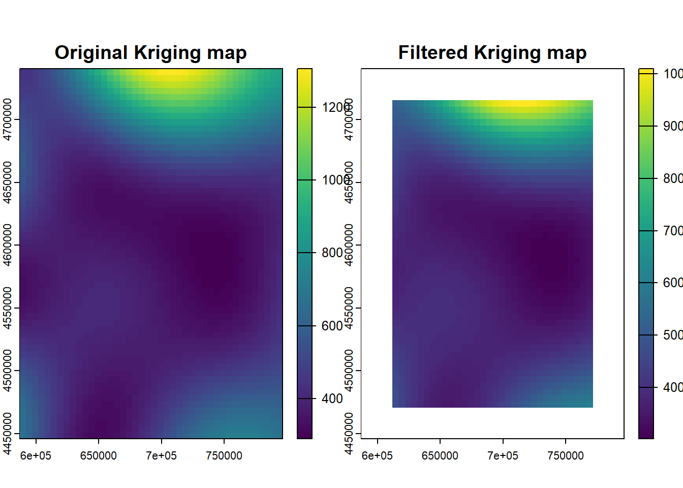
Finally, the terrain() function allows us to calculate indicators derived from MDEs as slope or aspect using pre-defined filtering operations:
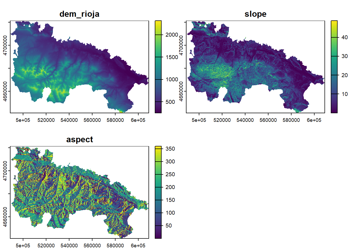
This type of operation is based on the calculation of statistical functions based on the delimitation of zones over a raster. The delimitation of zones can be done both with a raster or vector layers. In the following example we will see how to obtain the average value interpolated by municipality. We already know the function to use. It is the same extract() function we used to get values from raster layers to point location. In this case we use a polygon layer instead of point locations, and use an additional argument fun=function to get an summary value of the pixels within each polygon.
Let’s see an example:
Reading layer `Municipios' from data source
`C:\Users\pjgel\OneDrive - udl.cat\Sync\01 - Docencia\111019 - Introduction to Spatial Statistics (MEUFOR)\INTRO_R\QMD_book\INTROR\data\Module_6\Municipios.shp'
using driver `ESRI Shapefile'
Simple feature collection with 732 features and 19 fields
Geometry type: MULTIPOLYGON
Dimension: XY
Bounding box: xmin: 569192.4 ymin: 4412927 xmax: 810631.1 ymax: 4754879
Projected CRS: ETRS89 / UTM zone 30Nr.idw.muni <- extract(idw_rast, st_transform(municipalities, st_crs(idw_rast)), fun = mean)
head(r.idw.muni) ID Prec in mm
1 1 400.0430
2 2 400.1998
3 3 356.1628
4 4 355.0231
5 5 395.6653
6 6 391.0317zonal_mean <- cbind(municipalities, r.idw.muni)
ggplot() +
geom_sf(data = zonal_mean, aes(fill = Prec.in.mm)) +
scale_fill_distiller(palette = 1, direction = 0) +
theme_bw() +
labs(fill = "Prec (mm)")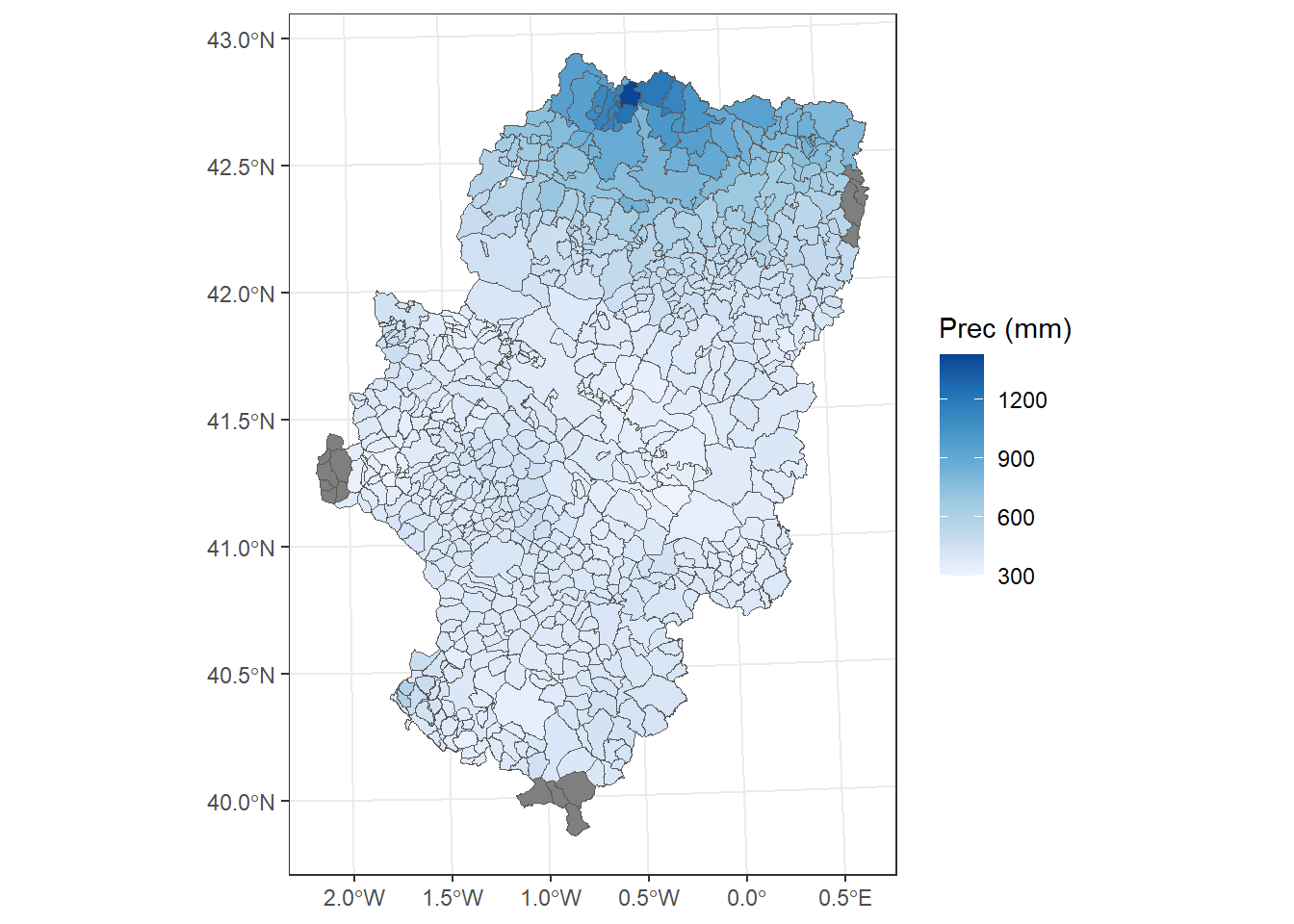
All the interpolation layers obtained have a rectangular shape. However, the stations from which the interpolation has been generated are within the Autonomous Community (CCAA) of Aragon. In this case, the usual thing is to do is cutting-off those pixel outside perimeter of the CCAA, so that we get something similar to the La Rioja mde layer
This is the last thing we’re going to see. To trim a raster layer to the limits of a polygon we use the mask function. In the example shown below we do just that. In this case it is important that the layers are in the same reference system, so that the layer with the limits of Aragon has been reprojected as a previous step:
Reading layer `Aragon' from data source
`C:\Users\pjgel\OneDrive - udl.cat\Sync\01 - Docencia\111019 - Introduction to Spatial Statistics (MEUFOR)\INTRO_R\QMD_book\INTROR\data\Module_6\Aragon.shp'
using driver `ESRI Shapefile'
Simple feature collection with 1 feature and 2 fields
Geometry type: POLYGON
Dimension: XY
Bounding box: xmin: -2.173671 ymin: 39.84678 xmax: 0.7713067 ymax: 42.9245
Geodetic CRS: ETRS89SpatExtent : -2.1736713, 0.7713067, 39.8467781990717, 42.9244951990591 (xmin, xmax, ymin, ymax)SpatExtent : 569195.503235651, 810645.3634103, 4413002.97712511, 4754964.2504878 (xmin, xmax, ymin, ymax)📝EXERCISE 11:
Create an script to compare IDW and Kriging outputs from the interpolation of Total precipitation.
Adapt the resulting interpolations to the extent of the layer Aragon.shp and crop rasters to its boundaries.
Deliverables:
Submit the commented code and a set of maps with the results for each interpolation method using the exercises portfolio template example.
This is probably the most useful one. The IDE will suggest the function name instead of fully typing it↩︎↩︎
Do not mistake it with the R vector object, they are quite different!↩︎
use \t for tab↩︎
the same applies fordec↩︎
Remember to adapt the path to your own folder structure↩︎
Do not forget quotes sorrounding the name of the package↩︎
Note that quotes are not needed↩︎
please, ignore the par() statement at this time↩︎
Remember to import the file properly, setting the adequate parameters for field and decimal separator↩︎
Taken from https://www.stat.berkeley.edu/classes/s133/saving.html↩︎
Note that I use the terms calibrate, fit or adjust indistinctly.↩︎
We will see how to do it in R automatically↩︎
Or what is the same observed-predicted↩︎
The greater the value of a given variable, the lesser the value of the other.↩︎
Consider this as homework and check what this function does on your own. It suffices to say that returns a vector↩︎
Yes, we can also save plots into objects. In fact this is one of the foundations of theggplot2package, the most used one for plotting data, although quite difficult to comprehend at the begining.↩︎
taken from http://data.library.virginia.edu/understanding-q-q-plots/↩︎
It is best suited for samples with N<30↩︎
Believe it or not, this kind of variable is quite frequent both in nature or environmetal science (species distribution models) or health sciences (disease outbreak)↩︎
Whatever process we should employ.↩︎
A DEM is a raster layer that takes elevation value in each pixel.↩︎
retrieved from http://centrodedescargas.cnig.es/CentroDescargas/index.jsp↩︎
We have a hint in the use of colnames instead of names. The first is or matrix or arrays and the later for data.frames↩︎
I am skipping sampling into calibration and validation but you should. I am also not doing the collinearity analysis but, again, you should.↩︎
This is particularly important in glm(). Don’t forget it!!↩︎
It is the same we employed before.↩︎
Before we go any further we should check the CRS of dem.rioja↩︎
Check https://cran.r-project.org/web/packages/rpart/rpart.pdf for further insights.↩︎
Remember we used this data in the linear regression example↩︎
We can apply the same method using spatial data but using the table is faster↩︎
Check http://rspatial.org/analysis/rst/3-spauto.html#compute-moran-s-i for a manual example↩︎
Taken from http://pro.arcgis.com/en/pro-app/tool-reference/spatial-analyst/how-kriging-works.htm↩︎
It’s called empirical because we fit it from actual data↩︎
we cannot operate with layers with different resolutions and/or extents, they must be equal on that regard↩︎